The story is that a product was built in ten days. The more useful story is what happened before the clock started.
For Cowork, ten days covered the push from an internal version to an external release. Different prototypes and interaction experiments came before it. The short launch story left out the work that made the launch possible.
Zoom out a little.
That omission changes the lesson. If you hear only the number, you might conclude that exploration was waste and execution finally replaced it. If you include what came before, the lesson is almost the opposite: the team had accumulated enough understanding to make a fast, imperfect commitment.
I’m interested in that difference because we are getting very good at showing how quickly something can be made. We are much less precise about what the speed is buying. A faster build, a faster decision, and a better day for the person using the product are three different outcomes.
They can reinforce each other. They can also come apart.
There are three clocks, not one
The production clock measures how long it takes the team to make something. The learning clock measures how long it takes to discover whether the idea deserves to exist. The user’s clock measures the work the product creates or removes for the person using it.
A generated prototype can improve the first clock immediately. The other two need more care.
If we produce five variants without knowing what distinguishes them, we have more material to review, not necessarily more knowledge. If we ship a shortcut that requires the user to check every result manually, we may have moved labor out of the product team and into the customer’s day. Our speed is not their efficiency.
You’ve stood in this spot.

None of that is an argument for being slow. It is an argument for knowing which delay we are trying to remove.
The delay between an idea and a working experiment is often worth attacking. The pause before an irreversible action may be doing useful work. The time spent checking an ambiguous result may be evidence that the interface is asking the user to compensate for a problem the product hasn’t solved.
When a team reports time saved, I want to know where that time went. Did it become an earlier test, another serious alternative, a more accessible interaction? Or did the same assumptions simply reach production sooner?
Build earlier. Commit later.
The easy reading of “the design process is dead” is that research and exploration have become optional. But studies and surveys remain part of the work at Anthropic. The change is in the mix of work, not the disappearance of inquiry.
I think the important change is where the inquiry can happen.
When behavior depends on a model, a static mockup can show an ideal response without exposing the conditions that produce it. A working version lets the team encounter the material: ambiguous inputs, uneven responses, delays, context that gets lost, and uses nobody put on the original flowchart. Implementation can become part of discovery rather than something that begins after discovery is declared finished.
But “build to learn” needs a second half: what would count as learning?
If the team cannot name a result that would change its direction, the prototype is probably being used to build confidence, not knowledge. The review becomes a search for reasons to keep what already exists. Fast generation makes that temptation stronger because a convincing artifact appears before the team has agreed on what it needs to establish.
I would separate the decision to make an experiment from the decision to ship its result. The first can be cheap and provisional. The second needs a reason grounded in the risk of the product and what the team has observed. Working code should lower the cost of asking a question, not quietly raise the cost of abandoning an answer.
This also changes how I would present the work. I want to show which assumption the prototype put under pressure, what happened, and what changed as a result. A polished screen is an output. A discarded direction can be evidence of progress.
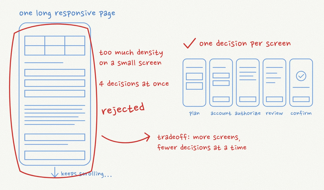
Here’s one from my own work. On E-ZPass, we considered carrying the dense desktop payment form onto phones as one long page.
The tool and the product are different opportunities
AI can accelerate the way we produce an interface, or become part of the interface’s behavior. In the tldraw demonstration, a sketch becomes a working interaction, and further edits use the same whiteboard conventions.
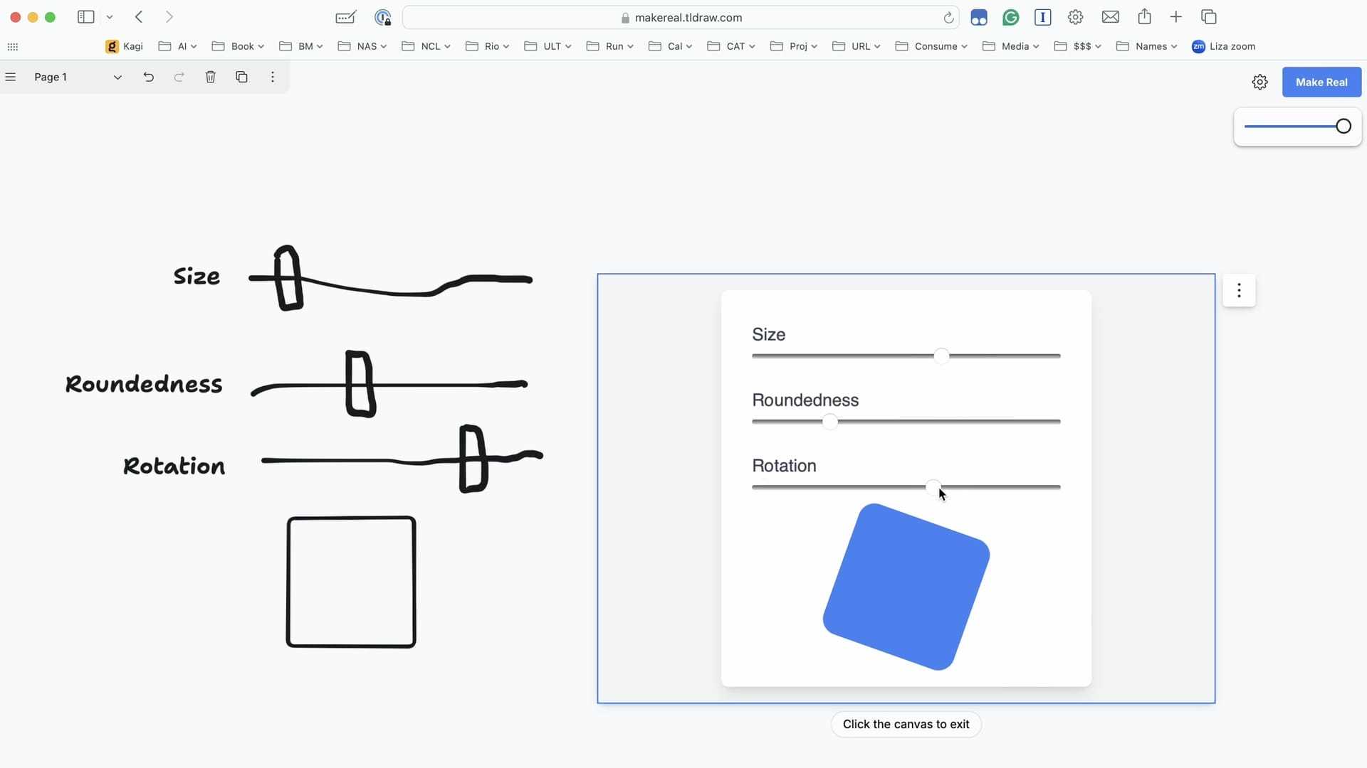
The generation is impressive. The continuity is the more interesting design decision.
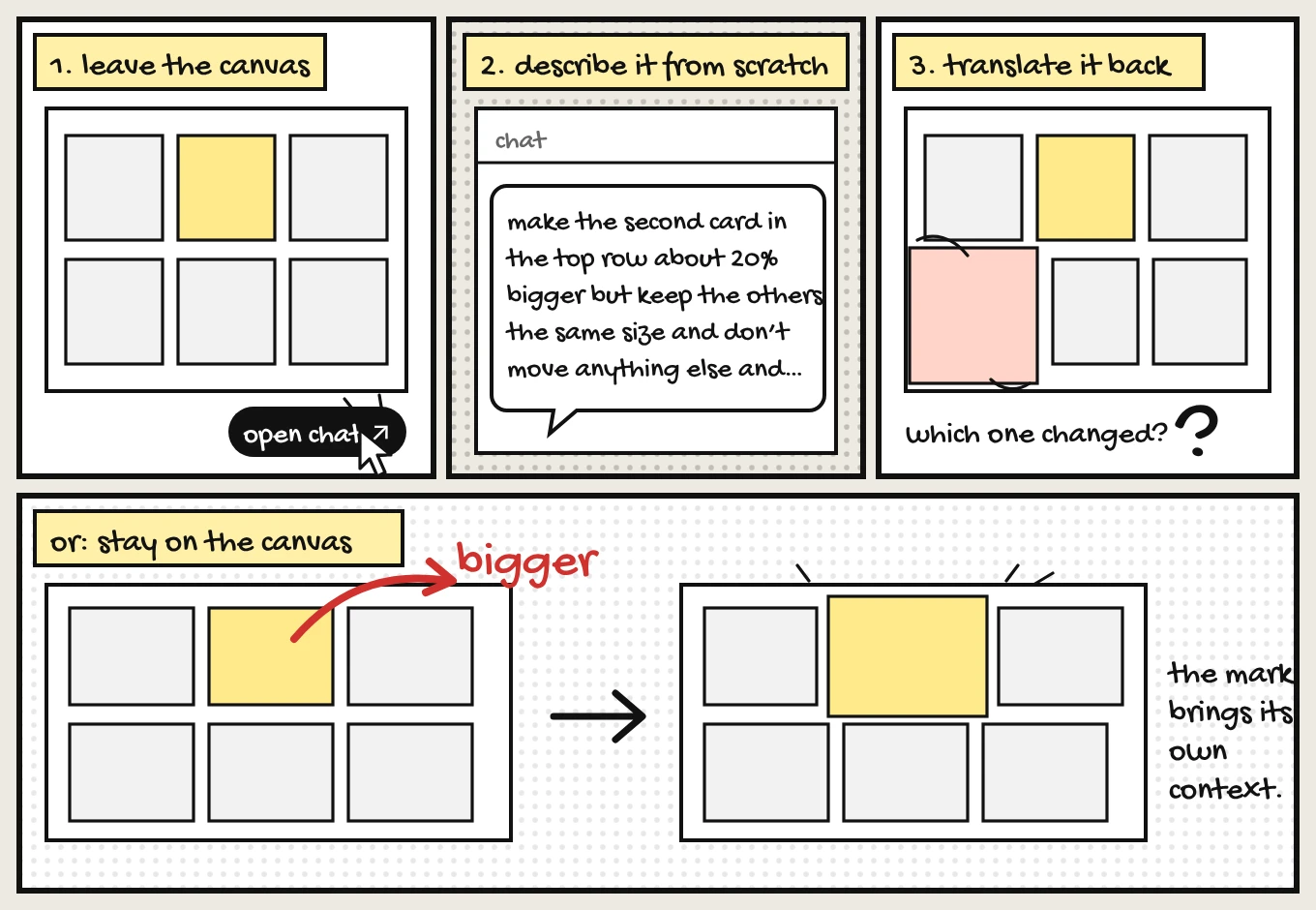
The person doesn’t have to leave the canvas, describe it from scratch, then translate the answer back into the work. A mark on the object carries context that would otherwise need to be reconstructed in language. The interaction is not just asking for the same work faster; it is removing a translation step.
The difference is easier to see than to describe, which is sort of the point.
That is a useful way to connect the two opportunities. Better building tools help designers explore more ambitious interactions. Better interactions reduce what users have to explain, remember, and reconstruct. The time saved in production matters most when it helps us remove work on the other side of the screen.
I don’t want to confuse that with adding an assistant everywhere. An interface can contain AI and still leave all the difficult interpretation to the person. A summary box above a complicated workflow may create another thing to read without helping anyone decide what to do.
The better question is what the person is repeatedly having to translate. From an intention into a query? From an answer into a decision? From a decision into several disconnected actions? There may be value in changing that relationship, even when the visible result looks less spectacular than a generated page.
A blank prompt is a door, not the whole room
There is a real tension between the argument for richer interfaces and the flexibility of conversation. Chat and direct controls can coexist: open-ended language allows unusual requests; specific interfaces can make familiar actions easier.
I don’t think the choice should be settled as chat versus UI. They carry different burdens.
A prompt gives me room to express an intention the product team never anticipated. It also asks me to know what is possible, formulate the request, and inspect the result. A button is more limited, but it advertises an available action and reduces the amount I have to invent.
Once the system understands enough about the task, it should not force the user to keep restating that task in prose. Let language open the space. Then provide a useful place to work.
Here’s what that handoff from language to a workspace could look like.
That place might be a comparison, a set of editable values, or an object I can point to. The specific form matters less than whether it makes the next decision easier to understand and reverse. A user shouldn’t need a talent for prompt composition to make a small, precise correction.
This is where I find the combination of implementation and interaction design compelling. We can build these alternatives cheaply enough to compare them. Instead of debating whether a chat interface is modern, we can investigate where conversation helps and where it becomes an extra layer between the person and the task.
Let the interface change without moving the ground
In the Gemini bespoke-interface example, the system selects an existing layout component. It isn’t inventing every part of the interface from nothing. The adaptability sits inside a constrained visual vocabulary.
That detail matters because radical flexibility and dependable use are not automatically compatible.
When I return to a product, I rely on more than recognizing the colors. I rely on knowing where my work went, what an action means, and what has already been decided. An interface that changes too freely can spend the attention it was supposed to save. I might gain a personalized view and lose the ability to compare it with yesterday’s.
The design problem is deciding what may adapt and what must remain stable.
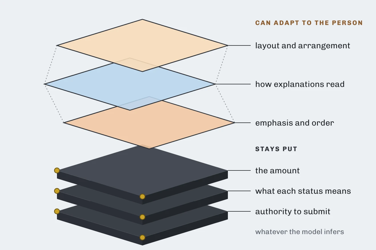
For a payment experience, I would be open to changing how an explanation is presented. I would not want an inferred preference to quietly change the amount, the meaning of a status, or the authority required to submit. Those are different layers of the product. Flexibility in presentation should not imply flexibility in the underlying commitment.
Think of it as layers. Some can move. Some hold everything else up.
The same distinction applies to the model’s role. It may help interpret a request, find relevant information, or propose a useful arrangement. The system that records a payment remains responsible for the actual payment state. A fluent description should not be allowed to turn an unverified assumption into an authoritative result.
This is not a call to make every interface rigid. It is a call to place freedom where it is useful. Let the user explore without losing the stable facts and controls that make exploration safe.
I would judge an adaptive interface partly by the effort required to recover from a wrong inference. Can the person see what changed? Correct it locally? Return to the previous view? Keep working without explaining everything again? Adaptation earns its place when being misunderstood is cheap to repair.
Collaboration is a question of authority
Miro’s Sidekicks example puts generated feedback on the collaborative canvas as comments and sticky notes. The assistant participates through the workspace’s existing objects instead of requiring a separate conversation.
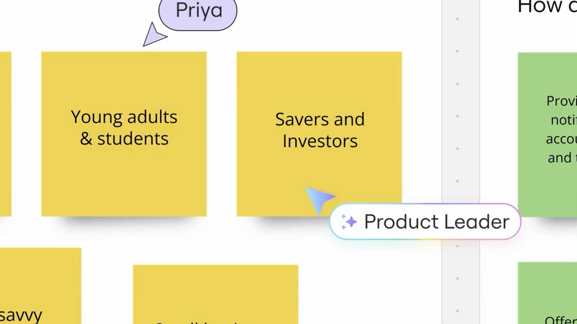
I like that placement because it makes the relationship between a suggestion and the work easier to inspect. But placement alone does not establish the suggestion’s authority.
A comment from a colleague, an approved product requirement, and a generated recommendation can occupy similar visual space while meaning very different things. If the interface blurs those distinctions, collaboration becomes a mechanism for laundering guesses into decisions.
The product needs to answer a few plain questions. Who proposed this? What information supported it? Has anyone accepted it? Does accepting it change the shared work, or merely add a possibility? Those questions belong in the interaction, not in a help article the user has to remember.
Agentic work makes the distinction more consequential. A system that can act on a suggestion needs a clear boundary between proposing, preparing, and committing. The right amount of interruption depends on the action: stopping for every harmless adjustment makes the tool exhausting; quietly committing consequential changes makes it untrustworthy.
Cowork’s direction is toward a shared task list, distinguishing work underway from work needing the user’s attention. That is a different information problem from displaying a chronological conversation.
A transcript records what was said. A working relationship needs to show what is happening, what is blocked, who owns the next move, and what has actually finished. Treating the conversation as the entire interface can leave the user reconstructing those states from a stream of messages.
Same information, two shapes. Watch the board turn what was said into who moves next.
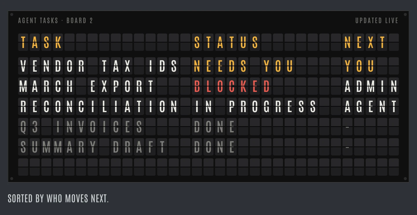
Here, design and coordination meet. The interface is not merely presenting an answer; it is distributing responsibility between the person and the system. That is why a well-placed status or approval boundary can matter more than a more conversational personality.
Don’t automate the leap from observation to conclusion
The research-workspace comparison below makes the problem visible.
What should we build next?
Users want a clearer overview of their work.
Which users? What did they actually need?
“I lose track of what changed.”
“I just need the next step.”
Both need orientation. Neither asked for a dashboard.
The first version turns different observations into a confident recommendation. A dashboard sounds like a plausible answer to a need for orientation. But plausibility skips the work of deciding whether these are the same problem.
Losing track of what changed may call for a history. Not knowing the next step may call for clearer task status. A dashboard could help, or become another surface that collects information without resolving either difficulty. The observations don’t settle that question.
The second version gives the researcher a place to inspect the interpretation rather than merely receive it. That is where an intelligent interface can offer something more valuable than faster summarization: it can make the argument easier to examine.
I would want contradictory evidence to remain visible, not treated as noise to be cleaned up. I would want an edit to a theme to preserve the observations beneath it. And I would want to know when the system is grouping what people said versus proposing an explanation they never expressed.
Those are interaction decisions with methodological consequences. A product that makes it easy to retain disagreement supports a different kind of research from one that rewards the shortest, neatest summary.
But adding evidence panels is not automatically progress. The researcher could end up checking a complicated tool instead of doing the research. The concept would need to earn its complexity: can someone find a supporting passage, notice an unsupported leap, and revise the recommendation without losing the context?
That is what I would compare, not simply how fast either version produces a summary. The useful result is a better-supported decision at an acceptable cost of review. A beautifully organized error is still an error.
Protect the work that makes speed possible
Shorter-horizon vision work means a directional prototype for the next few months, rather than a distant, elaborately packaged future. That makes sense to me as a response to faster execution. More people can build in parallel; they still need a shared destination.
Without one, the team’s capacity can grow faster than the product’s coherence. Each local change is reasonable. Together they introduce different definitions, repeated features, and conflicting ways to complete the same task.

The designer’s contribution is not to become a checkpoint through which every pixel must pass. It is to make the important decisions legible enough that other people can act on them. Which distinctions matter? What should remain consistent? Where are exceptions justified? What are we trying to learn next?
This is a different kind of leverage from producing every artifact personally. A decision that helps several engineers make better choices may have more influence than a screen that arrives after they have already moved on.
It also requires resisting the urge to polish every emerging idea immediately. Rough work can contain a useful behavior before anyone knows how to explain it. The first task may be to understand why people keep returning to it. Making it visually familiar too quickly can erase the unusual thing that made it valuable.
That does not make craft disposable. It changes when and where craft does its work. Early on, preserve the possibility long enough to understand it. Later, make the behavior clear, coherent, and dependable enough for someone who wasn’t in the room when it was invented.
Choose a finish line on the user’s side
I would begin the next project with two questions: what has become cheap for us to make, and what is still expensive for the user to do?
The opportunity sits in the relationship between them. Faster prototyping might let us compare interaction models we previously couldn’t afford to explore. Contextual assistance might remove the need to reconstruct a task in a chat window. A clearer task state might eliminate repeated checking. None of those improvements is captured by the number of screens generated.
Then I would make the evidence standard explicit. What observation would tell us that the new interaction helps? What failure would make us simplify it, constrain it, or abandon it? Who carries the cost when it is wrong?
That last question prevents the team from confusing its own convenience with a better product. We shouldn’t celebrate automation while ignoring the verification, correction, and recovery work it leaves behind.
There is room here for ambitious, fast-moving design. Not a defense of a ceremonial process, and not a surrender to whatever can be generated today. A working prototype can bring the team closer to reality. A thoughtful interaction can give the user a capability they didn’t have before.
But those gains require us to keep the work before the clock in view: the exploration, the rejected alternatives, the evidence, and the decisions that make rapid execution worthwhile.
Speed is valuable when it shortens the distance to something worth doing. The job is still to decide what that is, and show that the person on the other side is better off.