Status without priority
Balances, violations, vehicles, statements, messages, and payment tools competed at once. The redesign introduced a task-led dashboard and clearer account status.
I grew from responsive design into end-to-end ownership of E-ZPass billing and payments across web and native mobile for New York and New Jersey.
Problem: Drivers had to hunt for their balance and payment methods, then work out what they were paying and whether it had gone through.
Separate controlled walkthrough: one-time bank payment, roughly 45 seconds to under 12. Results and methods ↓
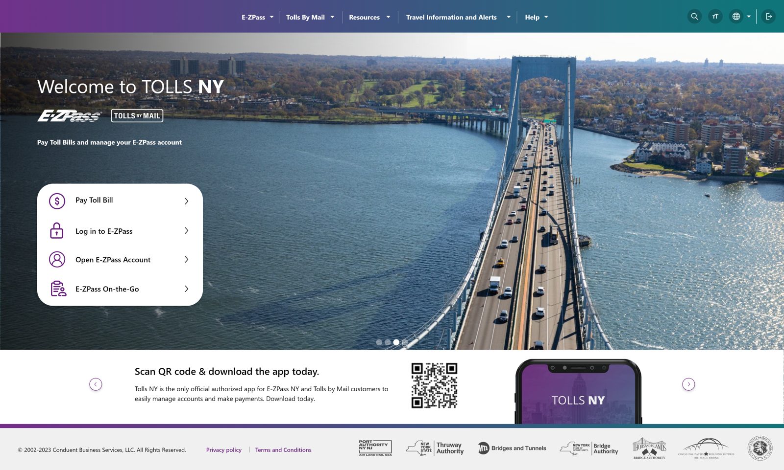
E-ZPass is not optional for most drivers in the Northeast, making every rough edge a real cost paid by customers who require this software. Three conditions shaped the work.
Dense tables, small fields, jargon, competing alerts, and weak hierarchy made it difficult to find the right task, understand account status, or recover when money was involved.
Authority rules, plan codes, payment types, and account conditions appeared as system concepts instead of clear customer decisions. Drivers had to understand the organization before they could complete a task.
New website features were routinely converted for smaller screens after desktop decisions had already been made. I established the responsive experience, then expanded my ownership across native mobile and web so each platform could support the same product intent without simply shrinking desktop.
The product spans four jobs. The redesign treated them as one connected account, not five separate screens bolted together.
Open an account, add a vehicle, pick a plan.
Standard or a commuter discount, per bridge or road.
Tolls post to the account. Statements summarize activity.
Auto-replenish, or pay a bill directly from a bank or card.
The interesting part of this project was not the screens, it was the calls made to get there. The screens are the output. This is the thinking that produced them, including surfaces the product never had before, pay types, disputes, support, collections, and correspondence, designed from zero.
I pulled analytics on the account flows and started where money and trust changed hands. Payments and statements had the clearest drop-off, and failure in those moments carried more customer and business risk than a cosmetic problem anywhere else. That gave the redesign a product order, not a visual order.
The legacy flow looked like a navigation problem. The evidence pointed to trust. Drivers needed to know what a plan would cost, what would happen after they pressed pay, and how to recover when something failed. I reframed five separate portals as one connected account built to answer those three questions.
NY and NJ, multiple toll authorities, and legal language that could not be designed away. I separated what had to stay legally exact from what could become clearer through hierarchy, sequence, and shared patterns. The goal was never to pretend the system was simple, it was to make the complexity navigable.
In usability testing, finding a balance and choosing a payment method without help rose from 68% to 92%. Correctly understanding payment status rose from 62% to 94%. Separately, my controlled one-time bank-payment walkthrough went from roughly 45 seconds to under 12.
One product language does not mean flattening real policy differences. I separated what should stay shared across authorities from what genuinely had to vary, so the result reads as one coherent product with controlled exceptions instead of forced consistency.
I presented the flow directly to executive and agency stakeholders, framing the decision through policy, customer risk, and implementation cost so the team could align on a direction that worked across New York and New Jersey.
A public toll service has to work for everyone forced to use it. I moved contrast, focus behavior, and labeling rules into shared components so accessibility repeated wherever those components were used.
I designed from screenshots of the live product, since the source files were not accessible, so these befores are the real state I worked from.
 BeforeAfter
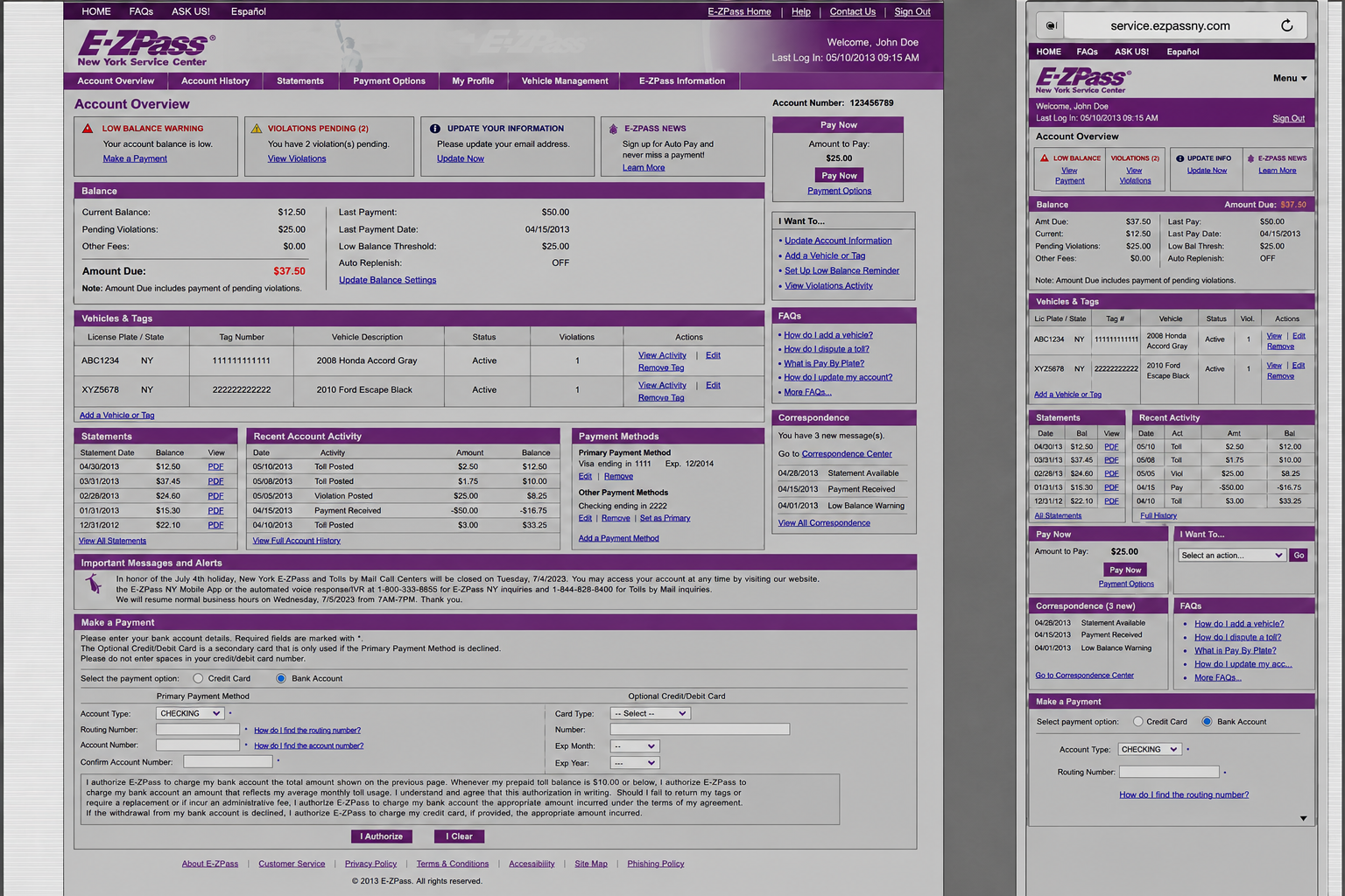
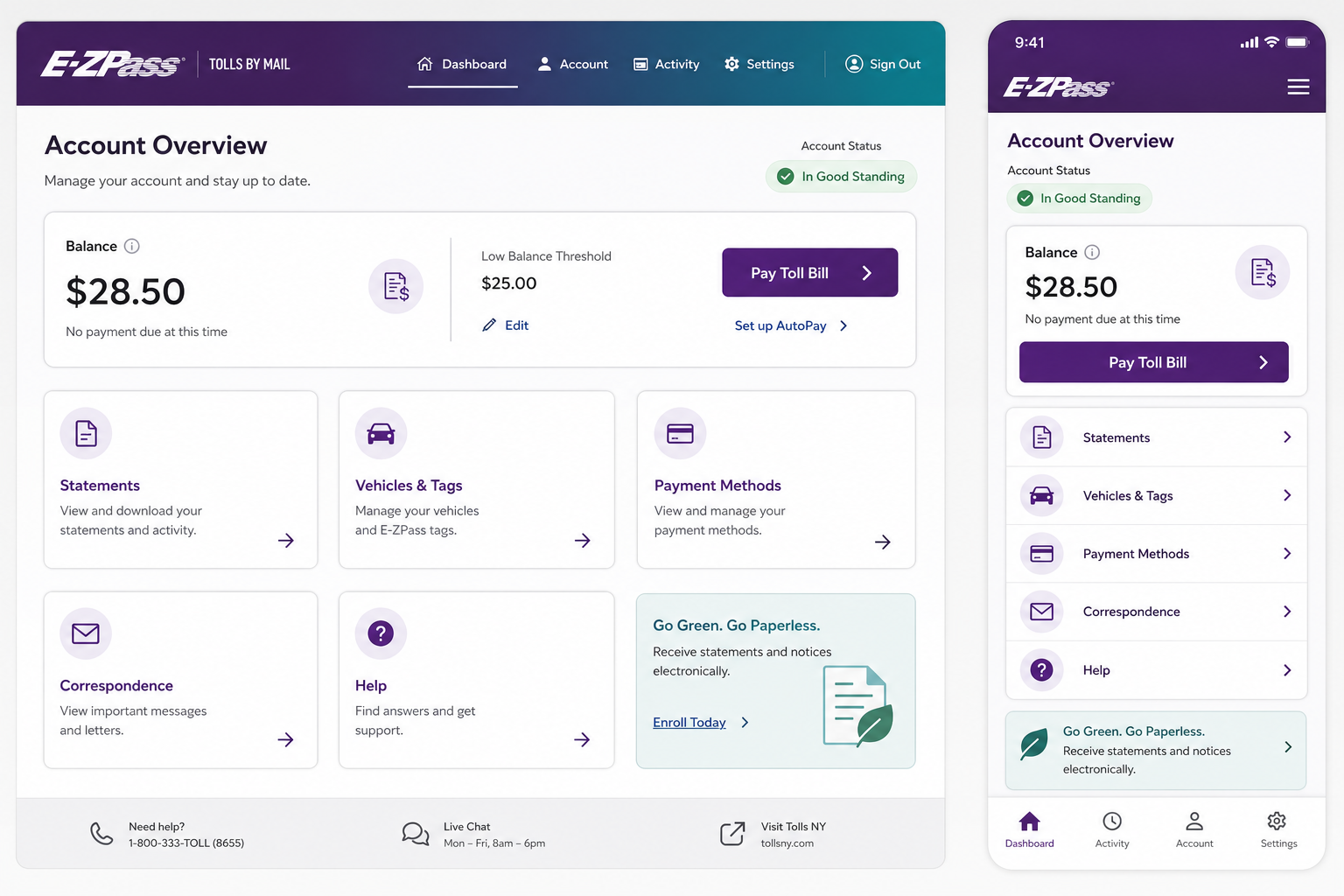
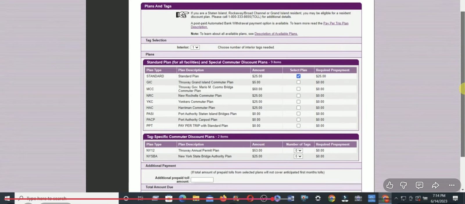
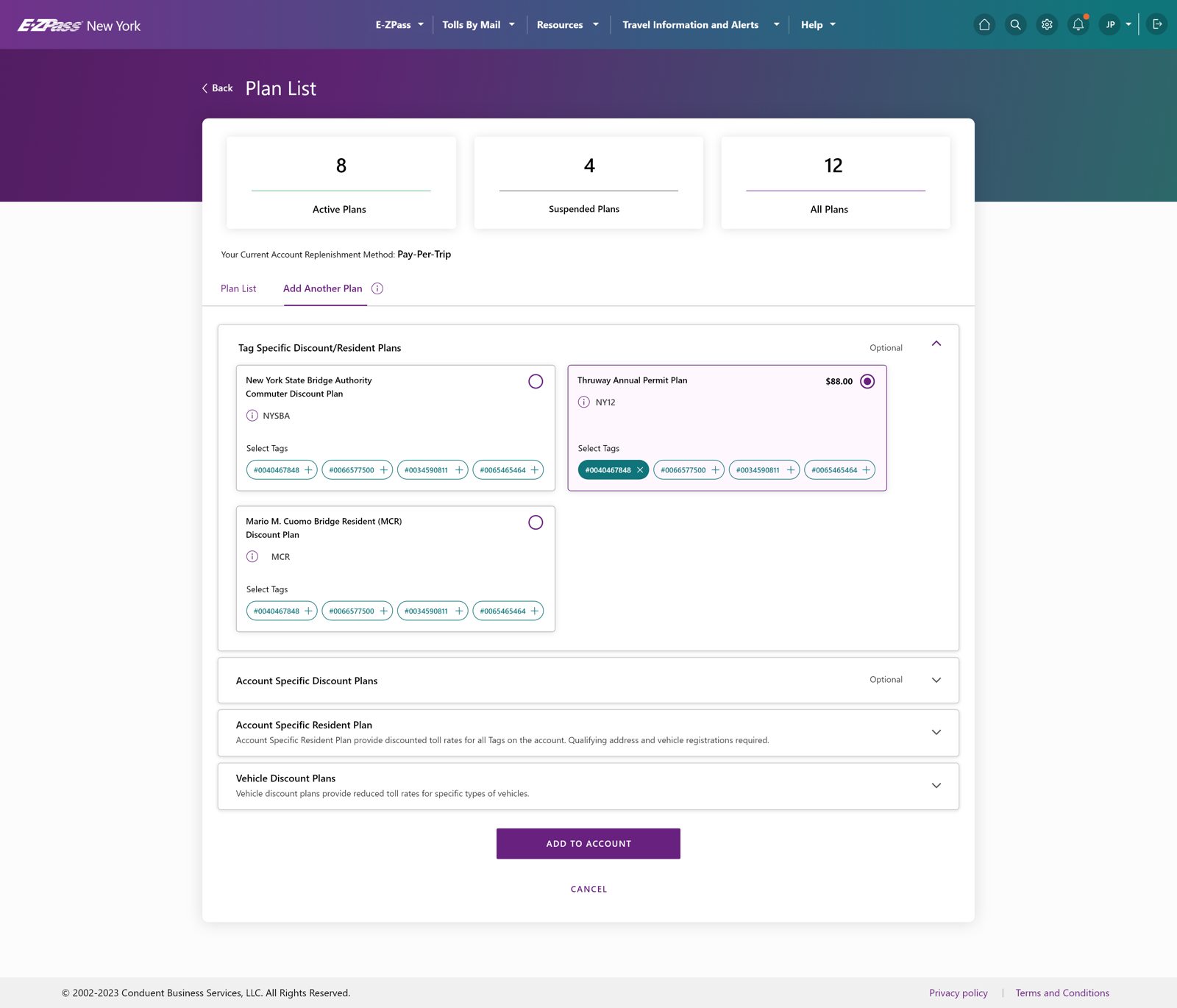
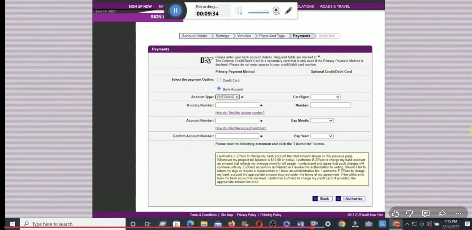
Each page exposed a different piece of the system and left the customer to assemble the meaning.
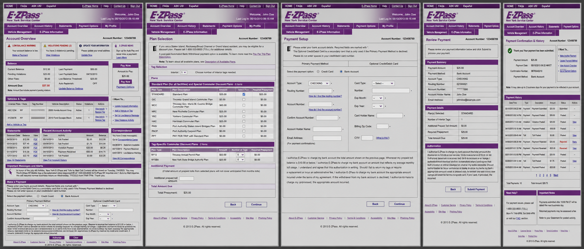
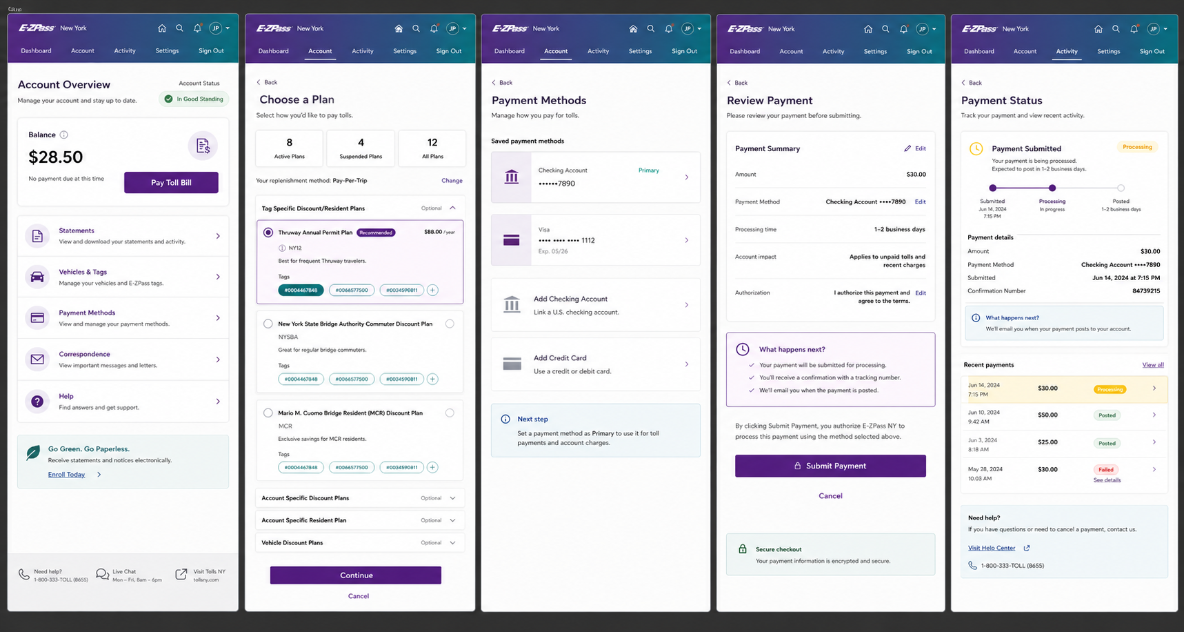
Balances, violations, vehicles, statements, messages, and payment tools competed at once. The redesign introduced a task-led dashboard and clearer account status.
Customers had to decode authorities, abbreviations, eligibility, and prepayment before choosing. Plan cards made coverage, qualification, and cost visible before commitment.
Primary and secondary payment rules, bank fields, card fields, and authorization copy appeared together. The new flow disclosed one decision at a time and added clearer pay-type paths.
The page verified entered values but did not foreground timing, account impact, or what would happen next. The redesign turned review into an explicit decision checkpoint.
A receipt could say submitted without explaining processing, posting, rejection, reversal, or recovery. I designed payment status as a continuing system, not a single confirmation page.
 BeforeAfter
Research showed: Drivers had to hunt for their balance and payment methods. They also needed to understand what they were paying and whether the payment had succeeded.
So I changed: I made the balance and payment options easier to find, clarified what the payment covered, and made successful completion explicit.
What improved: In usability testing, finding a balance and choosing a payment method without help rose from 68% to 92%. Correctly understanding payment status rose from 62% to 94%.
Separately, post-launch operational data shared by the E-ZPass program team showed payment-status support contacts falling from 36 to 14 per 1,000 payments.
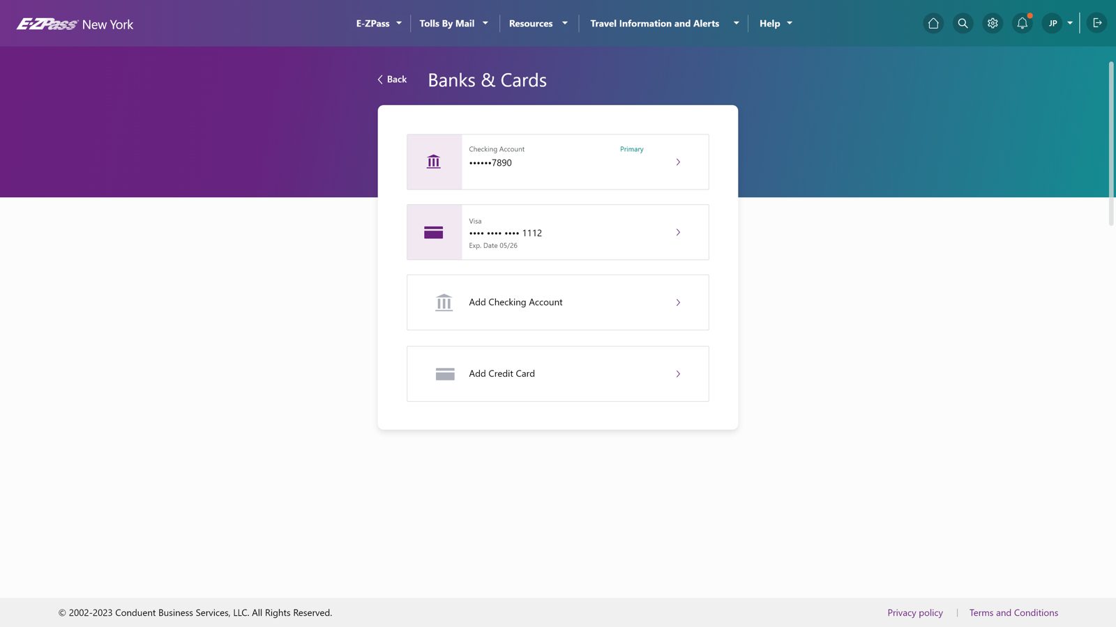 BeforeAfter
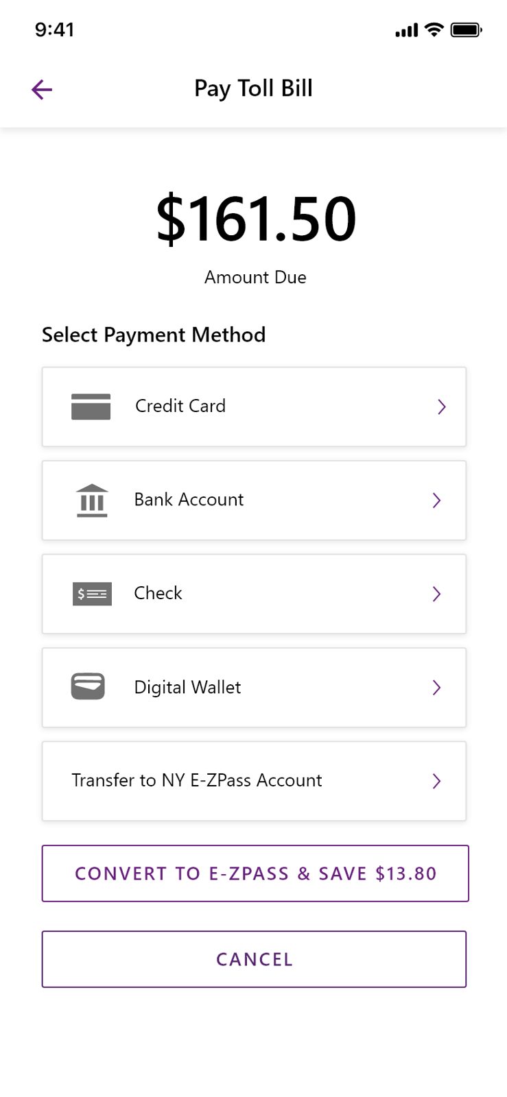
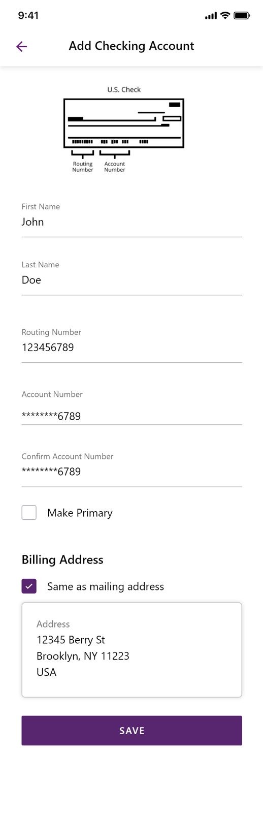
The mobile flow never asks for two things at once. Amount, then method, then the detail for that method. Each screen has a single obvious action.
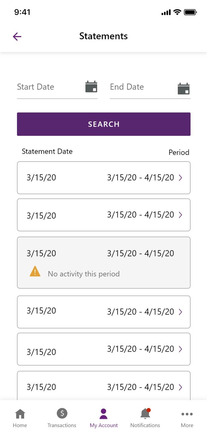
The redesign moved statements from a document people had to interpret into an account history they could search, filter, and act on. The two sides below are different product models, not a restyling of the same screen.
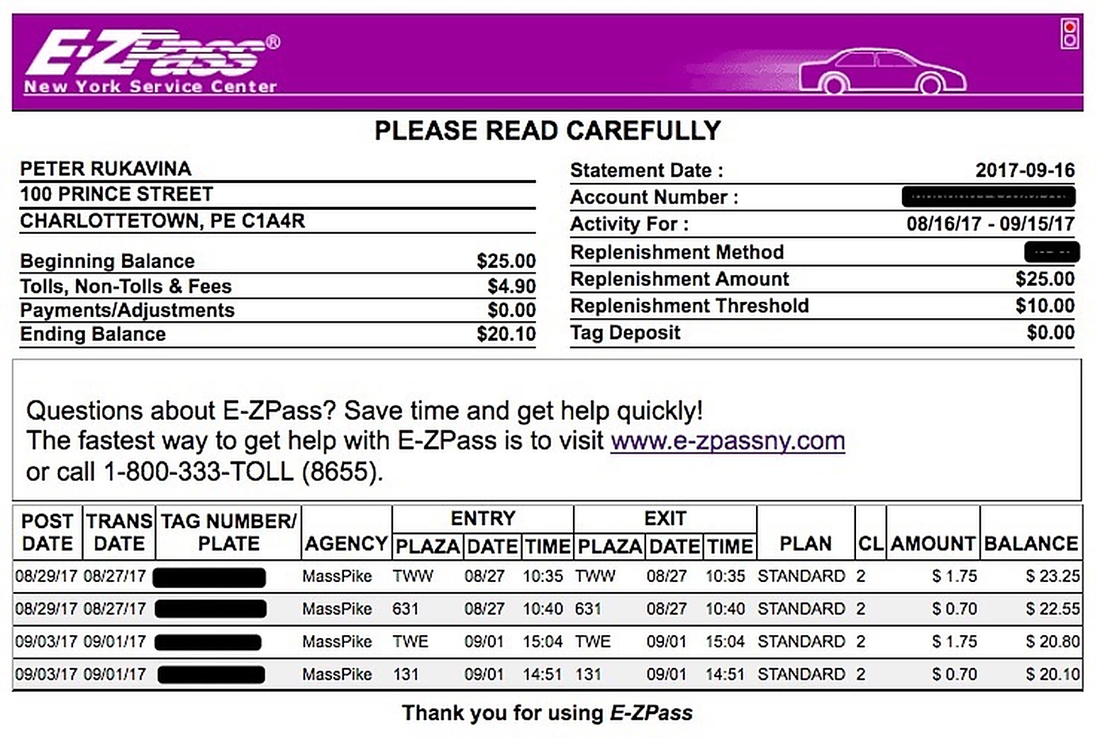
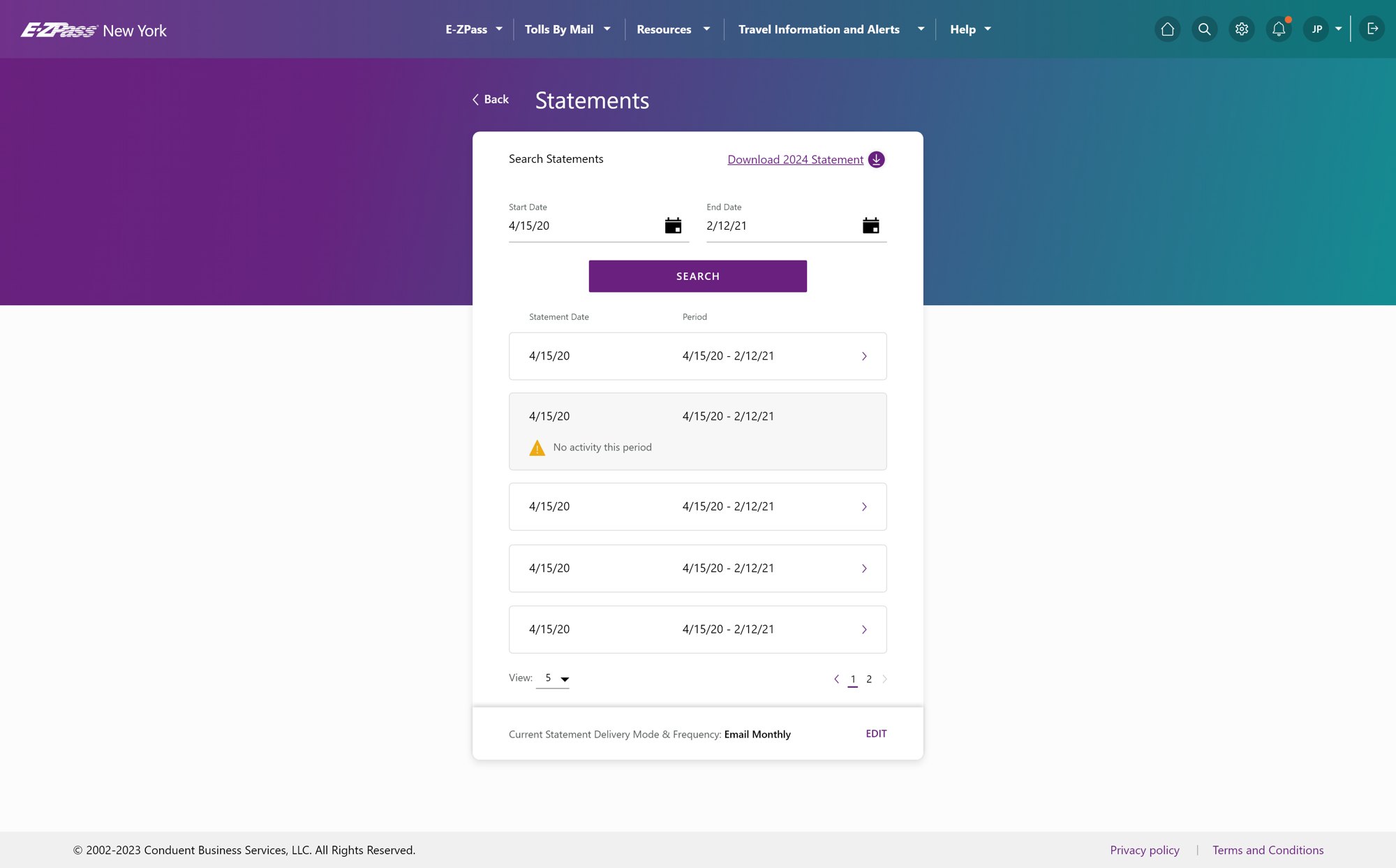 BeforeAfter
Start with the payment walkthrough, shared design system, and stakeholder decisions. Four additional examples cover prioritization, trust, legal constraints, and accessibility.
Open four additional examples of the design decisions and their supporting work.
Started where value breaks.
Verified project data| Journey area | Task completion rate | Drop-off | Support volume (per 1K users) |
Priority |
|---|---|---|---|---|
| Signup | 79% | 21% | 12 | 3 |
| Payments | 42% | 58% | 87 | 1 |
| Statements | 48% | 52% | 64 | 2 |
| Plans and tags | 66% | 34% | 31 | 4 |
| Profile and settings | 74% | 26% | 18 | 5 |
Pre-arrival account analytics baseline, May 1 to May 31, 2023. I used this existing baseline after joining in June to set the first redesign priorities. Support volume normalized per 1,000 users.
Open the full-size imageThe problem underneath the problem was trust.
Case-study artifact + original production evidence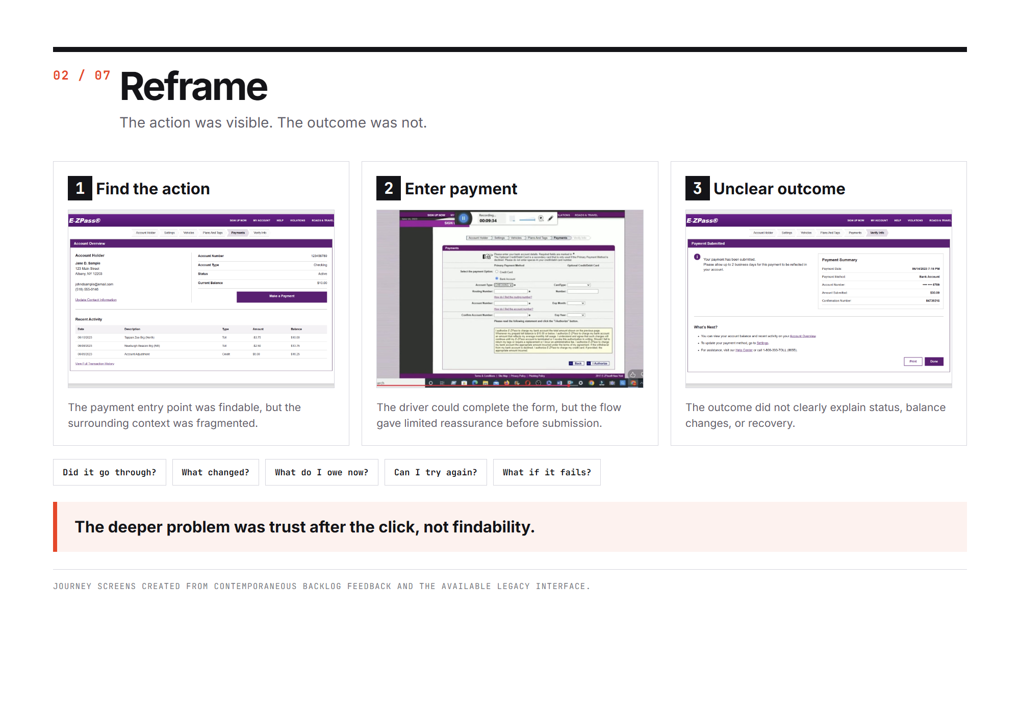
Findability was not the failure. The entry point worked.
The mechanics of the transaction were survivable.
Submitted is not the same as paid, and the screen never closes the gap.
Journey failure pattern in the legacy payment flow. Not an original end-to-end production capture.
Open the full-size imageSimplified the experience, not the rules.
Approved design comparison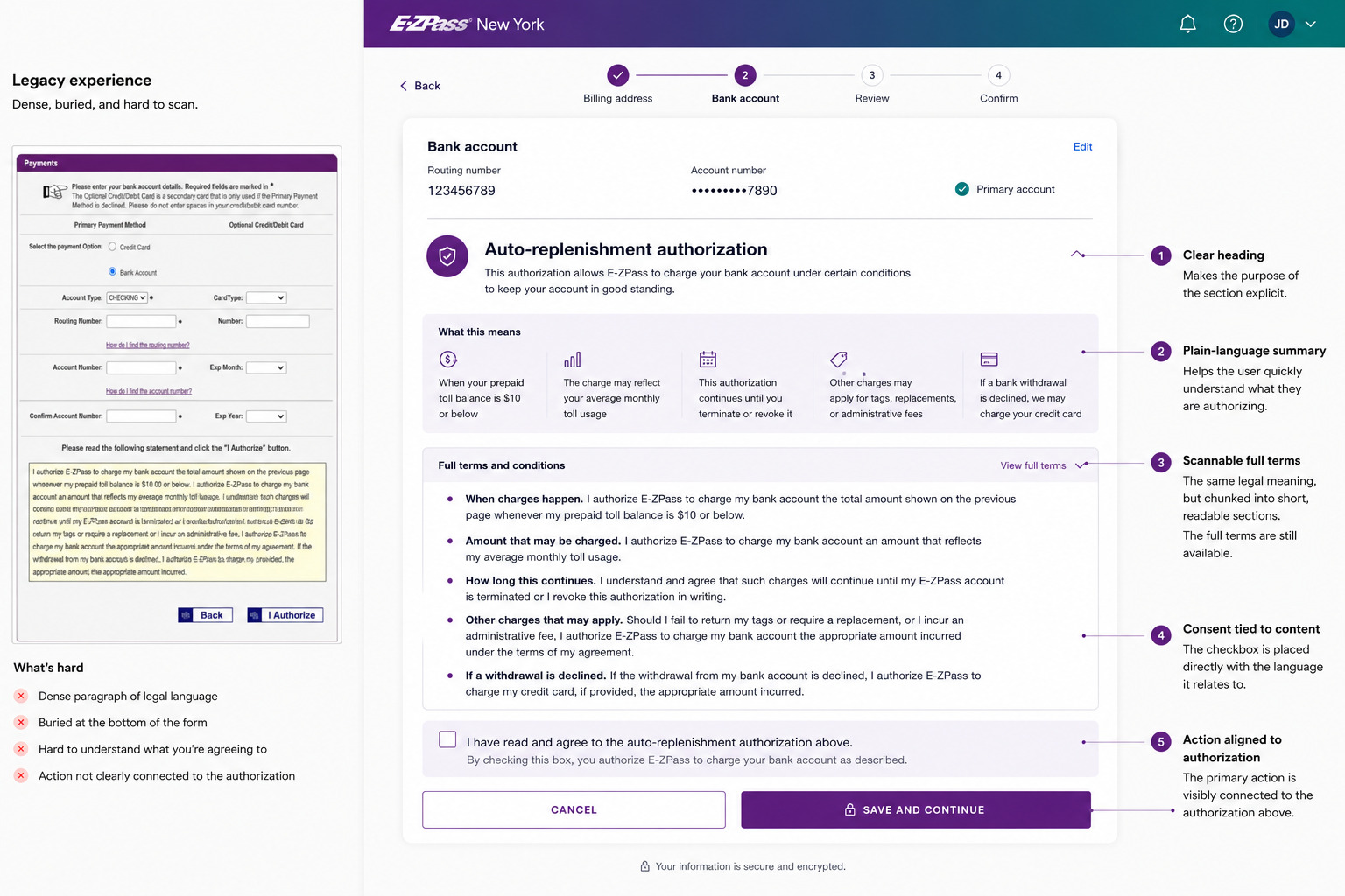
Auto-replenishment authorization, legacy experience beside the approved redesign.
Open the full-size imageI measured the flow, not the presentation.
My measured result + product contextResearch included 15 real customers. Timing protocol: legacy roughly 45 seconds, redesign under 12 seconds, with identical start and completion points across all runs.
Open the full-size imageShared core, controlled variation.
Approved redesign + Apollo documentation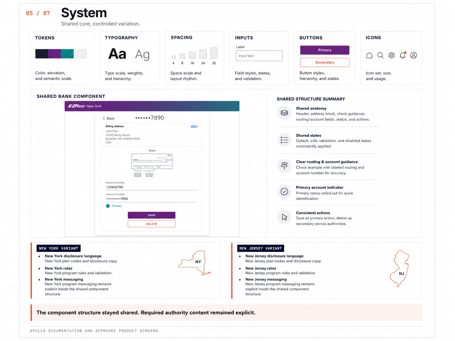
Shared component with authority-specific variants. The rows that differ are policy, not preference. See how the decision was implemented in the Apollo foundation.
Open the full-size imageMade decisions legible. The matrix, then the decision it produced.
Decision synthesis| Option | Separate NY and NJ experiences | One universal experience | Shared core with controlled variants |
|---|---|---|---|
| Policy fidelity | High | Low, risky | High |
| User consistency | Low | High | High |
| Engineering effort | High | Medium | Medium |
| Long-term maintenance | High | Brittle | Sustainable |
| Accessibility | Harder | Hard to maintain | Stronger |
| Scalability to new authorities | Low | Low | High |
Shared core with controlled variants. Consistency where it helps. Variation where it is required.
How similar should the New York and New Jersey experiences be across toll and billing?
Different priorities across groups made agreement hard without clarity on what was actually at stake.
A tradeoff matrix comparing three approaches against the criteria each group cared about.
Shared core with controlled variants, with authority-specific content handled as exceptions.
| Stakeholder | What they cared about | Initial stance |
|---|---|---|
| NYTA, legal | Accurate policy, required language, approval risk | Leaned separate |
| NJTA, legal | Accurate policy, required language, approval risk | Leaned separate |
| Engineering | Reuse, fewer implementations, maintainable code | Leaned shared |
| Product | Coherent experience, scale, future flexibility | Leaned shared |
| Design, me | Clarity, trust, accessibility, consistency with real differences | Proposed shared core plus variants |
Stakeholder tradeoff matrix and the decision it produced.
Open the full-size imageBuilt into the component, not bolted on per screen.
Apollo component specification| Bank account input | Default | Focus | Error | Disabled |
|---|---|---|---|---|
| Label | Routing number | Routing number | Routing number | Routing number |
| Value | 123456789 | 123456789 | 12345 | 123456789 |
| Helper text | 9 digits | 9 digits | 9 digits | 9 digits |
| Error message | None | None | Enter a 9-digit number | None |
| Account number helper | 4 to 17 digits | 4 to 17 digits | Enter a valid account number | 4 to 17 digits |
| Focus style | None | 2px ring, 2px offset | 2px ring on error color | Not focusable |
| Target size | 44 × 44 px min | 44 × 44 px min | 44 × 44 px min | 44 × 44 px min |
for / idaria-describedbyAA / AAABank account input, approved Apollo component specification.
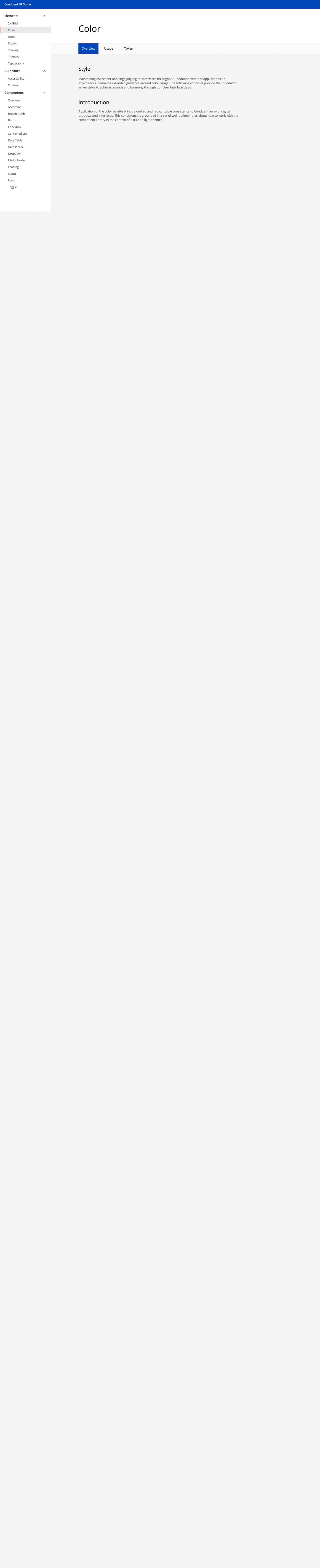
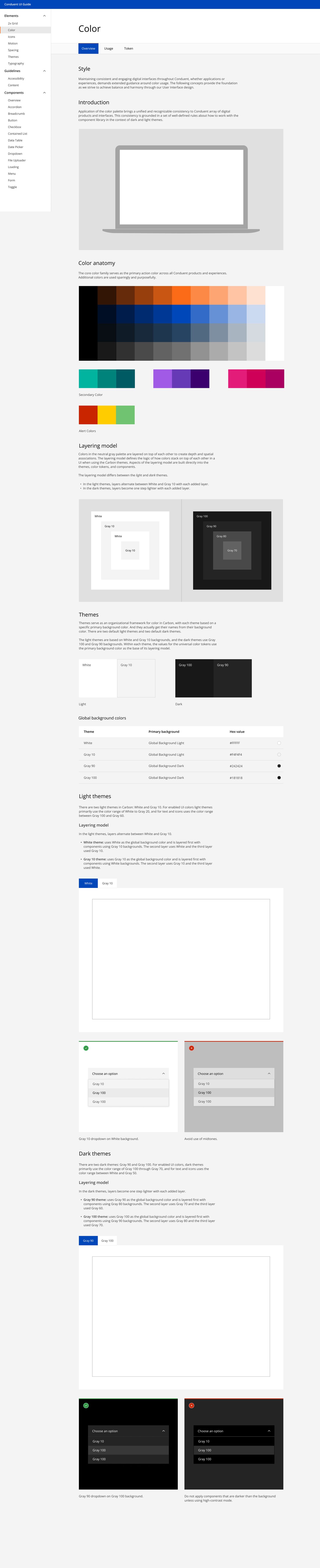
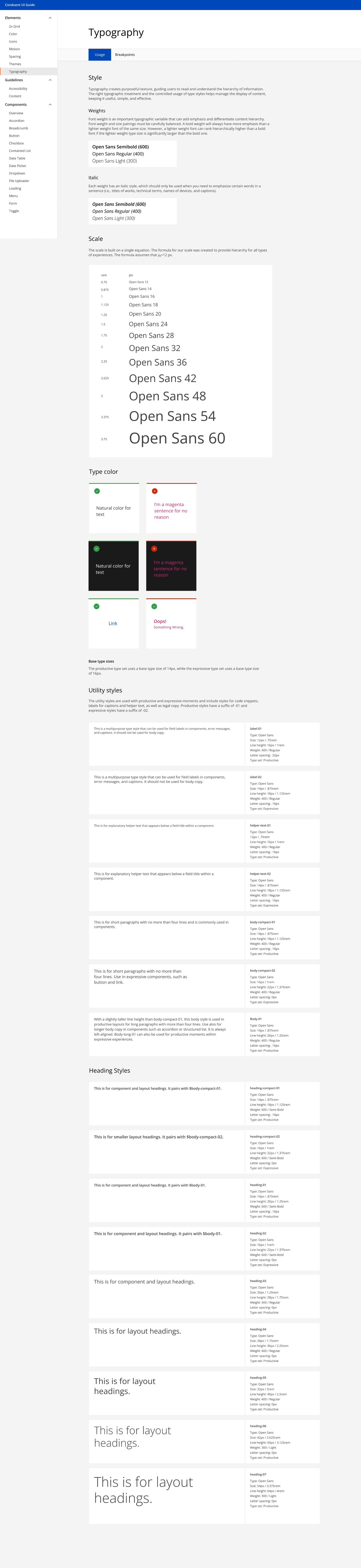
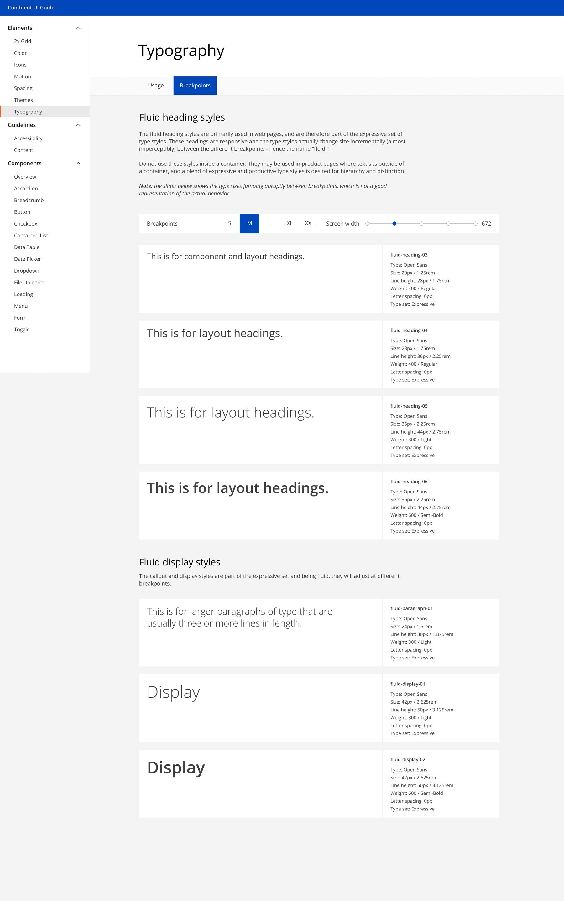
Open the full-size imageR5 establishes the product decision. This section shows the implementation evidence: the Apollo tokens, responsive rules, input states, buttons, and icons I designed and documented across web and mobile. Three exhibits provide the fast read. The full 11-page documentation is one click deeper.
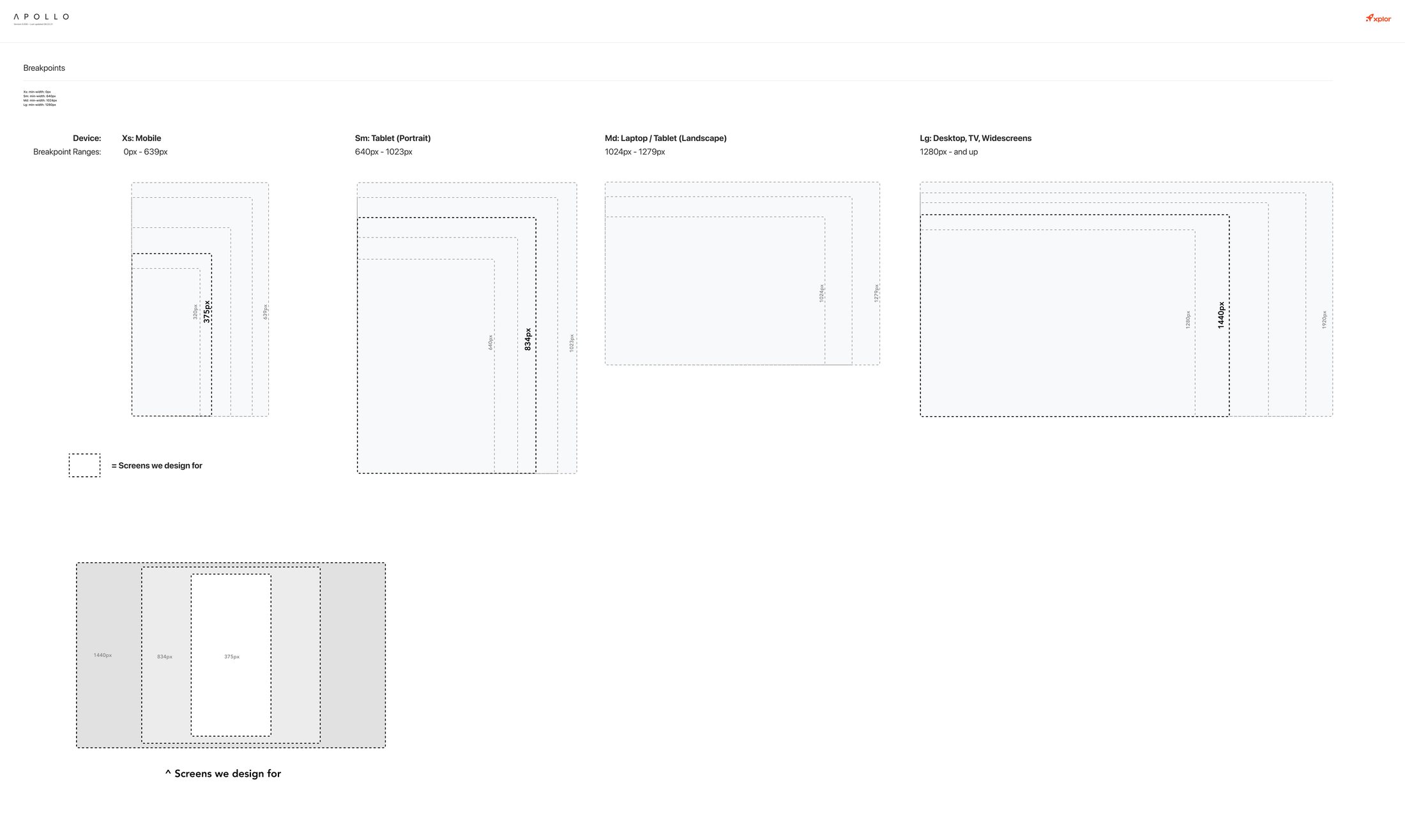
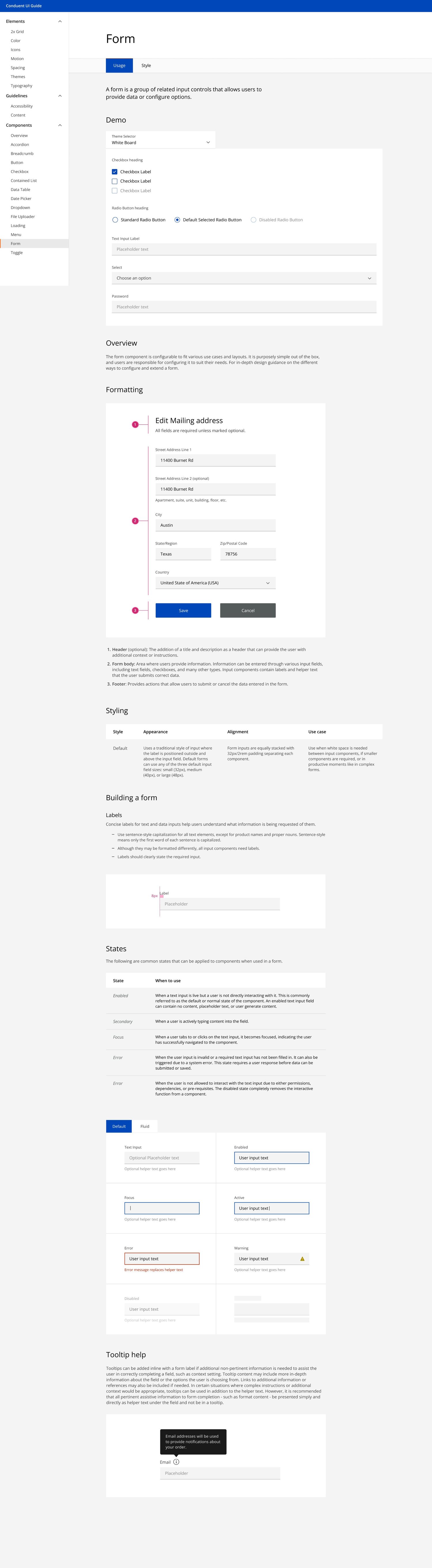
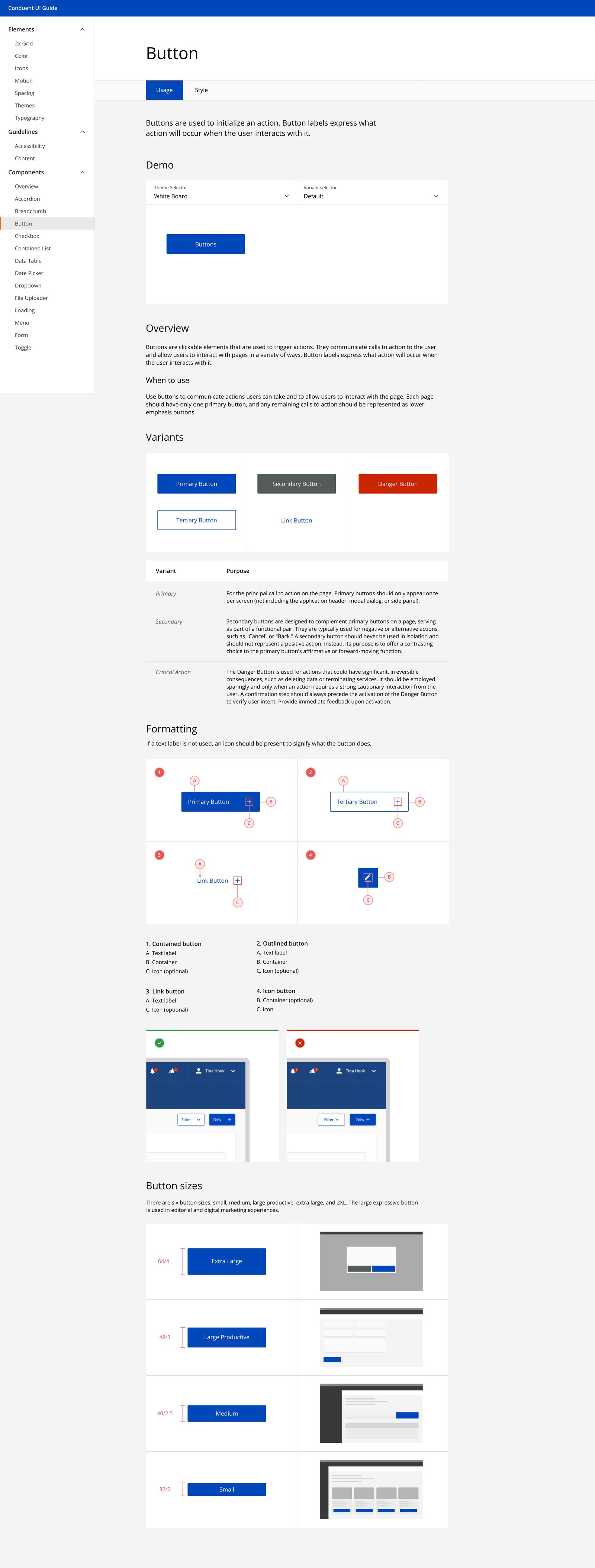
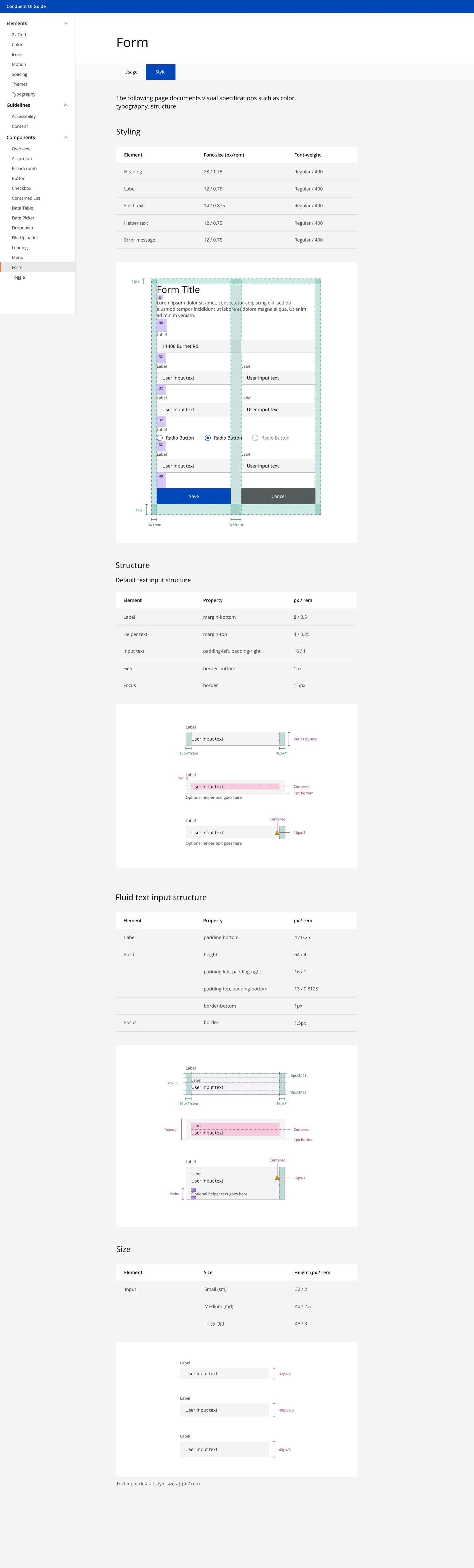
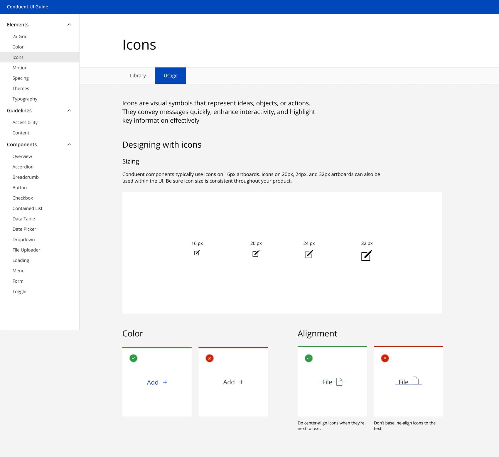
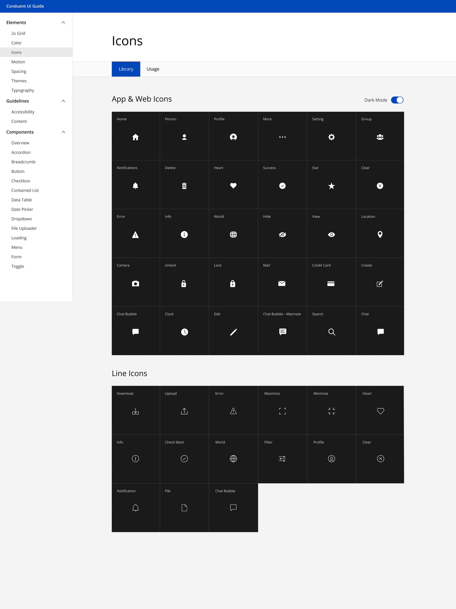
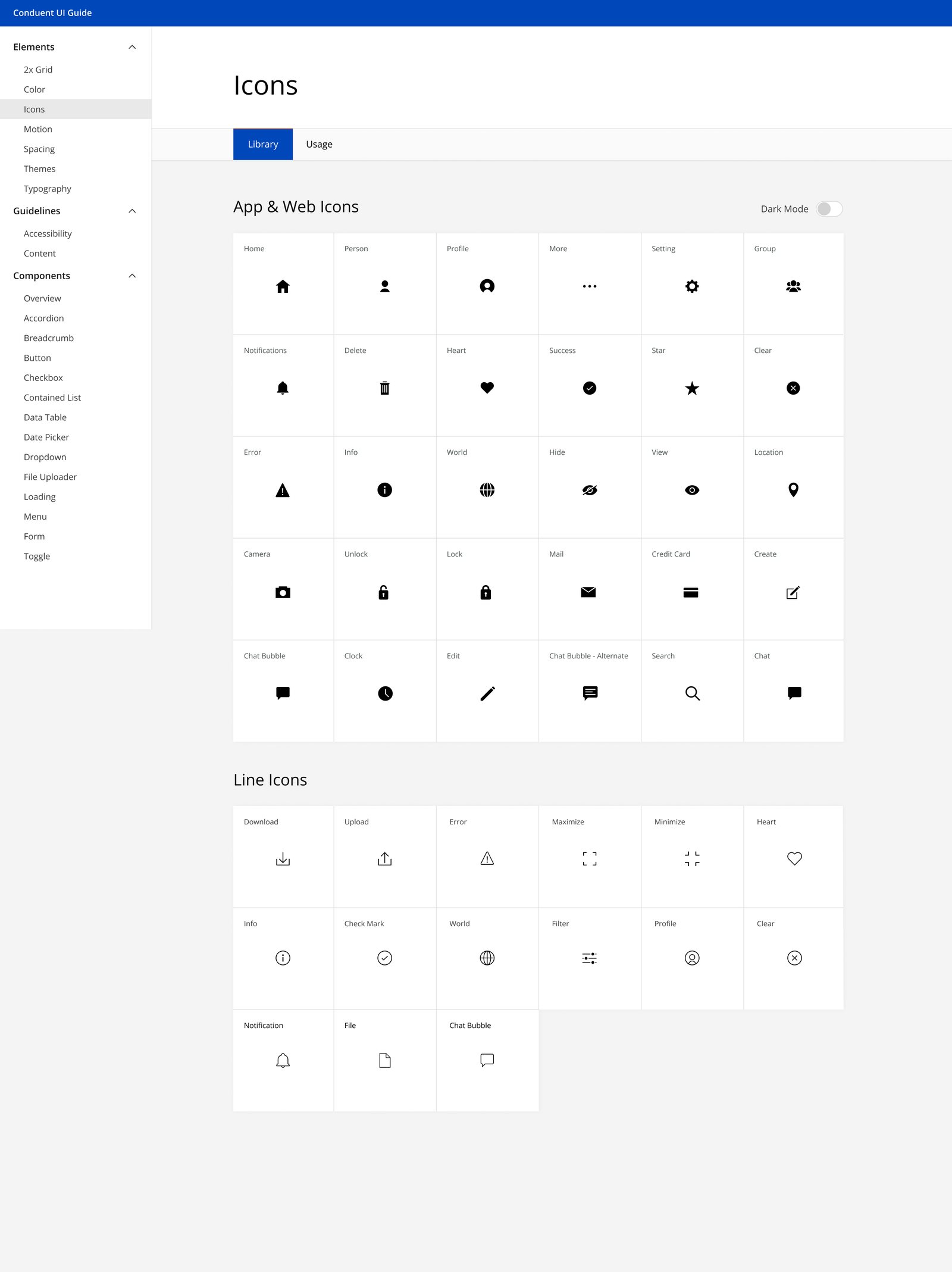
Controlled efficiency comparison: The one-time bank-payment task took roughly 45 seconds in the legacy flow and under 12 seconds in the redesign. I ran three timed walkthroughs per flow with the same account state and test data, starting on clicking Make a Payment and ending when confirmation was fully visible. These were designer walkthroughs, separate from customer usability testing.
Legacy research: 15 customers studied on the legacy experience helped shape the redesign priorities. This is the discovery sample, not the sample size for the follow-up results.
Product context: The app the redesigned experience shipped in has 3M+ downloads. This describes the product's reach, not an outcome attributed to my work.
The redesign made individual payment states clearer. The next opportunity is to make the whole account experience more aware of uncertainty, especially when money moves, systems disagree, or a driver does not know what happens next.