
The dangerous prototype isn’t the one that looks unfinished. It’s the one that looks finished enough to stop asking questions.
The components belong together. The type is right. The flow runs. Nothing on the screen tells you whether its central assumption came from a customer, a business requirement, or the model filling in a gap.
That gap interests me more than the argument about whether designers should use AI. Of course I want a shorter path from an idea to something I can try. But a shorter production cycle can conceal a longer list of things we haven’t established. A screen gains polish while the evidence behind it stays exactly where it was.
We need a way to see those two kinds of progress separately. Otherwise, “almost built” quietly becomes “almost right.”
The fix wasn’t a better adjective
In Owen Williams’s prototyping workflow, generic generation produced “blurple slop”: plausible interfaces that didn’t belong to the actual product. The useful intervention was connecting the model to a working application shell, real components, and rules for using them. One rule is especially revealing: if the component service is unavailable, report the failure instead of inventing substitutes.
That last detail is more consequential than another instruction to make the result polished.
There are two very different ways a generation system can handle missing information. It can expose the absence, giving the team a chance to resolve it. Or it can produce something plausible, allowing everyone to continue without noticing that an assumption has replaced a constraint. The second behavior feels smoother in a demo. The first gives you a more dependable working process.
Print shops had a name for both of these behaviors.
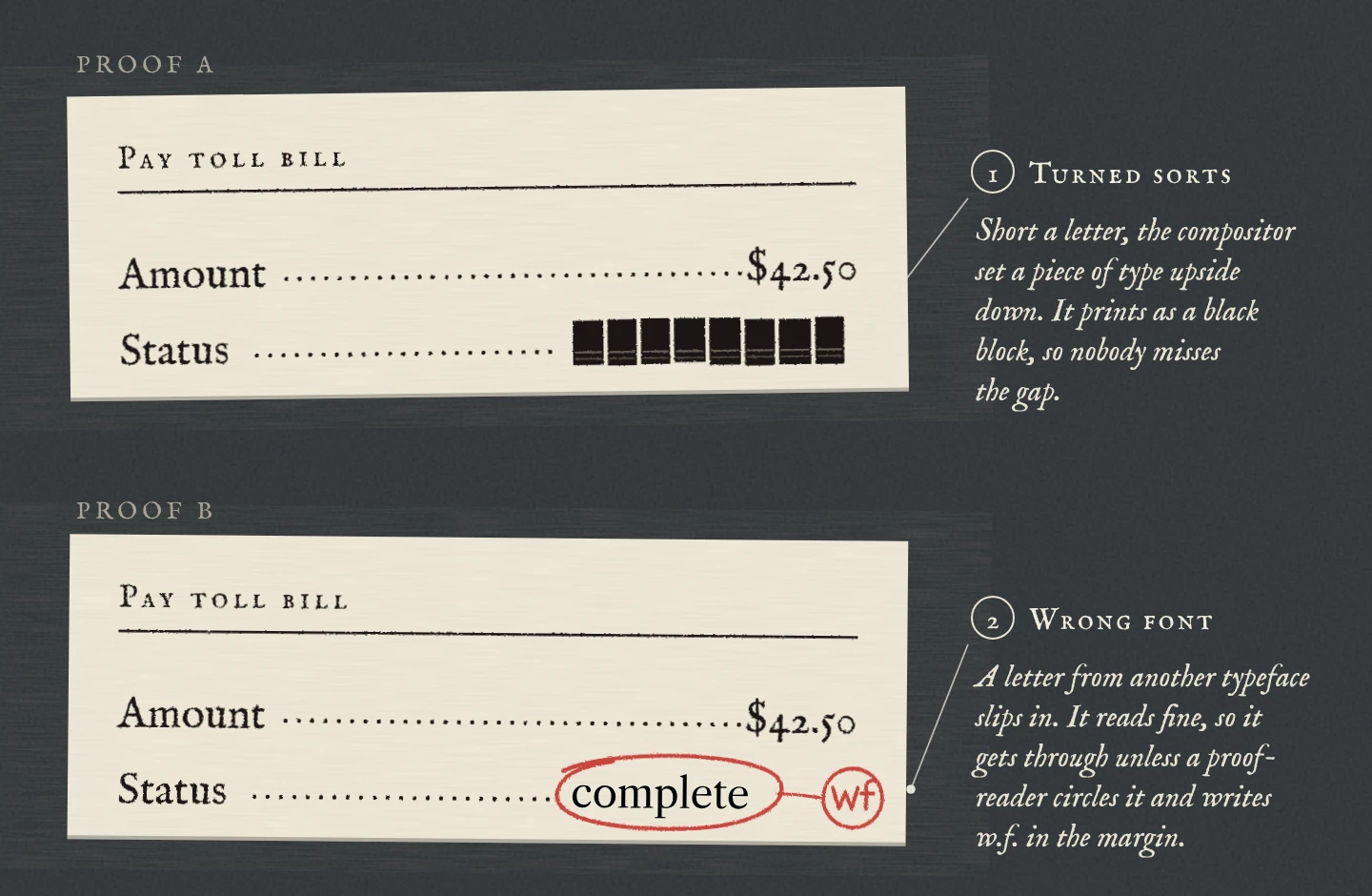
A designer shouldn’t have to recognize every counterfeit component by eye. The workflow should make it difficult to substitute one silently. This changes the job from repeatedly correcting outputs to deciding what the system is allowed to treat as authoritative.
I’d call that an important piece of design work even if it produces no new screen. It determines the character of all the screens that follow.
The implementation guide makes the distinction concrete: use real component imports, not lookalike CSS, and connect the prototype to the application’s routes and data structure. A visual match alone is insufficient.
That is also why “make it look like our product” is a weak specification. Looking similar doesn’t establish that the same keyboard behavior, error states, permissions, or maintenance path exist underneath. Some of those properties need engineering checks. Others need accessibility checks. None can be inferred from matching the brand color.
Better grounding reduces one kind of uncertainty: whether the generated thing belongs to the system we actually maintain. It does not remove the uncertainty about whether we should build that thing.
A consistent mistake is still a mistake
Design systems carry decisions forward. That is their value, and it is also the limit of their authority.
A payment component can consistently show an amount. It cannot, by itself, establish whether that amount answers the question a driver has at that moment. A confirmation pattern can render correctly while leaving someone unsure what was confirmed. Is the payment submitted, processed, or applied to the thing they meant to pay? The vocabulary can be consistent across the product and still fail to match the person’s understanding.
A design system is a very good stamp. It puts the same mark everywhere, whether or not the mark means what the driver thinks it means.
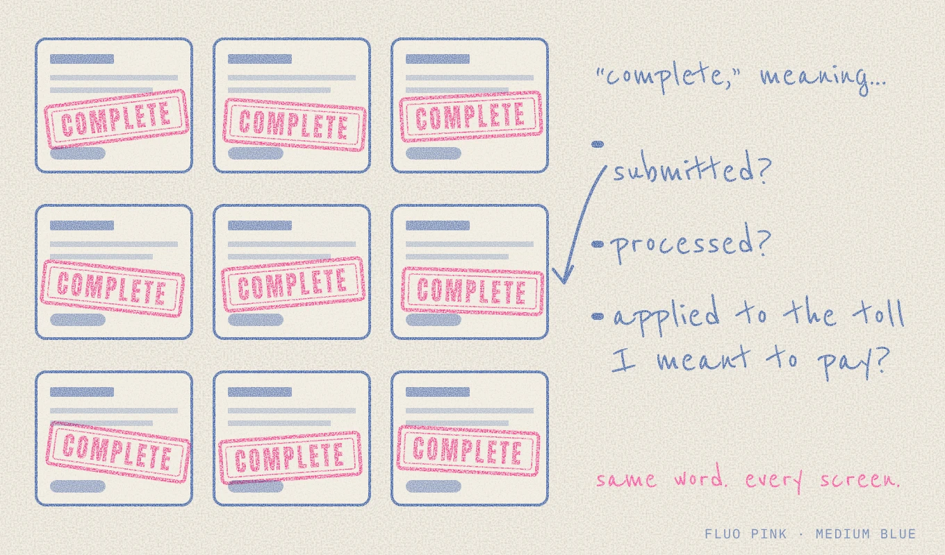
This is where I think the conversation about AI quality gets too visual. We notice an invented component immediately. We are less likely to notice an inherited assumption because it arrives wearing the correct interface.
Consistency makes a product easier to learn when its patterns are useful. It also makes an error easier to repeat when the underlying rule is wrong. Connecting AI to a design system increases the reach of both possibilities. The system needs a way to learn from use, not just a way to distribute its current answers.
That doesn’t mean every generated screen needs a new research project. It means the team should distinguish a well-supported pattern from a convenient default. Reusing an established answer is efficient. Reusing an unanswered question as though it were settled is not.
The payment was complete. Was the task?
My E-ZPass work for New York and New Jersey makes this distinction tangible. The documented problem wasn’t simply that the old screens looked dated. Drivers had to hunt for their balance and payment methods, understand what they were paying, and work out whether the payment had succeeded.
I made the balance and payment options easier to find, clarified what the payment covered, and made successful completion explicit. In the baseline and follow-up usability testing documented in the case study, correct understanding of payment status rose from 62% to 94%. Finding a balance and choosing a payment method without help rose from 68% to 92%.
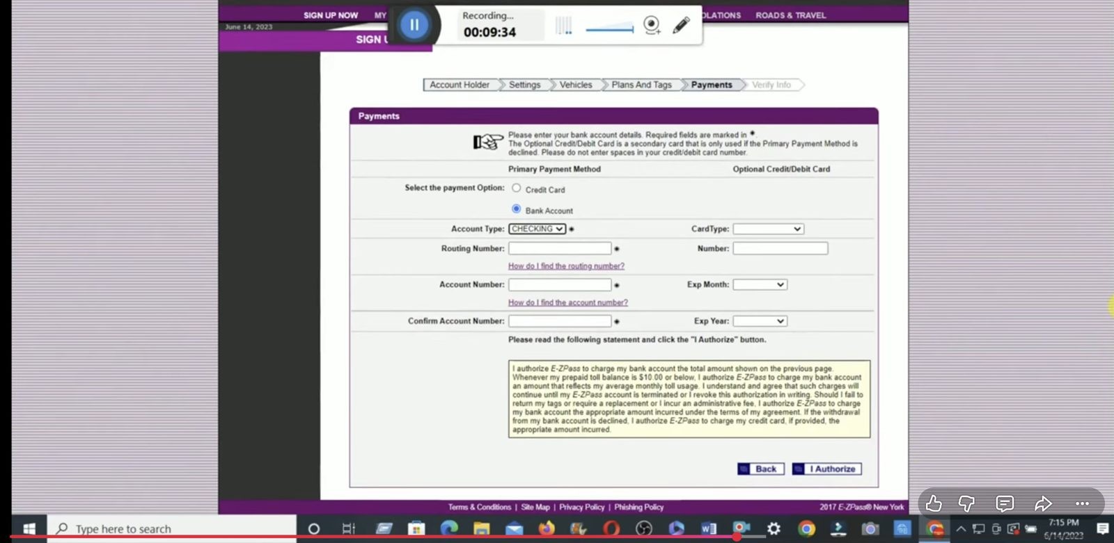
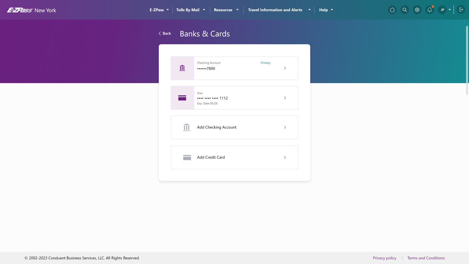
The distinction between those measures matters. Locating a payment method and understanding the outcome are different accomplishments. A task can advance through every screen while leaving the person uncertain about what happened.
From the system’s perspective, completion may be a recorded state. From the driver’s perspective, completion includes knowing enough to leave the flow. The interface is responsible for making the relationship between those two states understandable. A button that works is necessary, but it is not the whole experience.
There is another number in the case study: a one-time bank-payment walkthrough went from roughly 45 seconds to under 12. That was a separate controlled comparison I ran, with three timed walkthroughs per flow using the same account state and test data. It was not the customer usability study.
I want those results kept separate because collapsing them would make the story sound cleaner and mean less. The walkthrough tells us about the path under controlled conditions. The usability results tell us about observed understanding and unaided task performance. Neither should be used as a substitute for the other.
Here’s the headline I could have written, and the version I’ll stand behind.
That is the same discipline I want around generated interfaces. If a model produces a shorter flow, we have evidence that it produced a shorter flow. We don’t yet have evidence that people understand it better. If it identifies confusing copy, it has given us a useful hypothesis. That isn’t the same as observing the effect of changing the copy.
This project was not an AI-versus-human experiment. I can’t honestly claim that a model would have missed the problem. It might have identified several of the same issues. The point is that no screenshot critique (mine or a model’s) could establish those user outcomes on its own.
The missing ingredient isn’t human exceptionalism
Jakob Nielsen separates research into three roles: the participant, the facilitator, and the design being tested. The facilitator can be AI. So can the means of producing the interface. The necessary human is the representative participant. His argument isn’t that an expert has supernatural insight into people; it is that neither a person nor a model can replace observation with perfect prediction.
That is a much stronger position than “humans have empathy, therefore hire a designer.” It puts the burden on the quality of the work rather than the identity of the person doing it.
When I ask a model how a driver might interpret a payment status, it can produce a coherent account. When I ask it to answer as a worried driver, it can produce another. Those answers may be useful for planning a study. They remain outputs of a model, not encounters with the people who need the service.
The distinction is not whether the answer sounds realistic. It is where the answer came from.
A prediction can tell me where to investigate. An observation can contradict the prediction. If both the proposed interface and the supposed customer reaction come from the same assumptions, I have made a loop that is very good at agreeing with itself. Adding more simulated personas doesn’t automatically introduce an independent view.
Draw it out and the problem is easy to see. Every step checks its work against itself.
The uncomfortable part is that a designer can build the same loop without AI. Ask leading questions. Recruit only people who resemble the team. Treat polite agreement as understanding. Explain the interface during a test, then record that the participant completed the task. The study has human beings in it, but the process still protects the original idea.
My responsibility is to make disagreement possible: choose participants for a reason, ask questions that don’t supply the answer, distinguish what someone did from my explanation of it, and identify what would make me change the design. AI can assist with parts of that work. It doesn’t excuse weak methods, and neither does seniority.
Nielsen’s article dates to 2024. I wouldn’t turn its assessment of that generation of AI into a permanent capability boundary. Models can improve at critique, interviewing, and synthesis. The durable distinction is narrower: generating an account of customer behavior is not the same act as collecting evidence of that behavior.
Ninety percent of what?
The roughly 90% estimate in the prototyping discussion describes progress toward a usable prototype in that workflow. It is not a universal benchmark, a measurement of product-market fit, or a claim that only 10% of the important decisions remain.
The percentage sounds more complete than it is because we imagine the work as a straight line. Generate most of the screen. Have a designer finish the rest. Ship.
But some remaining questions don’t fit at the end of that line. If the flow is solving the wrong problem, the next finding may change its structure. If an important policy difference has been flattened, consistency may need to give way to a controlled exception. If the user’s interpretation is wrong, the technically correct sequence may still need to be reconsidered.
That is not the final polish. It can be a reason to go back.
I find it more useful to separate three questions. Does it run? Does it respect the product’s rules? Does it help the intended person accomplish the intended task? Those questions overlap, but passing one doesn’t answer the others. An engineering test, a policy review, and a usability study establish different things.
One number was hiding three questions. Pull it apart and the progress looks different.
This is how the optimistic and skeptical arguments fit together. Faster prototyping gives us more affordable ways to investigate. User research prevents us from treating the affordability of an answer as evidence for its correctness. They aren’t fighting over the same final ten percent.
There is a practical consequence: choose fidelity according to the uncertainty. If the question depends on exact wording, preserve the wording. If it depends on realistic account states, don’t test with an impossibly clean dashboard. If the question is still about the overall concept, a polished interaction may add production time without adding useful evidence.
The best prototype is the one that makes the consequential question answerable. It doesn’t have to be the one that looks closest to launch.
A faster handoff can move the wrong thing faster
The live-review workflow attaches comments to interactive elements, summarizes the feedback, and converts it into implementation tasks. Its guidance also calls for preserving context and resolving conflicting comments before the agent implements them.
This is a real improvement over describing a moving interaction through disconnected screenshots. But it introduces a decision boundary that deserves attention: a comment isn’t automatically an instruction, and an instruction isn’t automatically an approved product decision.
“Make this simpler” could mean fewer choices, less explanatory copy, or a clearer distinction between choices. Those changes can pull in different directions. Turning every comment into a task queue creates activity; it doesn’t resolve the conflict.
Three words of feedback. Three different drawings.
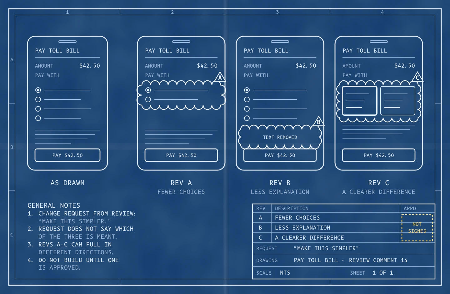
For a payment flow, I would want the reason behind a change to travel with it. Not just “add confirmation,” but what the driver must understand at that point. Not just “keep this text,” but whether it is a legal requirement, a tested explanation, or an interim assumption.
These are different kinds of constraints. A model shouldn’t silently trade away a requirement to satisfy a preference for shorter copy. A reviewer shouldn’t have to rediscover why a piece of information exists every time a fresh variant appears.
This is where research and design systems should meet. Research identifies a consequential distinction. The team translates it into a component, content rule, or review check. Future generation then starts from a better foundation. The study has improved more than one screen; it has changed the conditions under which the next screen will be made.
It is equally important to keep a route back from the rule to the evidence. Otherwise, yesterday’s local finding becomes tomorrow’s universal command. A convention that helped one group with one task may not apply unchanged everywhere.
Give uncertainty a place to live
On Monday morning, I would begin with one consequential flow, not a campaign to put AI into every part of the process.
Write down what the user needs to understand or accomplish. Then separate the things the team knows from the things it is assuming. Name the source for each constraint. Is it a system state, an agency requirement, an observed behavior, or someone’s best guess?
This is the whole tool. One page per flow, kept next to the prototype.
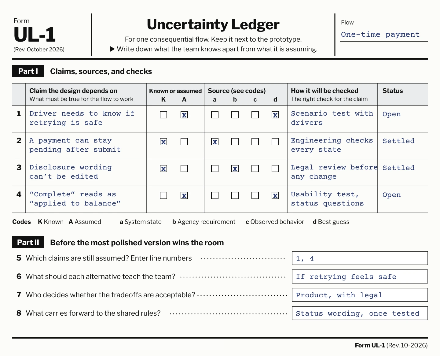
Give the model the real components and rules. Make missing context visible. Let it generate alternatives that differ in a meaningful way, not just rearrangements of the same untested premise. Agree on what each alternative is meant to teach before the most polished one wins the room.
Use the right check for the claim. Engineering can verify that the implementation handles the required states. Representative users can reveal how the experience is understood. The team still needs to decide whether the resulting tradeoffs are acceptable. None of those responsibilities should disappear behind a single green checkmark.
Finally, carry the result forward. Record what changed, what supported the change, and what remains unresolved. Improve the shared rules when the evidence warrants it. The next generation should inherit what was learned, not merely the latest screenshot.
I don’t think the designer’s future is guarding the last bit of manual production. It is making the relationship between intent, implementation, and evidence harder to lose.
The goal isn’t to make every uncertainty disappear before we build. It is to stop a finished-looking interface from making the uncertainty disappear from view.