Freelancer finances, made clearer.
I led a five-person design team on invoices, the dashboard and onboarding for a back-office app used by freelancers and small businesses.
- Role
- Lead product designer
- Team
- Led four other designers; worked with the CEO and Orchid B’s developers
- Timeline
- Oct 2022 to June 2023: two phases of 16 and 12 weeks, with a break between them
- Product
- Back-office web app for freelancers and small businesses. Shipped.
How these were measured
Two rounds of usability testing, five participants in each, 10 in total. Satisfaction comes from participants’ survey ratings.
Lead designer on a team of five.
- 1 Sign-in flowsDesigned the sign-in and forgot-password flows for the first prototype.
- 2 Affinity mappingRan the affinity mapping that pulled the test feedback into four themes, then ranked the issues by severity.
- 3 Master reportWrote the master report the team and later stakeholders used.
- 4 Invoices and dashboardOwned the invoices tab and the dashboard. Added the onboarding progress bar after testing showed people couldn’t tell how long setup would take.
- 5 Style guideBuilt out the style guide and component library: spacing, type, icons and button states.
- 6 Team supportHelped teammates on their UI iterations, and we finished ahead of schedule.
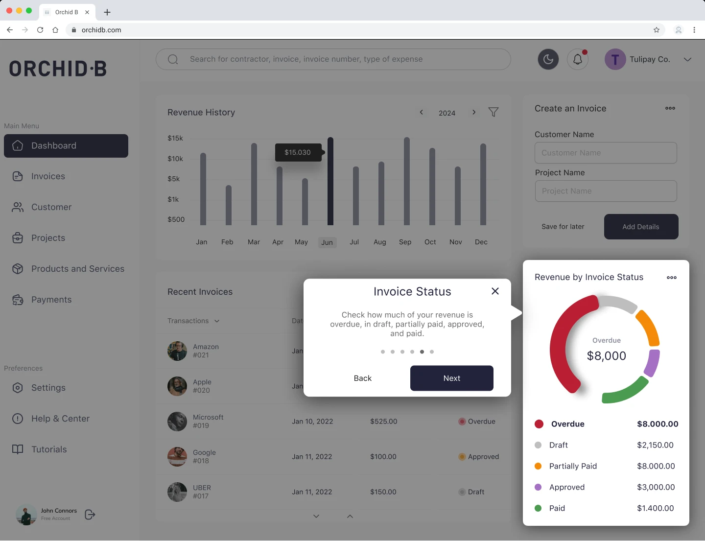
The first prototype worked, but it didn’t feel easy to use.
- People struggled to find invoice details and mixed up the invoice tab with recent suggestions.
- In onboarding, they couldn’t tell how long setup would take.
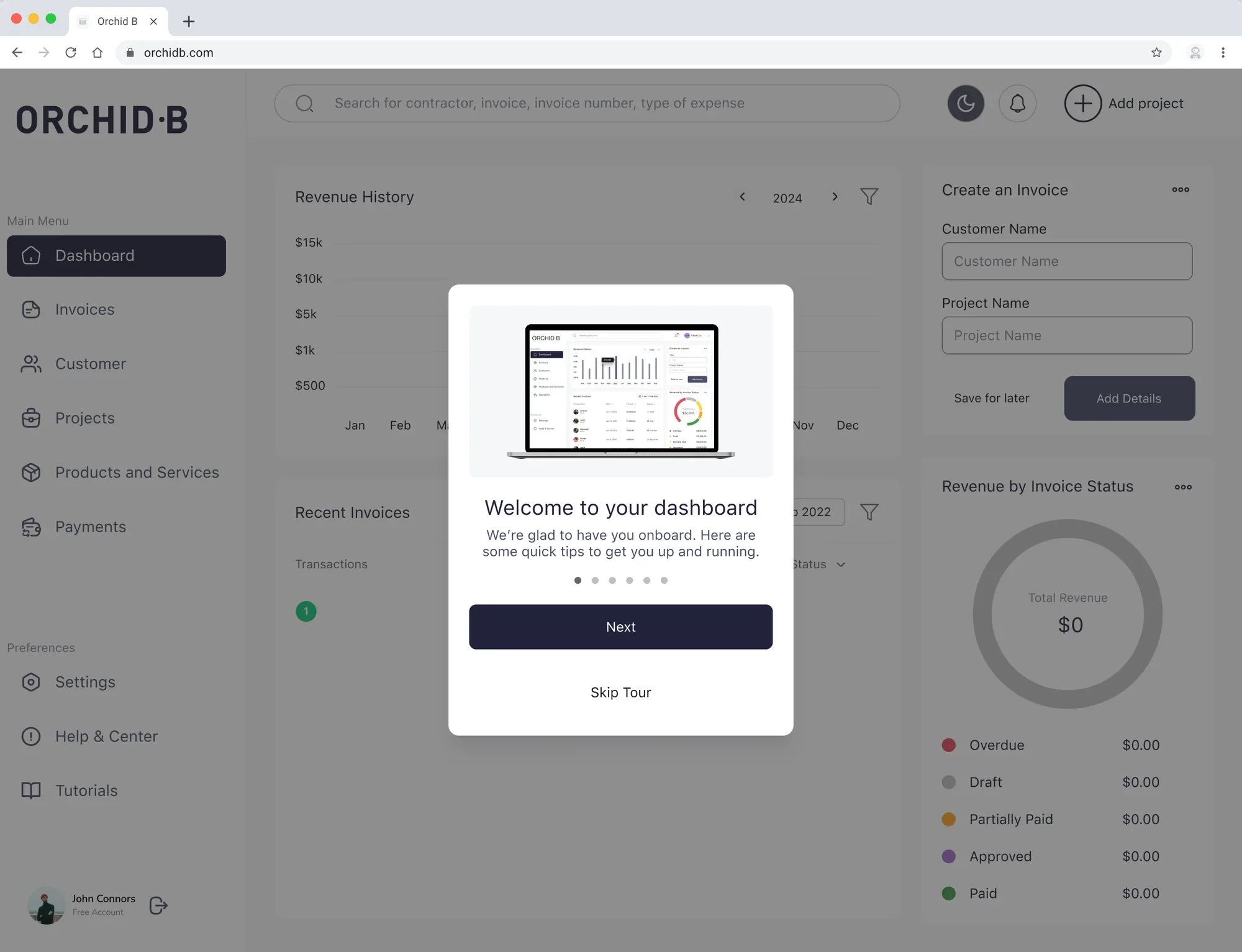
- The product tour got in the way, and people disagreed on whether it was useful.
“We just want a tree that stands up and has the star at the top.”
The CEO described the product as a Christmas tree with too many ornaments. Every change had to make it simpler, not busier.
Claudio Romano, CEO and founder of Orchid B
What we had to work inside.
Two fixed phases
16 weeks, then 12, with a break between them, from October 2022 to June 2023.
A working first prototype
Our first prototype already worked. The job was making it easier to use, not starting over.
A scope set at kickoff
One fix went past it: moving the tutorial into the side navigation. Some colleagues questioned that.
Four fixes, each from something we saw in testing.
-
- Saw
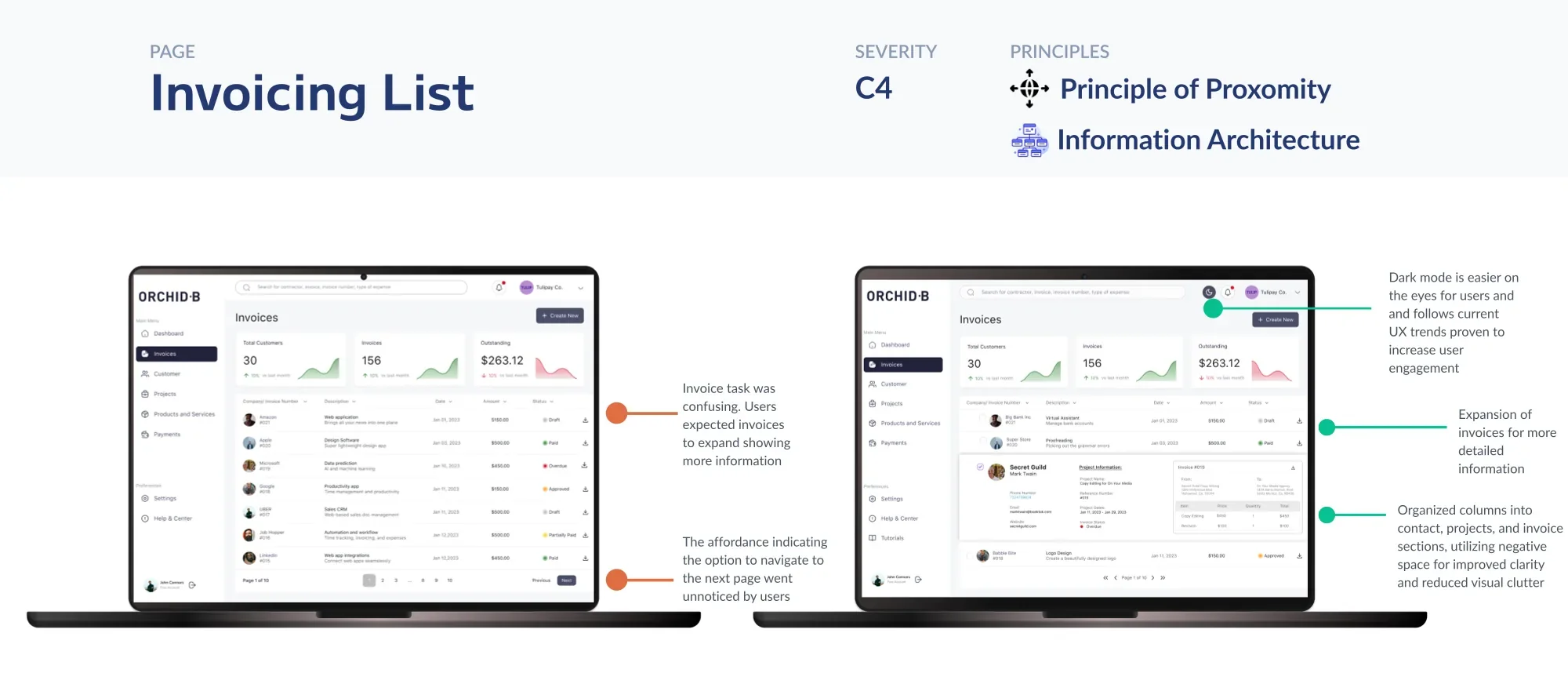
- People struggled to find invoice details, missed information, and confused the invoice tab with recent suggestions.
- Call
- An expandable invoice card, so details open in place without losing your spot in the list.
- Result
- Invoice satisfaction rose from 80% to 92.5%, and the invoice task got 30 seconds faster on average in the retest.
-
- Saw
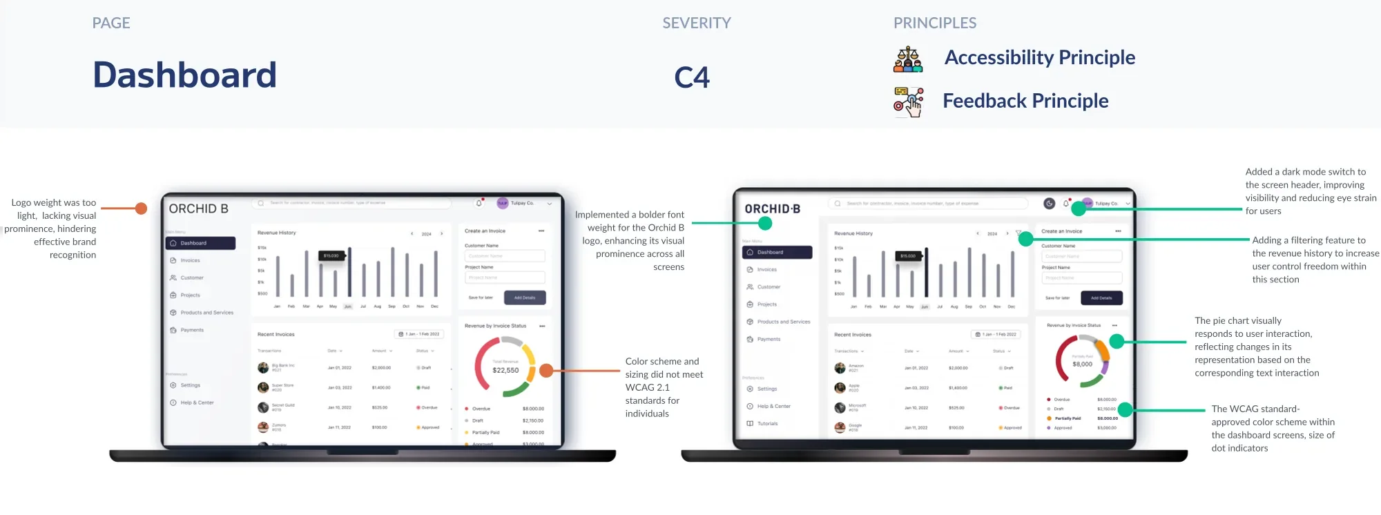
- People understood the revenue chart. The room to improve was letting them dig into individual categories.
- Call
- Change how the chart works, so the segment you pick expands and the overall breakdown stays visible.
- Result
- Everyone understood the chart in both rounds, and developers reused the design in the Orchid B mobile app.
-
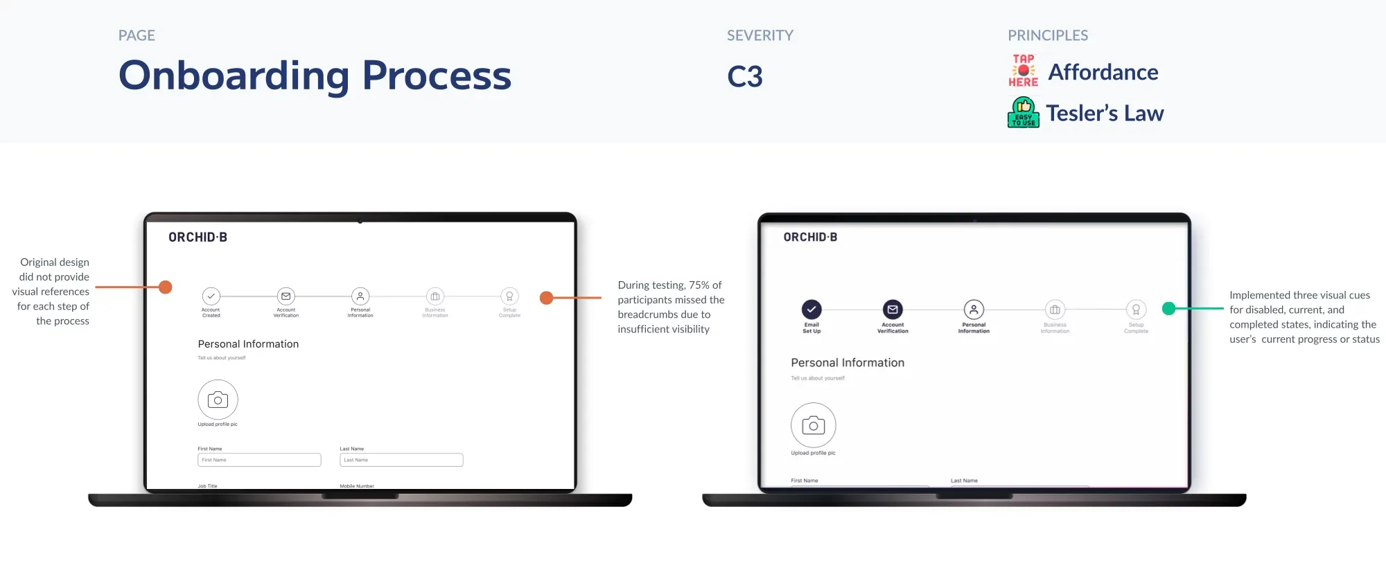
- Saw
- People were unsure how long setup would take and went back to the personal information screen to find the next step.
- Call
- A three-stage progress indicator at the top of onboarding.
- Result
- Onboarding completion went from 80% in the first round to 100% in the retest.
-
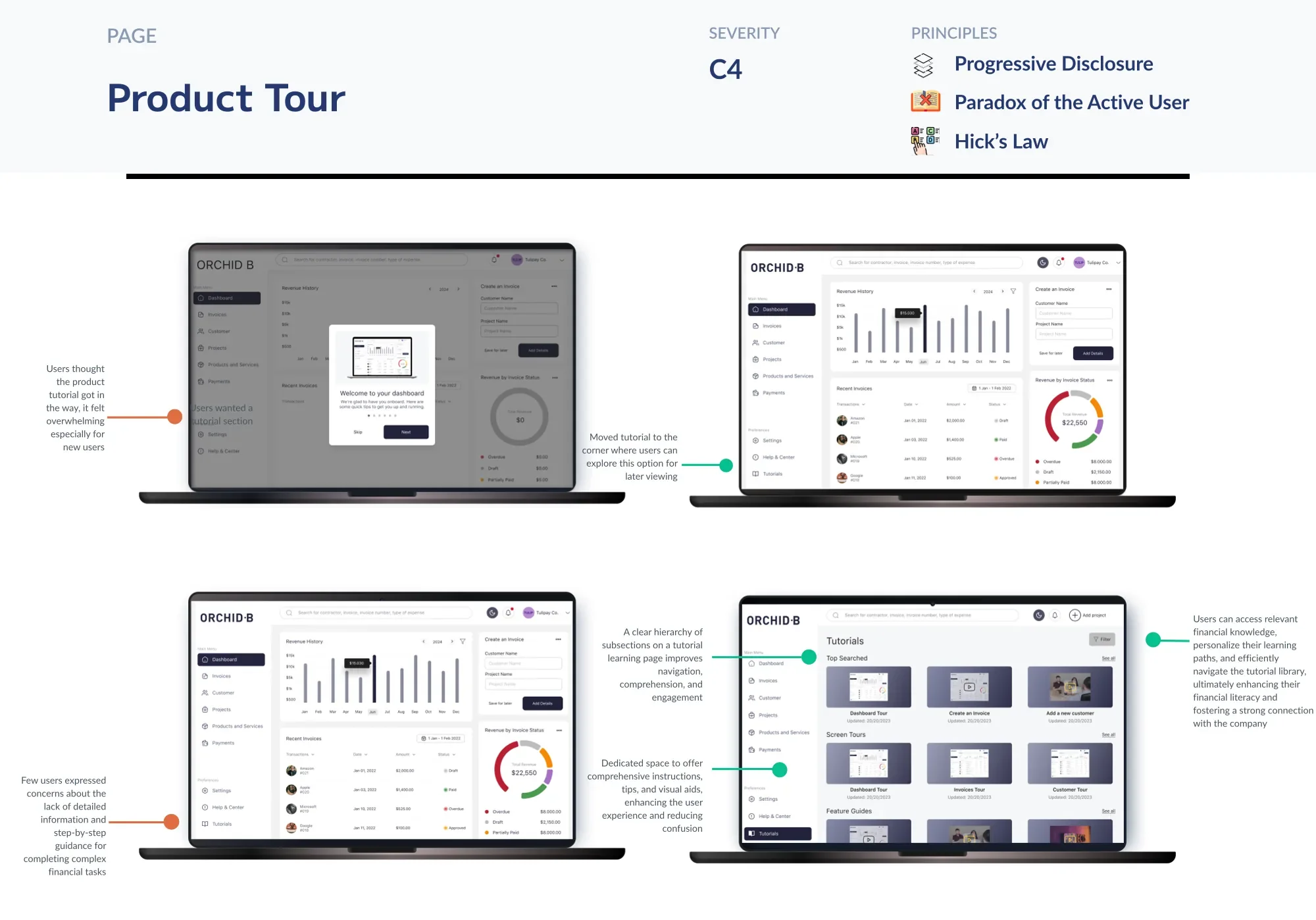
- Saw
- People struggled with the tour and differed on whether it was useful.
- Call
- Move the tutorial into the side navigation, so people can skip it and come back later.
- Cost
- It went past the original scope, and some colleagues questioned it.
- Result
- One participant skipped the tutorial, then came back to it through the side navigation after logging in.
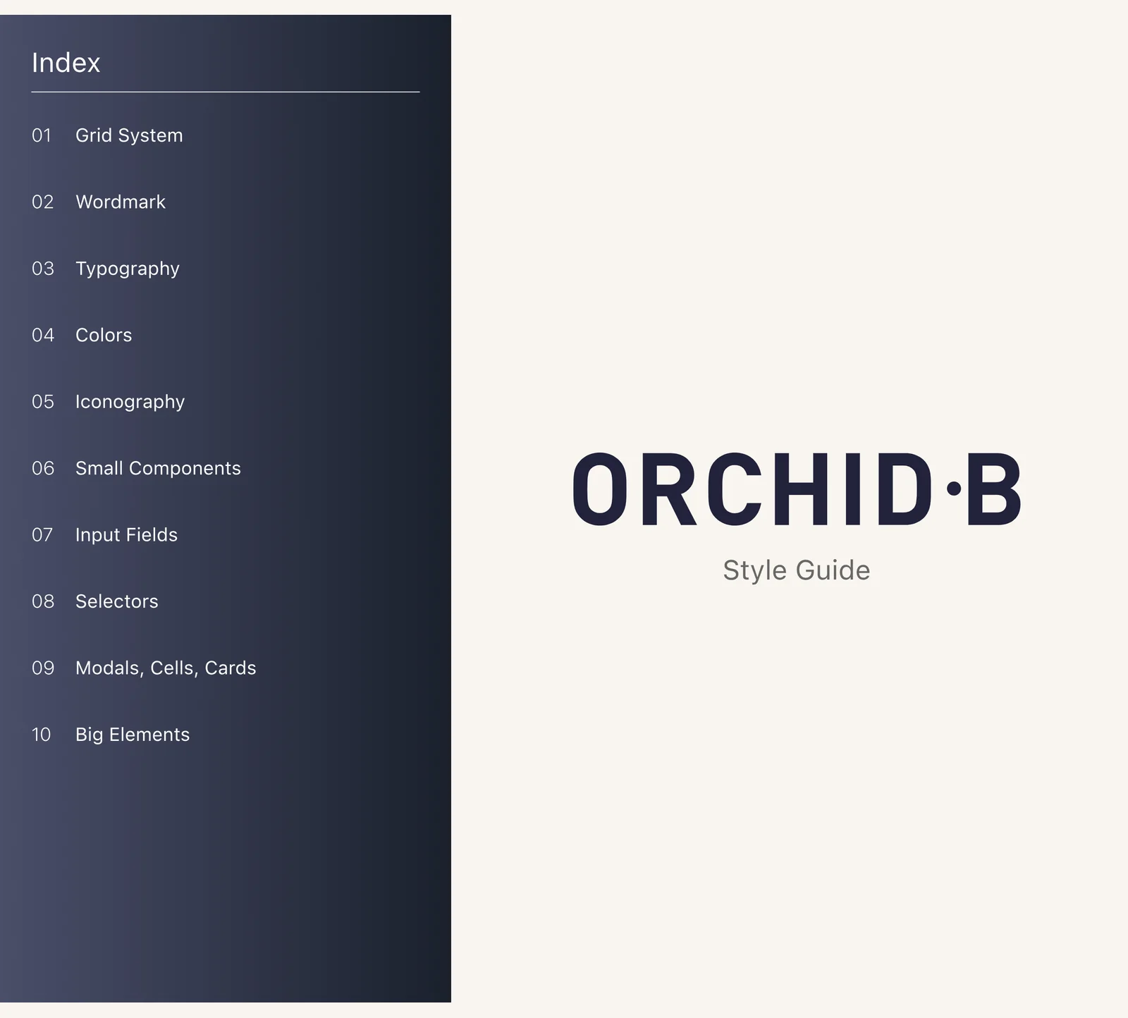
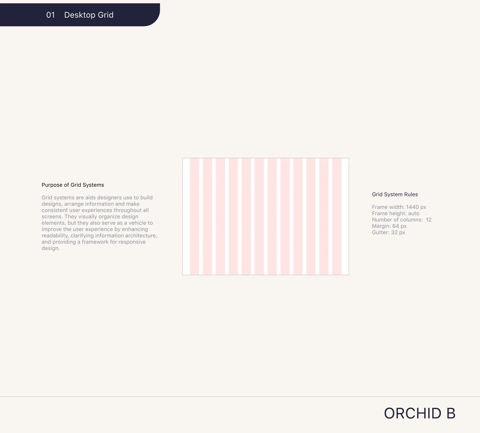
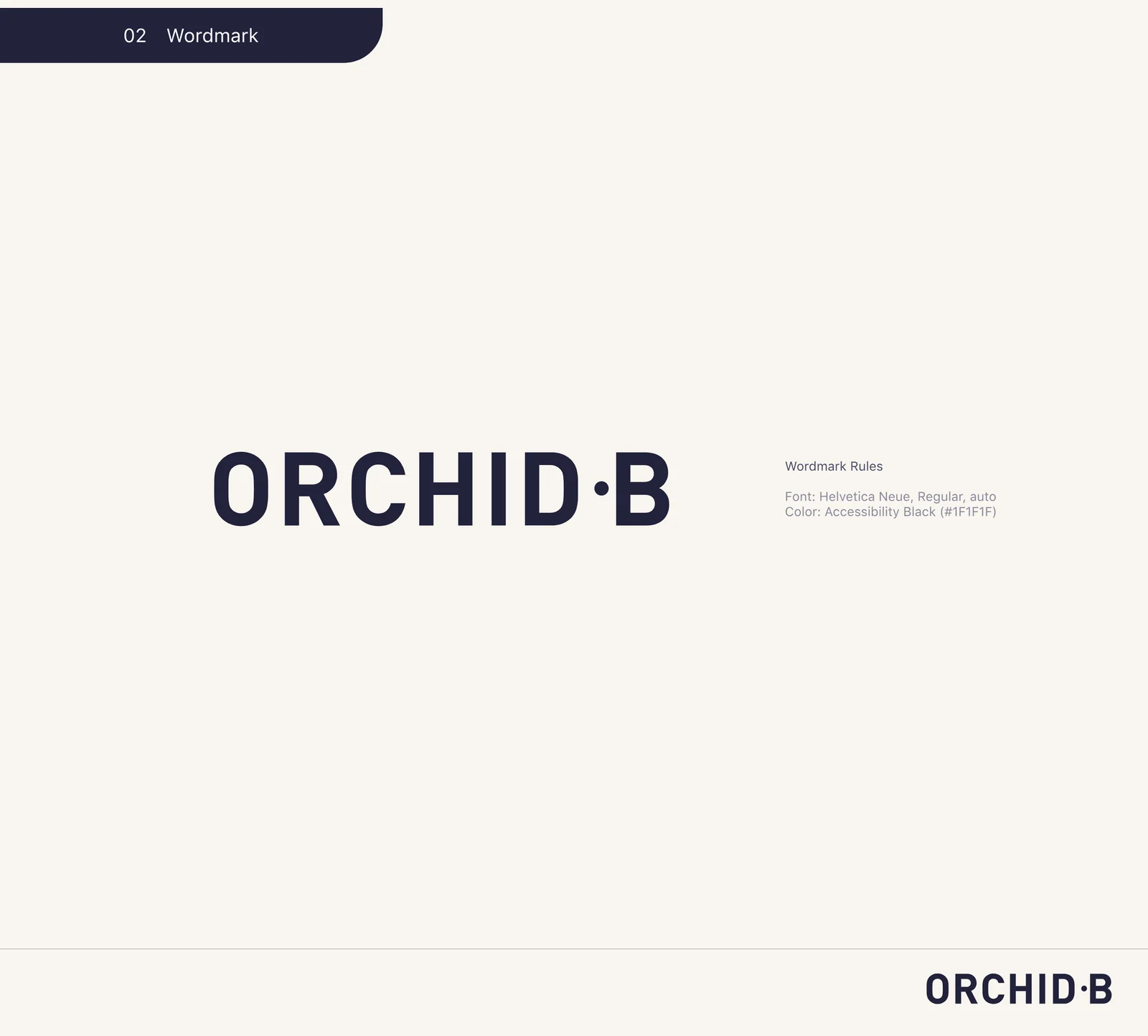
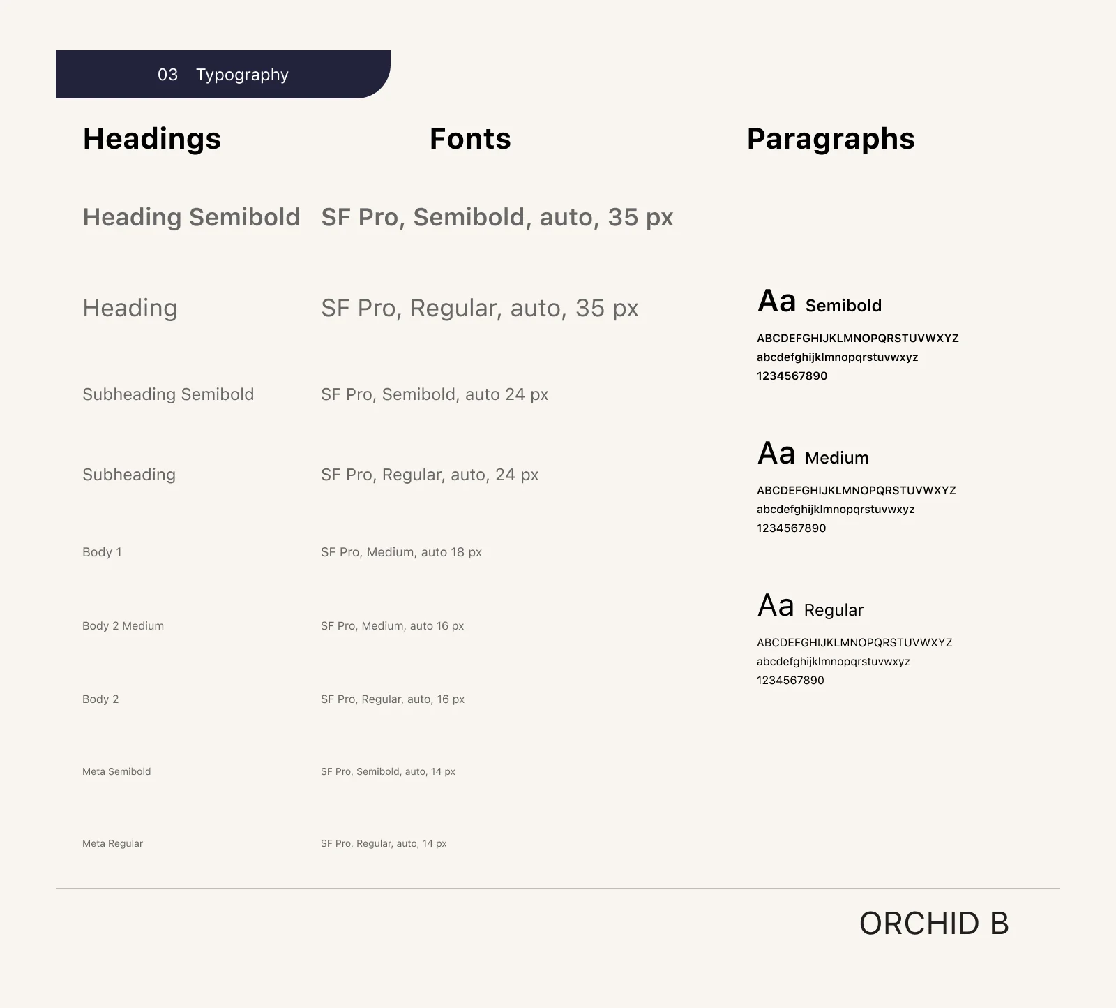
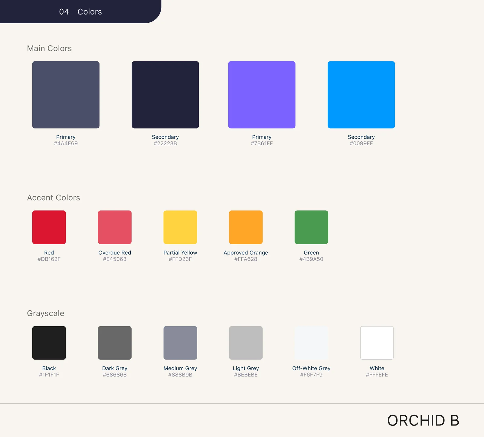
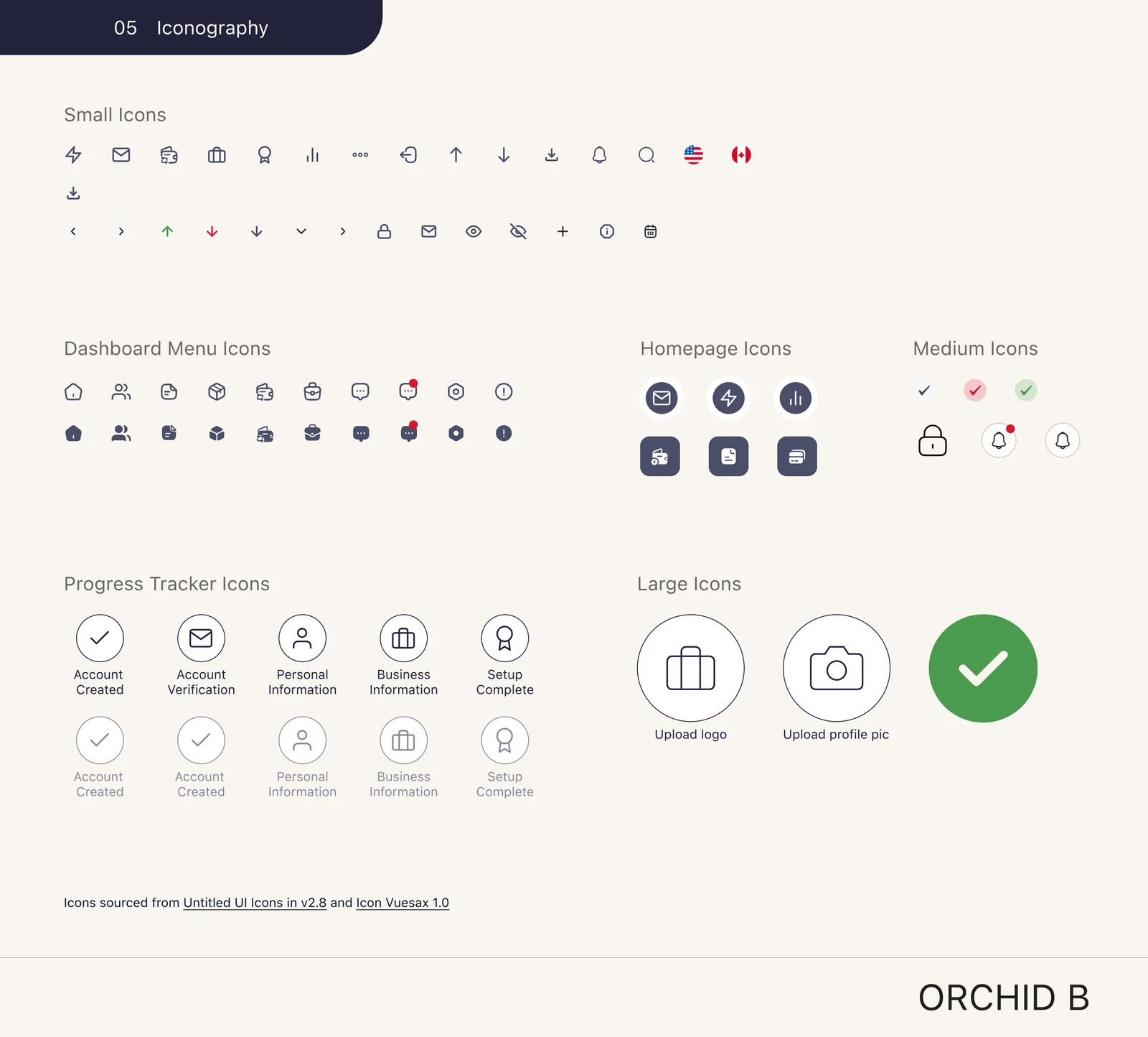
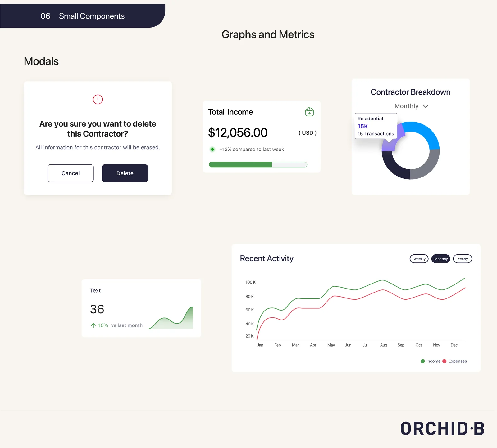
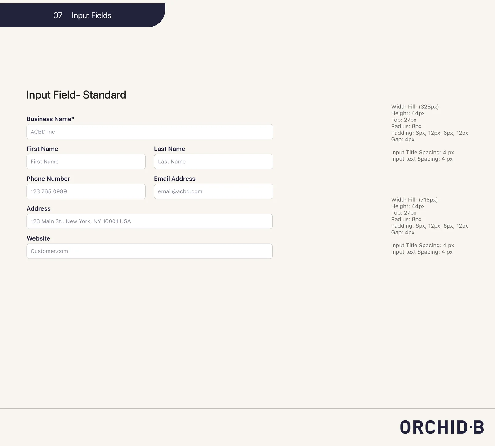
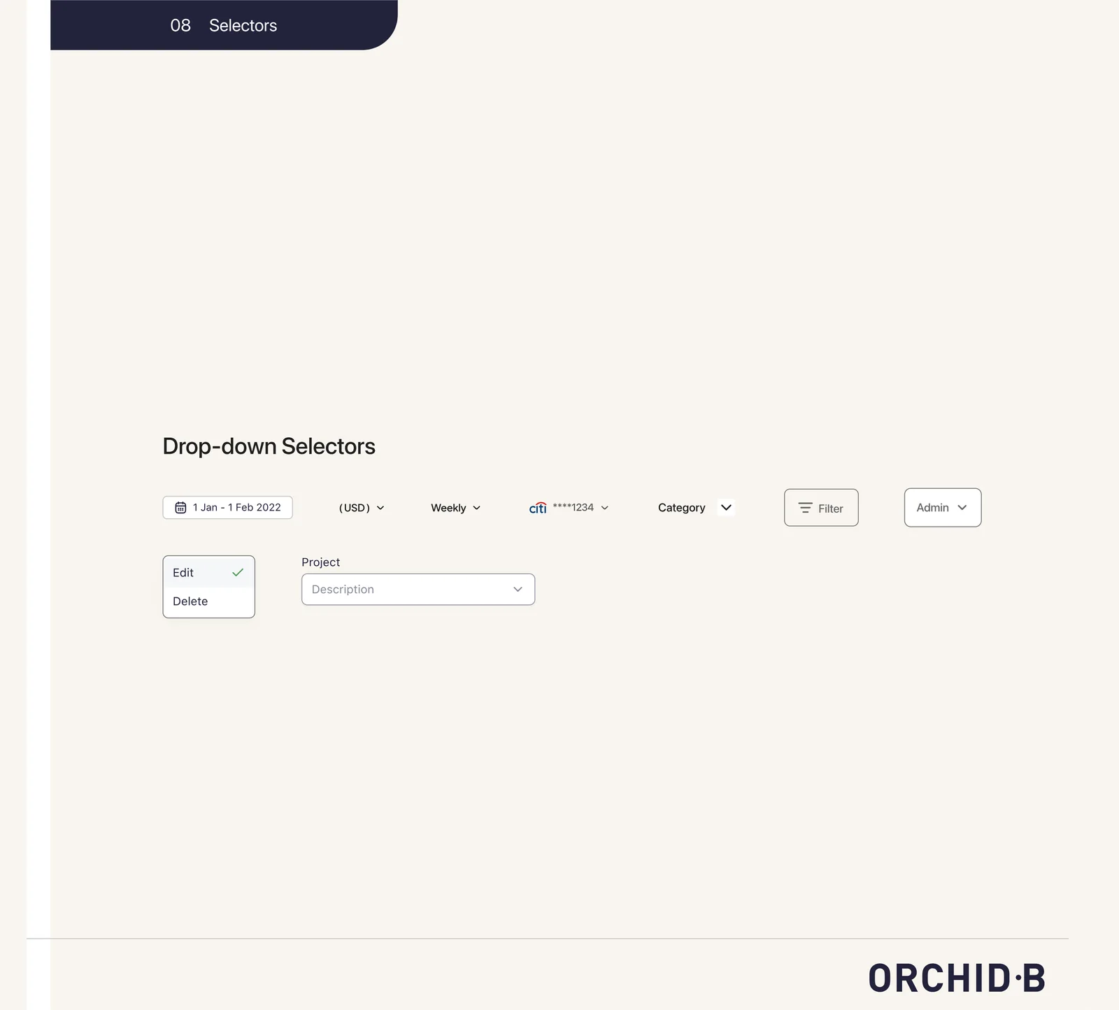
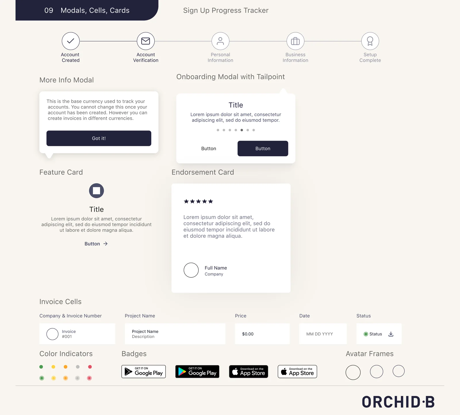
The style guide I built out.
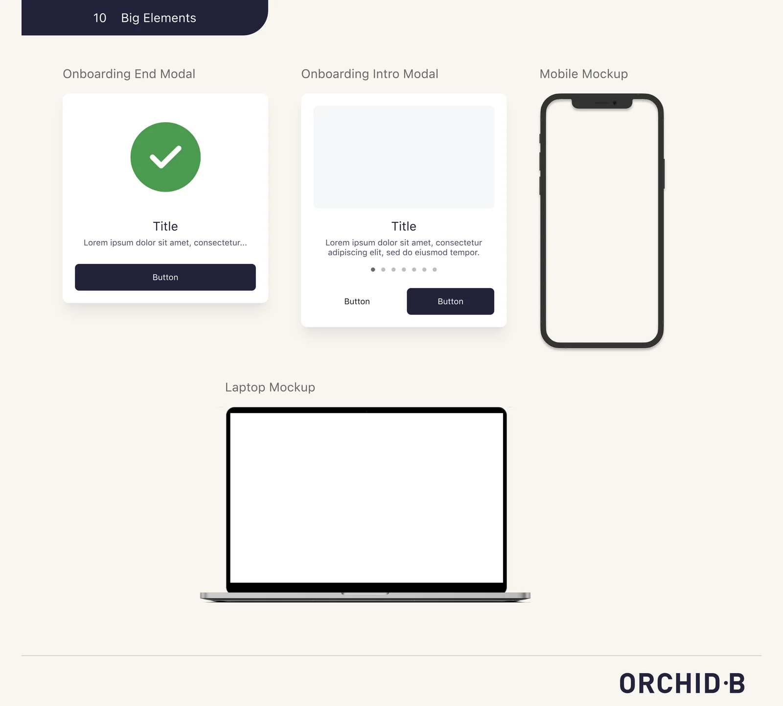
I built the style guide and component library so the whole team designed with the same spacing, type, icons and button states. Ten sections, from the grid to the onboarding pieces.
From people I worked with.

“His ability to turn research questions into actionable results is nothing short of inspiring.”

“He had a knack for making complex concepts easy to understand and was always able to communicate our design decisions in a clear and concise manner.”

“Thank you so much for the excellent work turned around in such short time.”
Bring up the tradeoffs earlier.
What I’d change
Raise tradeoffs earlier. Moving the tutorial into the side navigation went past the original scope. Next time I’d bring three things up front: what we saw in testing, the smallest fix, and what it costs to build.
What I’d do next
Watch the optional tour now that it has shipped: how many skip it, how many come back, and whether people who skip it still finish setup.