The fix that changed nothing
It treats what people see, not what’s wrong.
Pay buttonMoved and made more visibleNothing really changed
People could already find Pay. The problem came after it.
Instrumentals I produced. My first album, Survivor's Liberation, is on all streaming platforms.
Mine: the design and the Apollo design system. Not mine: the build, the follow-up test round and the support data.
Error recovery: in prototype testing of the validation, confirmation and error-recovery flows, recovery without help rose from 58% to 92% and median recovery time fell from 92 to 54 seconds. Percentages above: baseline and follow-up usability testing; another group ran the follow-up round. The 7 of 15 in What I found comes from a separate study of 15 customers, so it isn’t the same measure as the 62% baseline. Support contacts: post-launch data shared by the E-ZPass program team. The 45 seconds to under 12 comes from my own timed walkthroughs (same task, same account, three runs per flow), not customer testing. Tolls NY, the app this shipped in, has 3M+ downloads; that is the product’s reach, not a result of my work.
The short version
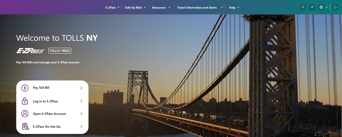
On E-ZPass, that moment came right after Pay: did it go through, and is it safe to pay again? Every chapter designs for it: payment status, guided billing, which shipped, and two AI assistant concepts that didn’t ship.
The rule behind every screen: data that isn’t confirmed must never look like a fact. See it in three states
E-ZPass isn’t optional for most Northeast drivers, so when it’s confusing, they’re stuck.
Paying wasn’t the hard part.
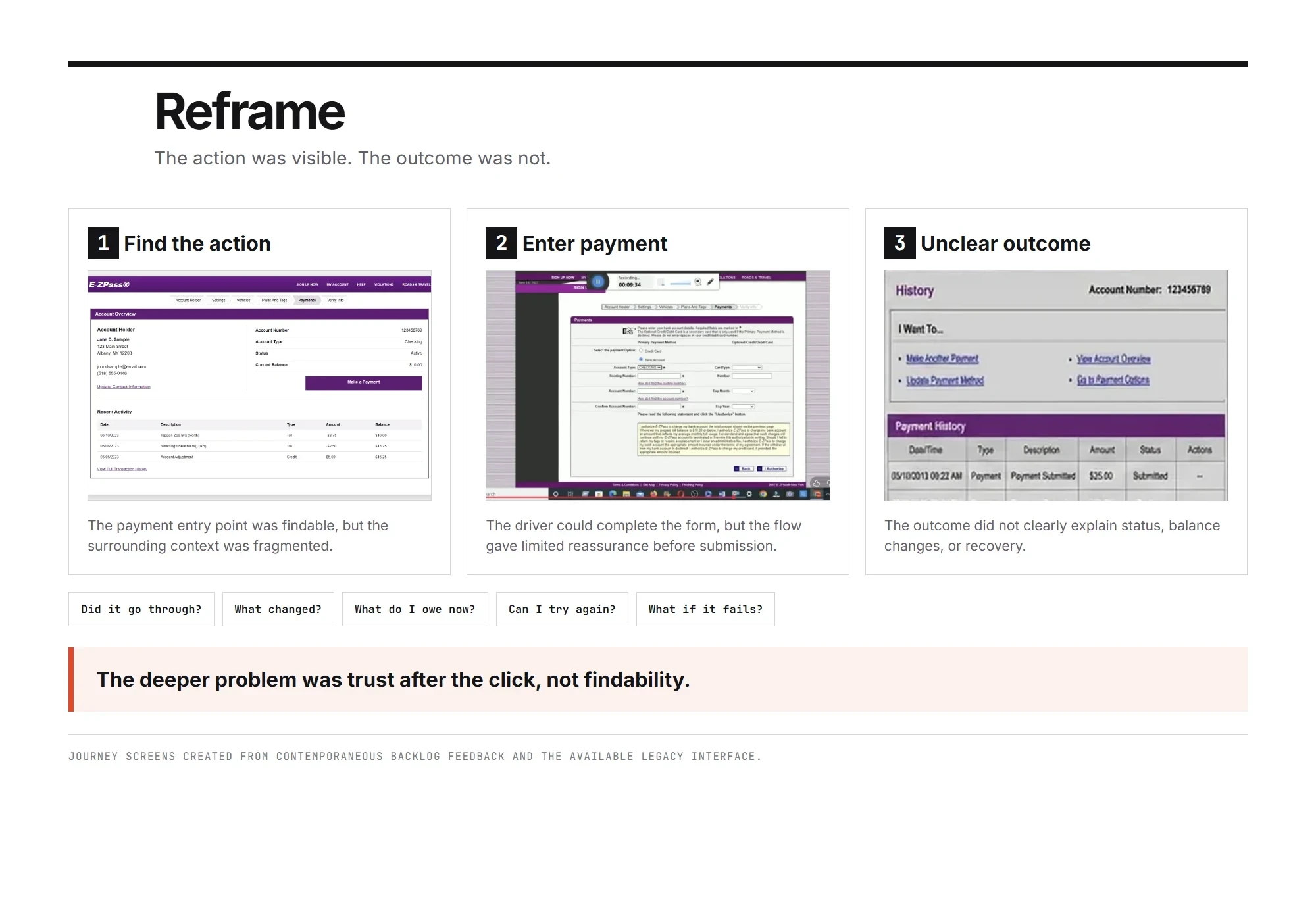
People could find Pay. They couldn’t tell what happened after they pressed it, so the redesign centers on what people see after they pay.
7 of 15 customers we studied on the legacy site couldn’t tell if their payment went through.
Before I design anything, I check that I'm solving the right problem. I put what people say next to where they actually drop off, then trace it back to where the breakdown starts. On E-ZPass, three different sources pointed at the same moment.
About 4 in 10 billing tickets were about payment status
The strange number isn't a drop. It's people coming back to check.
Where all three sources point
The problem wasn’t finding the Pay button. It was not knowing what happened next. Research said the same: 7 of the 15 customers we studied on the legacy site couldn’t tell if their payment went through.
You're fixing a symptom when the friction just moves somewhere else in the journey. These are the red flags I watch for, with the E-ZPass version of each.
It treats what people see, not what’s wrong.
People could already find Pay. The problem came after it.
People patch a broken workflow themselves.
Add a ‘paid’ filter to my transactions.
They were building their own status check.
New gets attention, then fades.
Satisfaction jumped, then the calls came back.
Keep asking why until the answer is something the system does, not something the user does.
Drivers pay the same toll bill twice.
They don’t think the first payment worked.
The balance doesn’t change after they pay.
Bank payments take days to post, but the screen just showed the payment history.
The system has several payment states. The interface squeezed them into one, so people filled the gap with a guess.
Where people notice a problem is rarely where it starts. I walk the journey backward until I find the screen that set the wrong expectation.
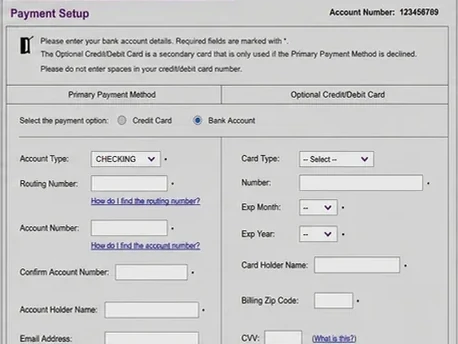
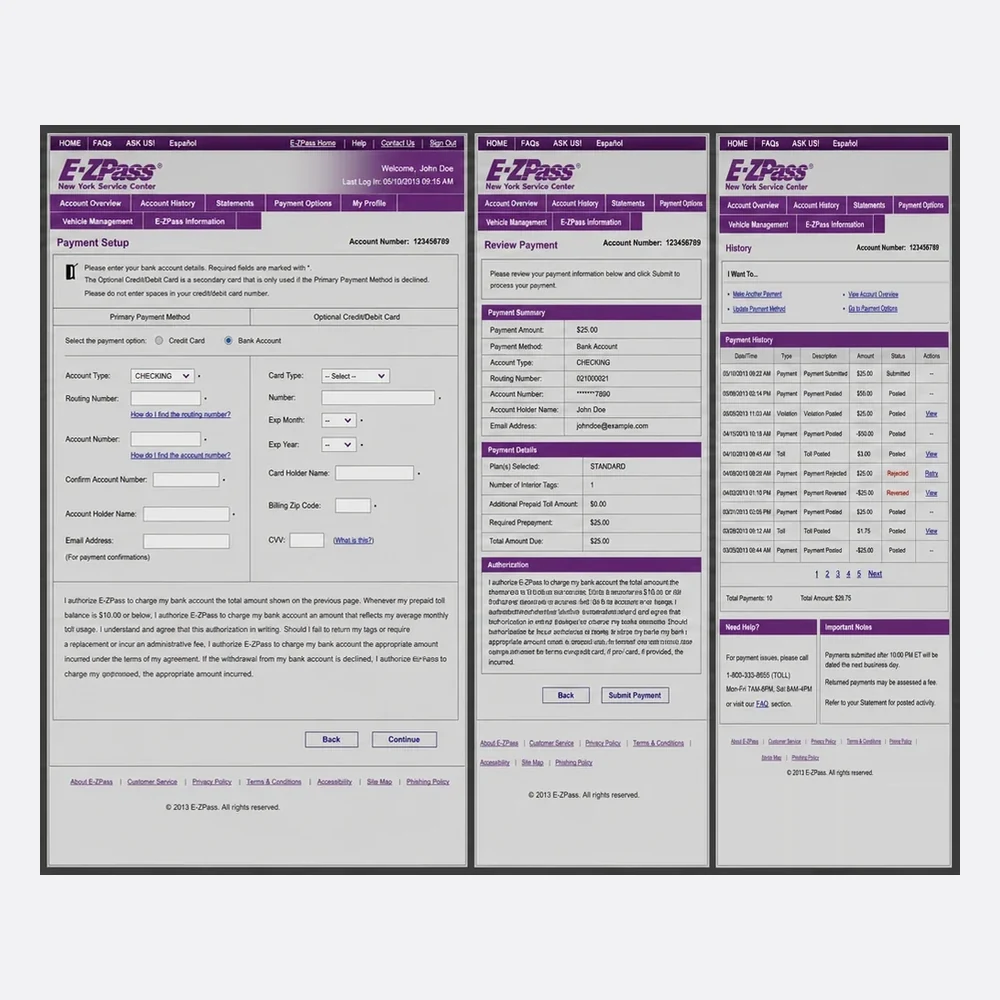
Entering a payment works. No issue here.
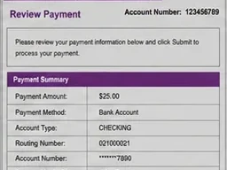
Fine on its own. People submit it.
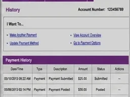
Lists past payments and stops. No timing, no next step.
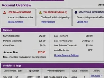
The balance still shows the amount due. This is where the calls come from.
The fix belongs on screen C, not screen D. That's why payment status became the center of the redesign.
Every step fed the next one. Each step links to the chapter that shows it.
Hands offOne problem, with success metrics
Audit the inputsTickets, analytics and stakeholder goals in one place, to find the single highest-impact problem.
Set guardrailsSuccess metrics up front, so the scope can’t creep.
See it: Finding the problem, Prioritizing
Hands offOne tested direction engineering can build
Start with engineeringSketch rough flows with the tech lead and check feasibility on the spot.
Prototype and testClickable prototypes with slow and unsure data built in, then tests with real users, run in Maze with people recruited through Respondent.
See it: Exploring options, Tradeoffs, Working with engineering, Guided billing
Hands offA release built from Apollo
Use the systemBuild with Apollo components and its shared values, so no time goes to redrawing layouts.
Define version 1Release when the core flow unblocks people without adding risk.
See it: Ready for build, Design system, Handoff, Design QA
Track and adaptWatch drop-off and support contacts against the goals set up front.
Pick the next problemWhatever is still left over goes back to step 1.
See it: After launch
Hands off
Live data picks the next problem · back to step 1, every release
One long form on a phone.
The legacy site split paying across several screens. The agency asked for one page. On a phone it was too long, so each screen got one decision: pick the bill, pay, done.

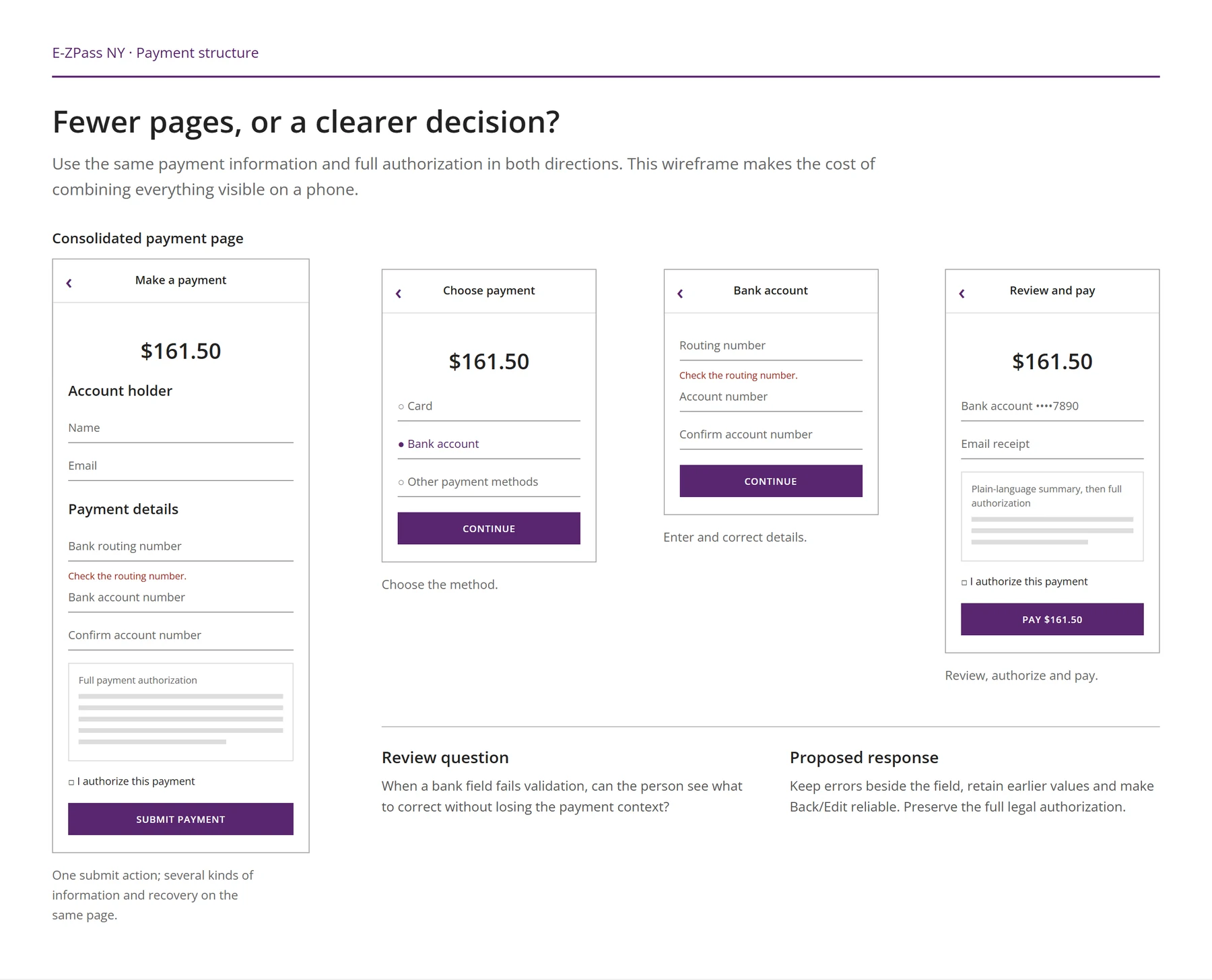
I sketch several directions that change how the interaction works, not just how it looks. Engineering helps cut the ones we can't support, and only the top two become prototypes.
Everything on one scroll, as the agency first asked.
Related fields grouped into a few steps.
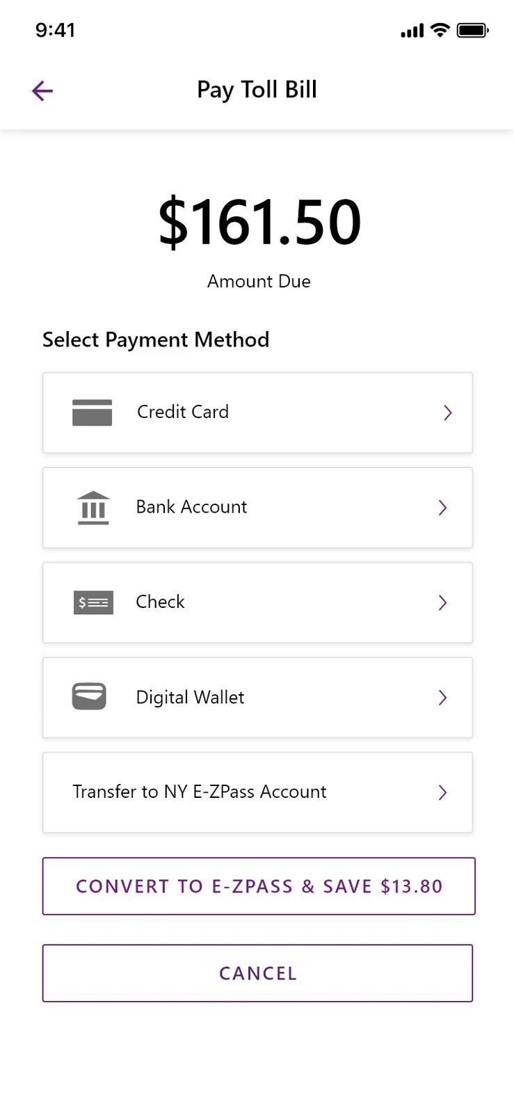
Pick the bill, pay, done.
One page, sections open one at a time.
I put the same uncertain state into both prototypes: the bank hasn't confirmed the payment yet. Then I watched which layout held up.
Degrades badly.The uncertain state is one small word in a summary table. People read it as paid.
Degrades gracefully.The uncertain state gets its own screen, with what it means and what to do next.
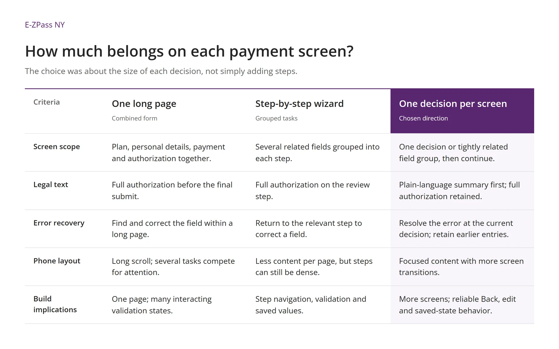
When two directions both work, I stop asking which one looks better. I score them on four criteria, and each one has a rule for who wins.
| Criteria | Step-by-step wizard | One decision per screen |
|---|---|---|
| Build costFewer changes to existing data pipelines wins | Reuses the existing step component. About 3 sprints. | More screens, same components. About 4 sprints. |
| Failure resilienceDegrades more gracefully under slow or unsure data wins | Uncertain status buried in a review table. | Every state gets its own screen and next step. |
| Cognitive loadFaster with fewer errors wins | 34s median, 3 of 8 testers misread the status. | 19s median, 0 of 8 misread the status. |
| Roadmap fitSets up future features wins | Steps are fixed. New payment states don't fit. | Room for submitted, processing, posted, returned and more. |
| Result | 1 of 4 | 3 of 4. Chosen. |
People arrive for different jobs: account holders want their balance, bill payers want to pay a notice.
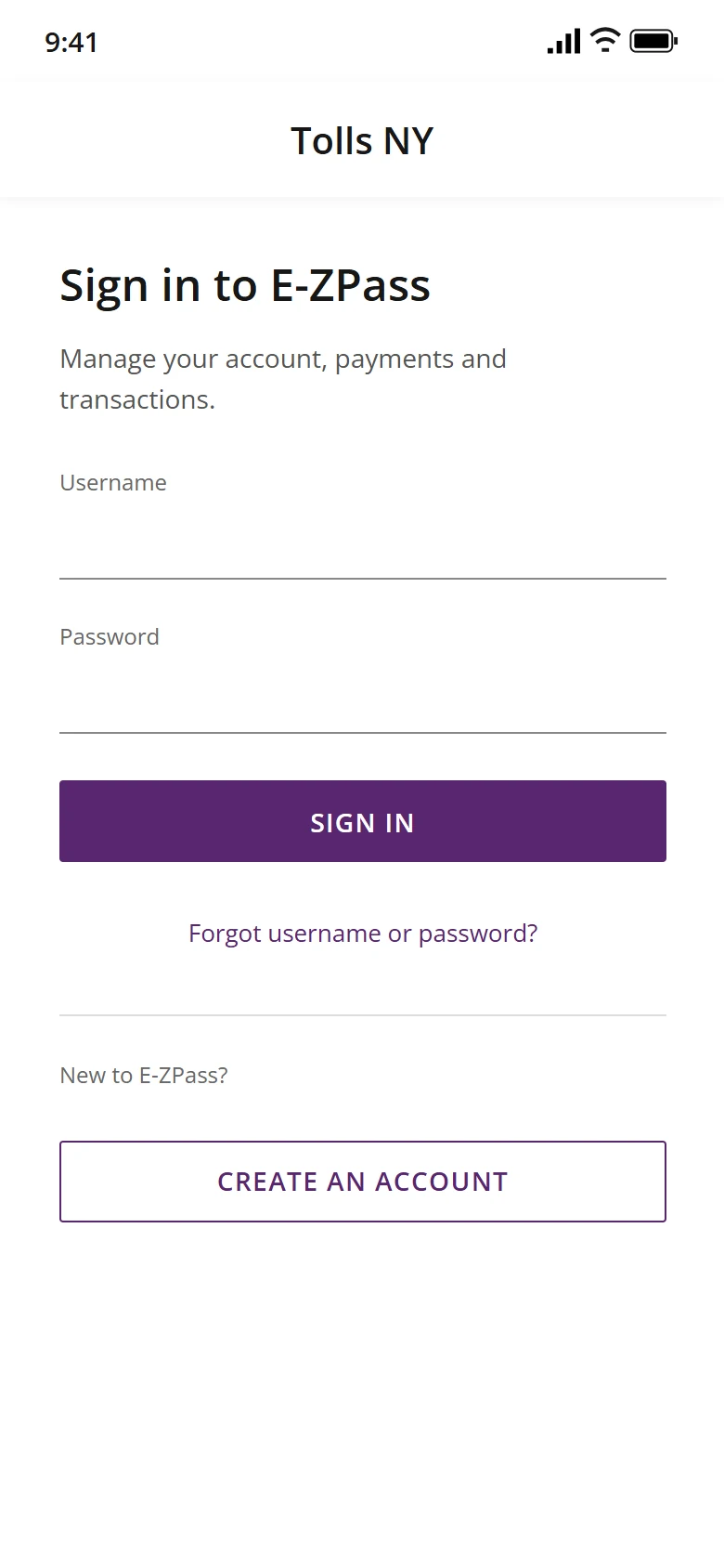
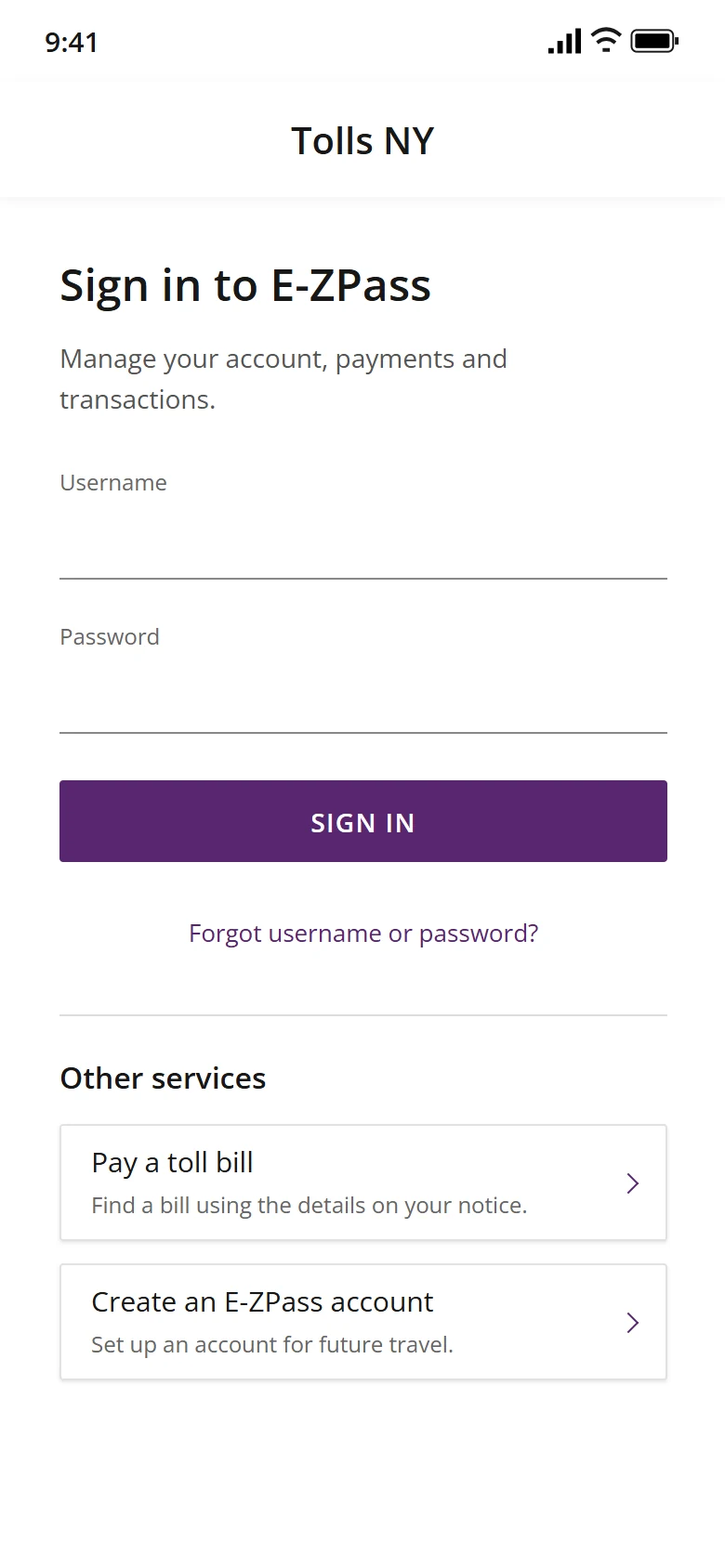
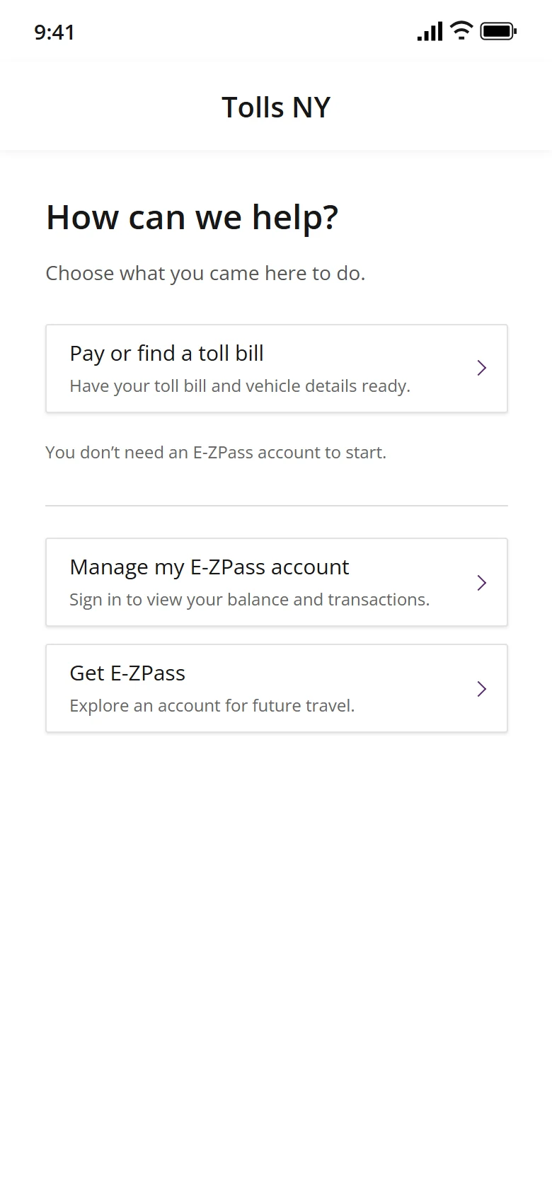
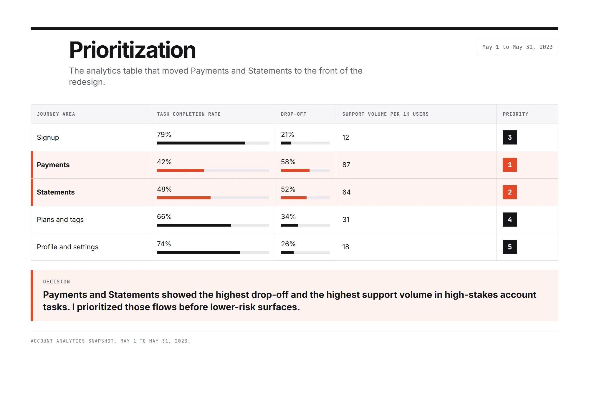
To sort out what’s actually urgent, I put every open problem on an impact and effort grid, then score it through four lenses. Quick wins unblock people now, while the big root-cause work gets scheduled properly.
I write down which change in behavior proves the problem is solved. If I can't measure it, I don't have a goal yet. One number proves it, and two check it moved for the right reason.
Customers can say whether their payment went through, without help.
They find their balance and choose a payment method without help.
Payment-status support contacts per 1,000 payments go down.
I look at where technical limits and business goals overlap, then design a layout that makes those constraints work for the user instead of against them.
The same screen, changing with what the system actually knows.
PostedData is solid
ProcessingNot confirmed yet
Action requiredA person steps in
This is the thesis in one screen. The layout changes with how sure the system is: Processing never borrows the look of Posted, and it says not to pay again.
I bring engineering in during problem framing, before any layout exists. Waiting until the specs are polished creates tech debt and forced pivots.
While we're still lining up the data, the tech lead is already in the room.
Waiting for polished specs means designs that assume data the system doesn't have.
Backend limits turn into realistic UI rules, so slow responses and unsure data are designed for from the start.
The same project, run two ways. Engineering in the room
Technical constraints aren't blockers. They're the canvas.
“Not feasible” starts the conversation. It doesn't end it. I find out exactly what's blocking it, protect what the user actually needs, and design the tradeoff together.
Not our API, not the deadline. The data only arrives once a night.
“Did my payment go through? Should I pay again?”
People don't need live data. They need to know not to pay twice.
Sketched with the backend lead, using data that already exists.
Ship the simpler version now. The ideal goes on the roadmap.
IdealNot buildable: no live data
Version 1Buildable today
Guided billing beat open chat in prototype tests, so guided shipped. It shows whether the payment went through and what to do next, without people needing to know what to ask.
What the AI does
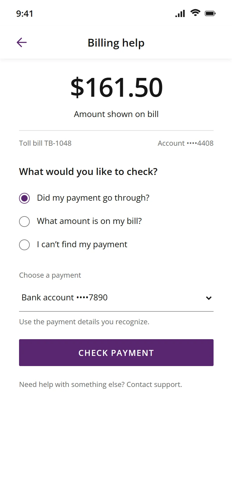
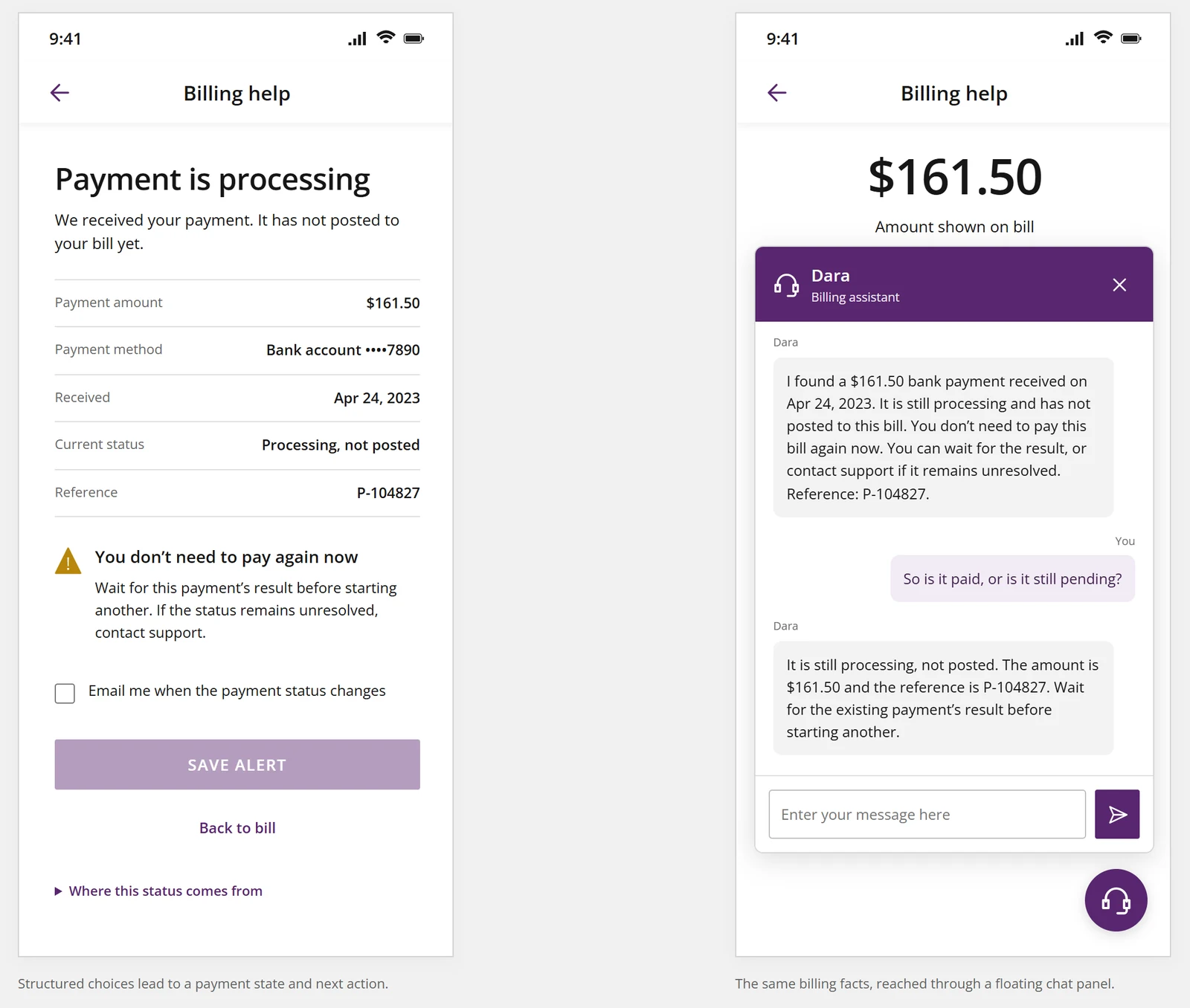
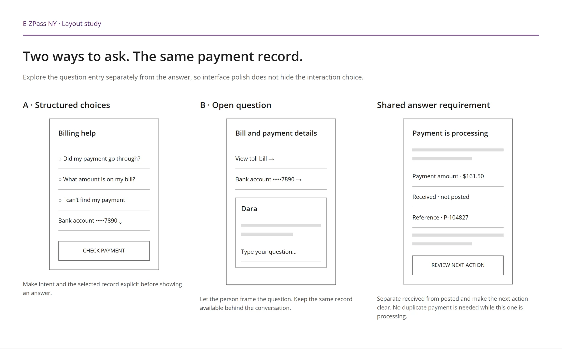
Guided billing answers the question people kept calling about: did my payment go through? The happy path was the easy part. The design work was deciding what it does when it can’t tell which payment someone means, can’t match one at all, or shouldn’t answer without a person.
The flow never shows a best guess as the answer. It answers when one payment matches, asks one question when two could, and brings in a person when none do.
SureOne payment matches
It answers, and says not to pay again.
Not sureTwo could match
It asks one question. The person picks.
No matchNothing matches
It asks for the bank details once, then offers a person.
If it can’t tell, it asks, or passes you to a person. Same rule as the payment status screens: nothing unconfirmed gets shown as a fact.
People can ask in their own words. The model turns the question into structured choices, and people confirm or adjust them, so the system never acts on a guess about what they meant.
A handoff isn’t a failure state. When money is involved and the system can’t tell, a person is the right answer.
The bill, what the driver was looking for, where the flow searched and what didn’t match. The driver doesn’t start over, and the screen still says not to pay again while the agent checks.
Handed offA person steps in
The person who picks it up already knows what was checked.
Guided started from the bill, with the questions people called about ready as choices. Dara started from an empty chat window. Both took typed questions and both answered from the same payment record, so only the way people asked changed. The question wasn’t which one people liked more. It was which one left fewer people guessing.
Guided shipped. Dara, the chat assistant, and Connie, a second AI assistant, stayed concepts and didn’t ship. How I designed their trust controls
These are just a sample of the full redesign.
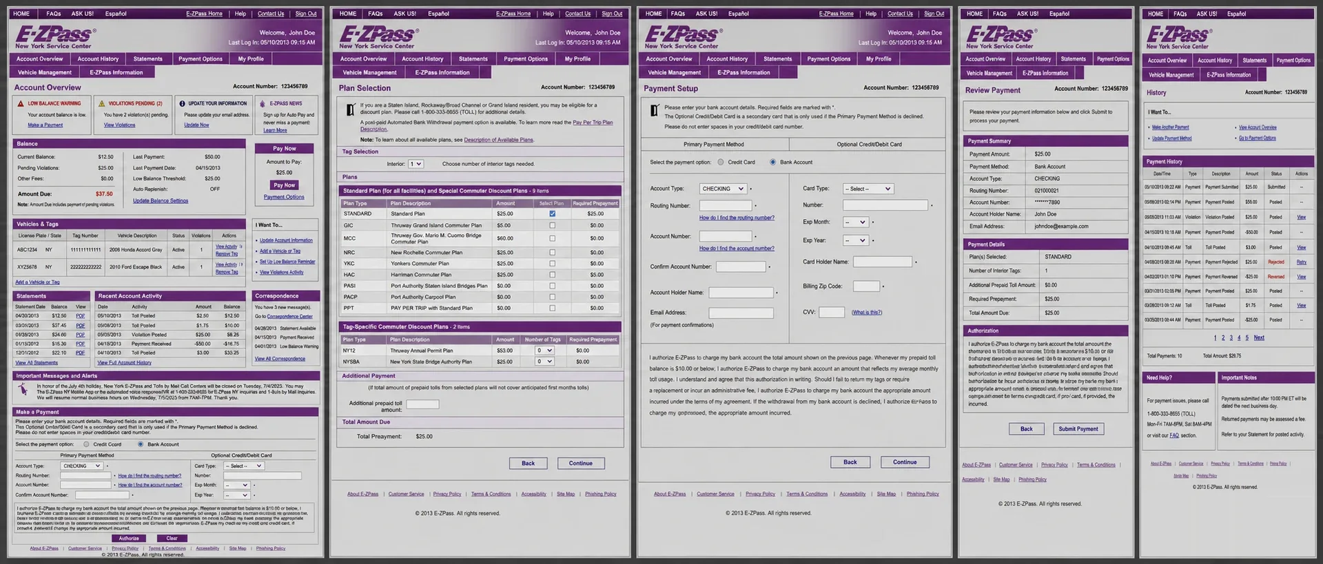
Five screens from account to payment status, before and after.
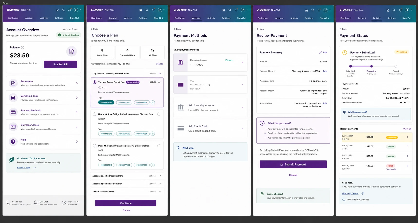
A handful of the roughly 3,000 screens in the redesign, across web, native and responsive. Pick a task to see the legacy screen and the redesign together.
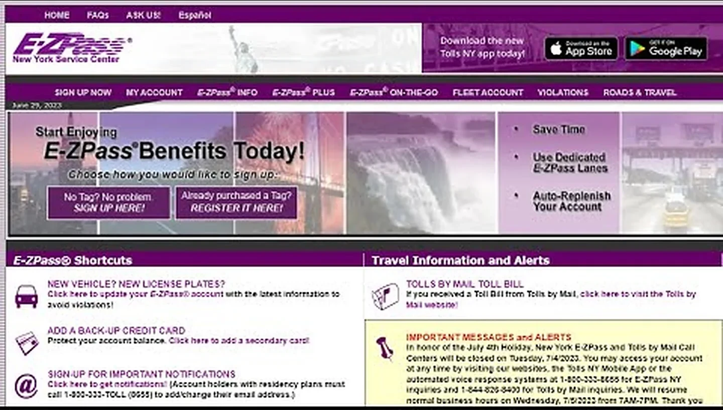
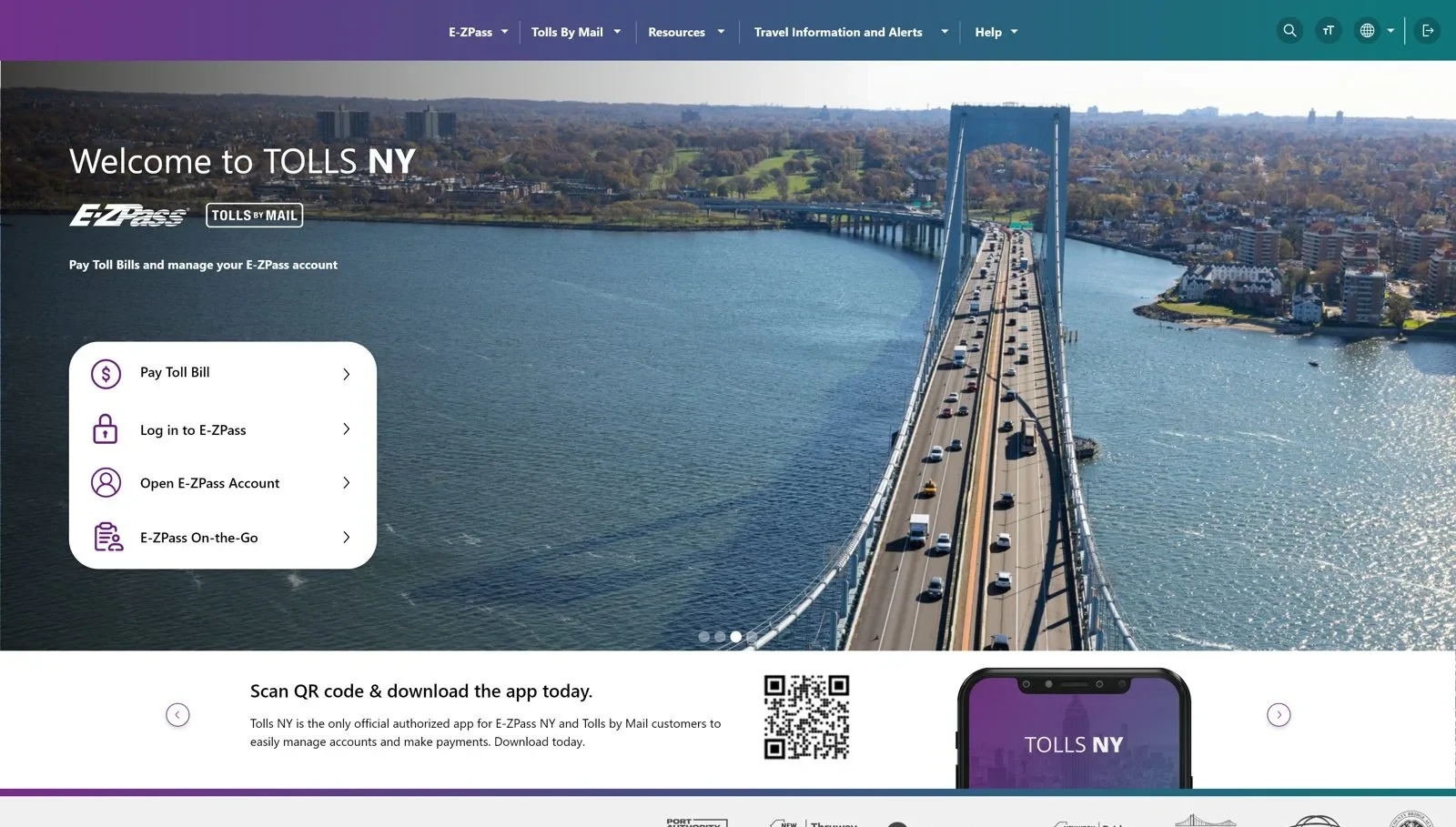
The four main tasks are up front, and alerts got their own spot.
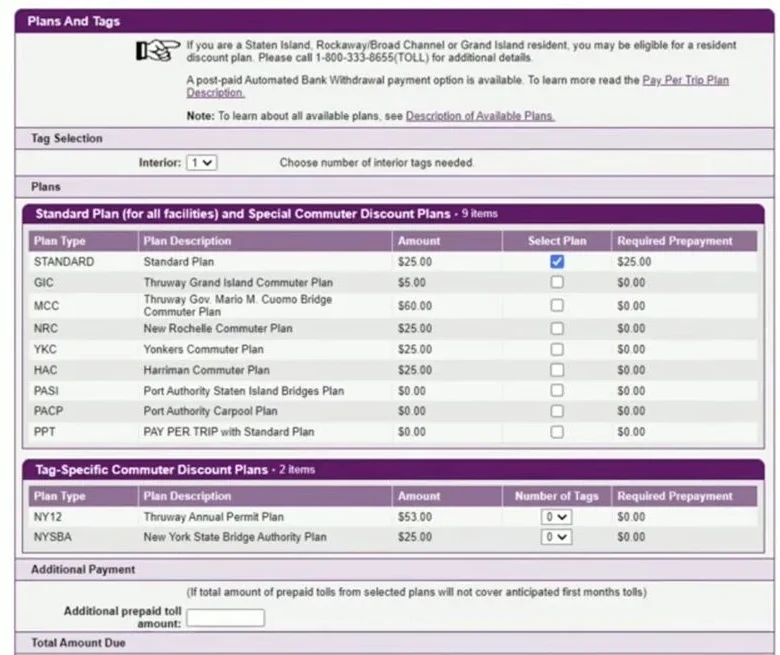
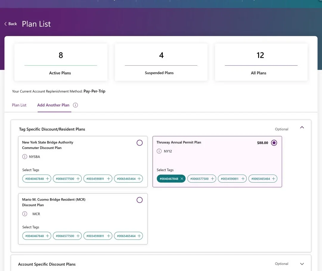
The coded rows became cards with a real plan name, what it covers and the price.
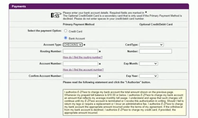
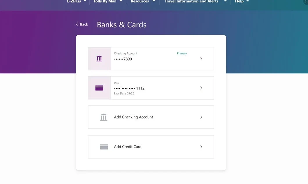
Saved methods show first with the primary one marked, and there’s one way to add a bank or card.
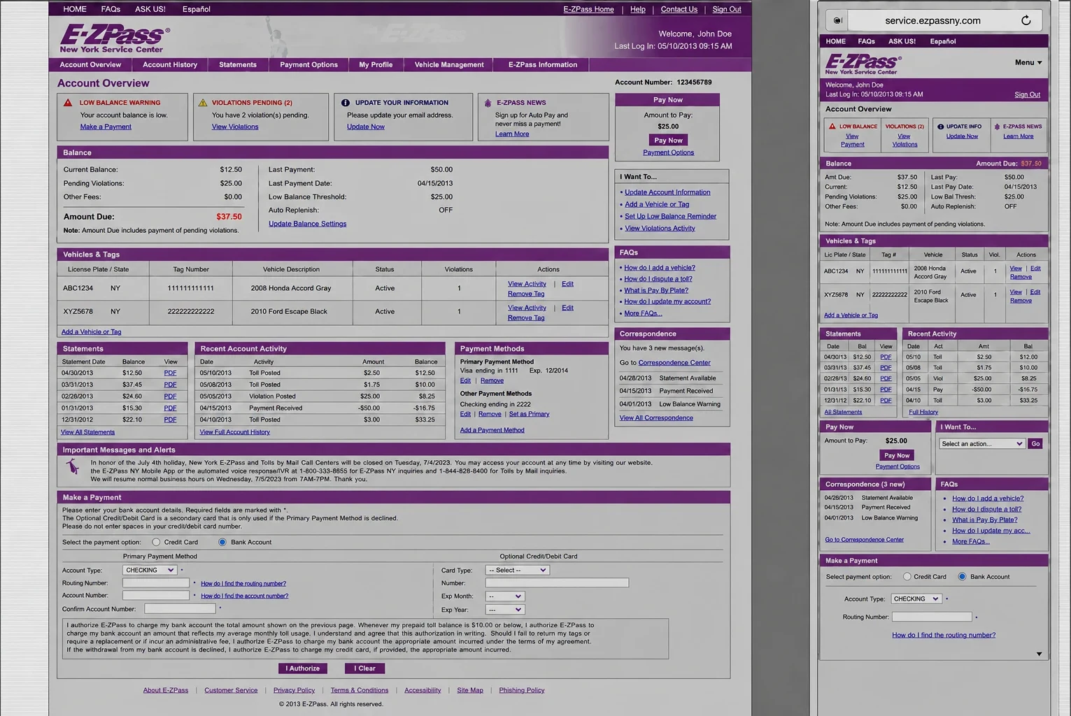
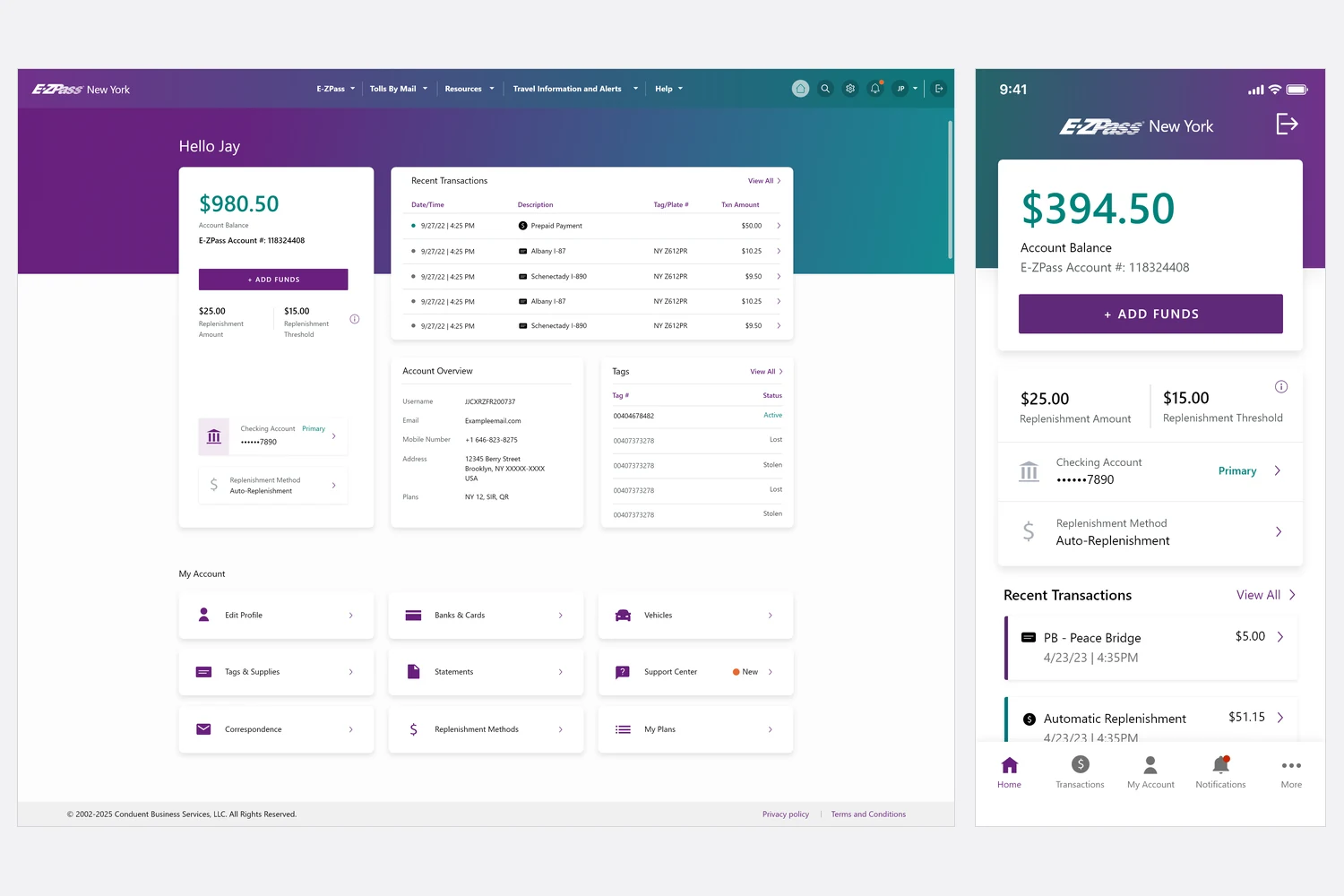
Status comes first, there’s one main action, and the controls are big enough to tap.
Before: the legacy website, and the same page squeezed onto a phone, tables and tiny actions included.
After: the redesigned website, with a phone layout designed from the start.
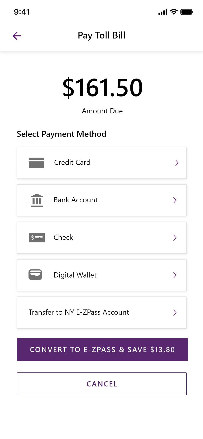
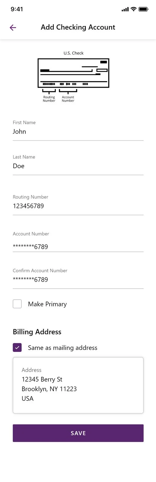
Every step follows the same pattern.
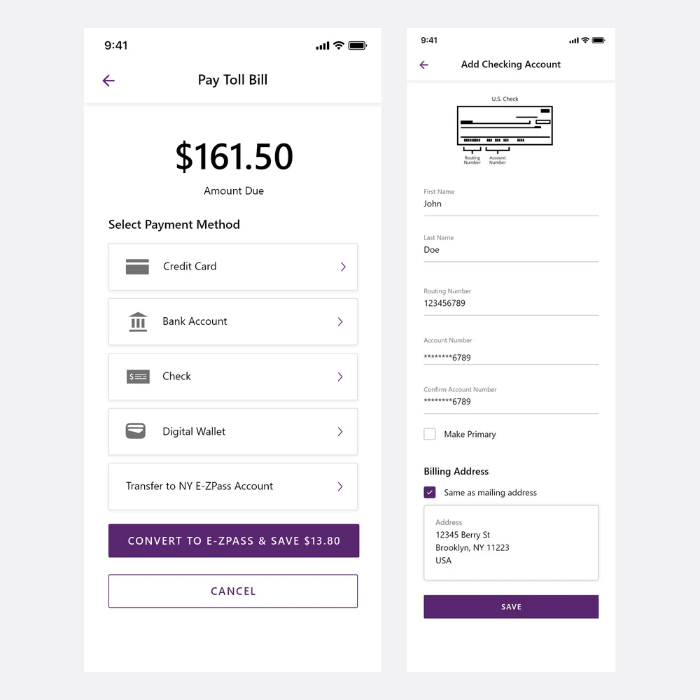
Amount due up top, payment methods below.
One field per line, with a check diagram where people need it.
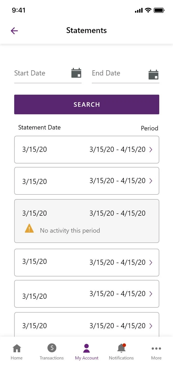
Statements are searchable, and any period is one tap away.
A design is ready when it unblocks what people came to do without adding risk or tricking anyone. Not when every idea is in. I check three benchmarks before it goes to engineering.
Find a bill, pay it, see where it stands. No dead ends and no catastrophic errors.
The interface handles loading, slow responses, failures and unsure data the way the system really behaves.
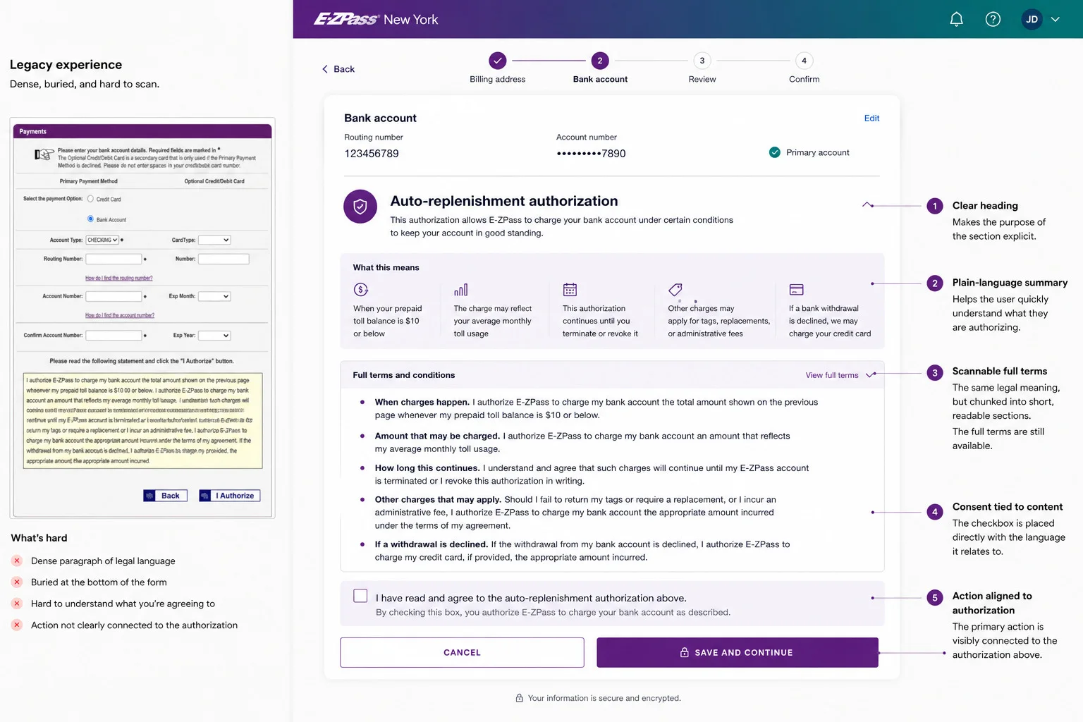
No dark patterns, nothing that nudges a second payment, and the legal authorization text kept intact.
I rebuilt Conduent’s Apollo design system myself. For the first two to three months it took about half my time.
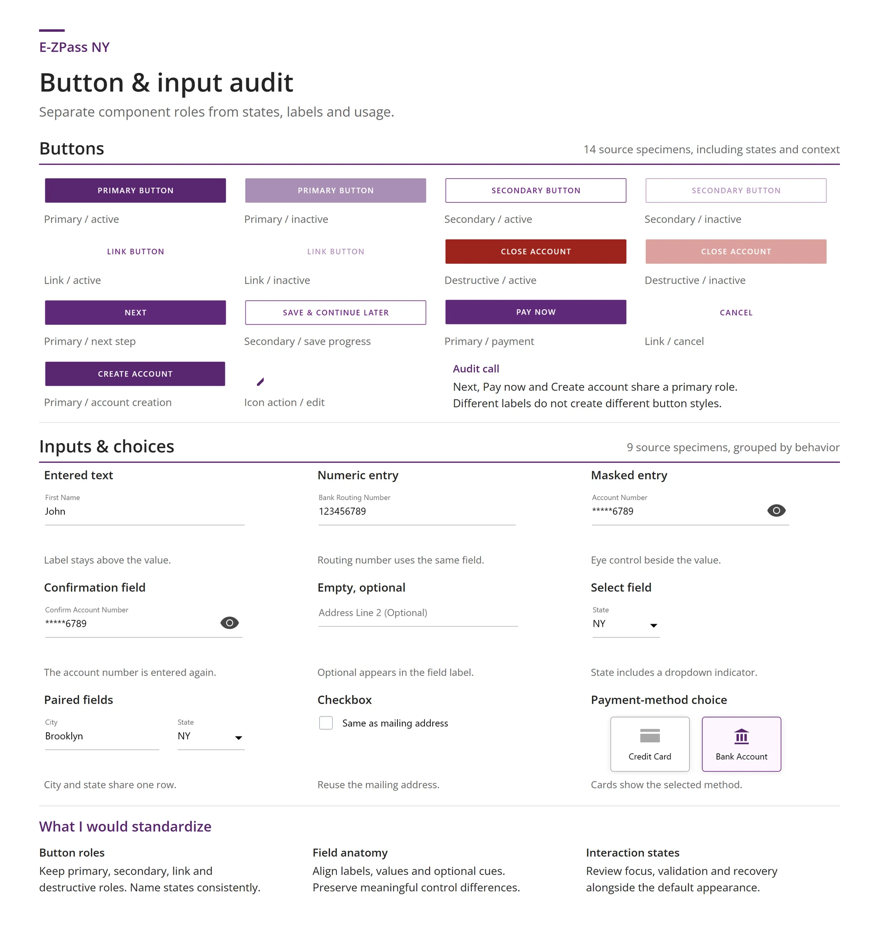
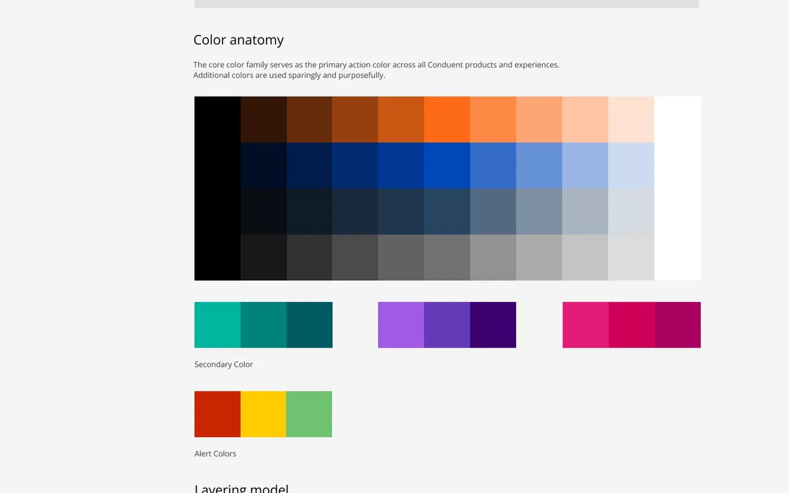
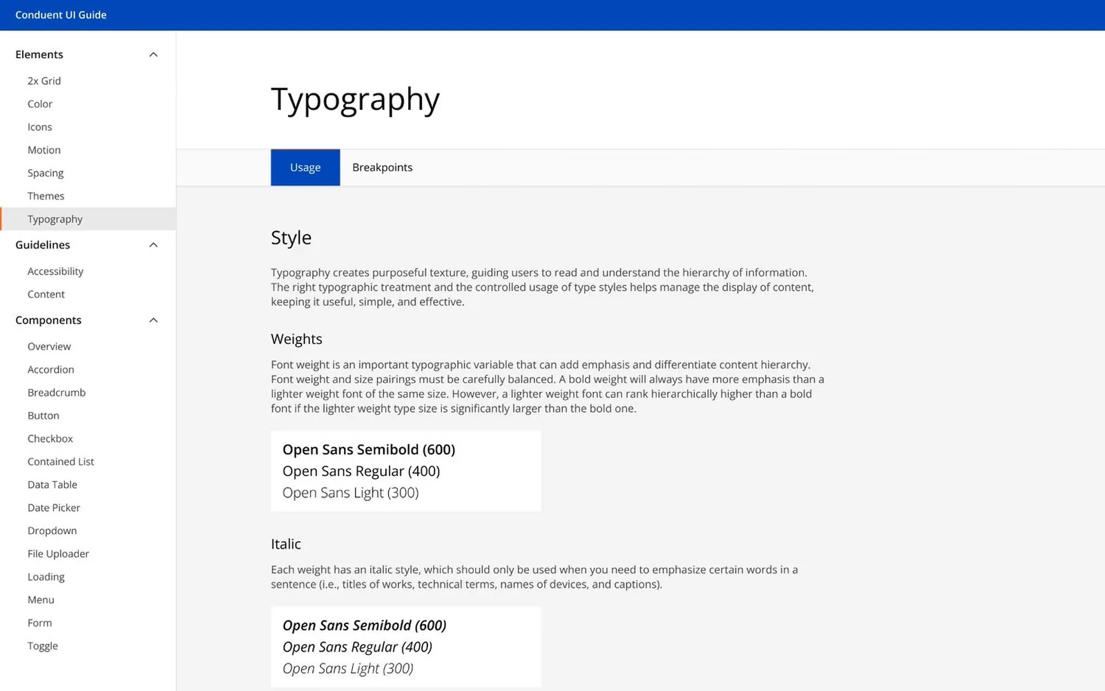
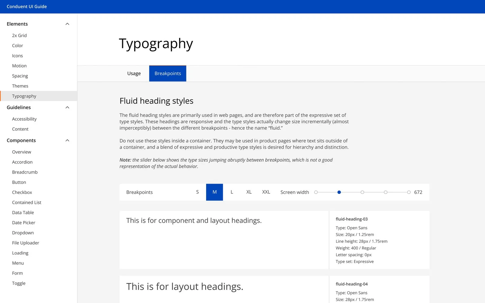
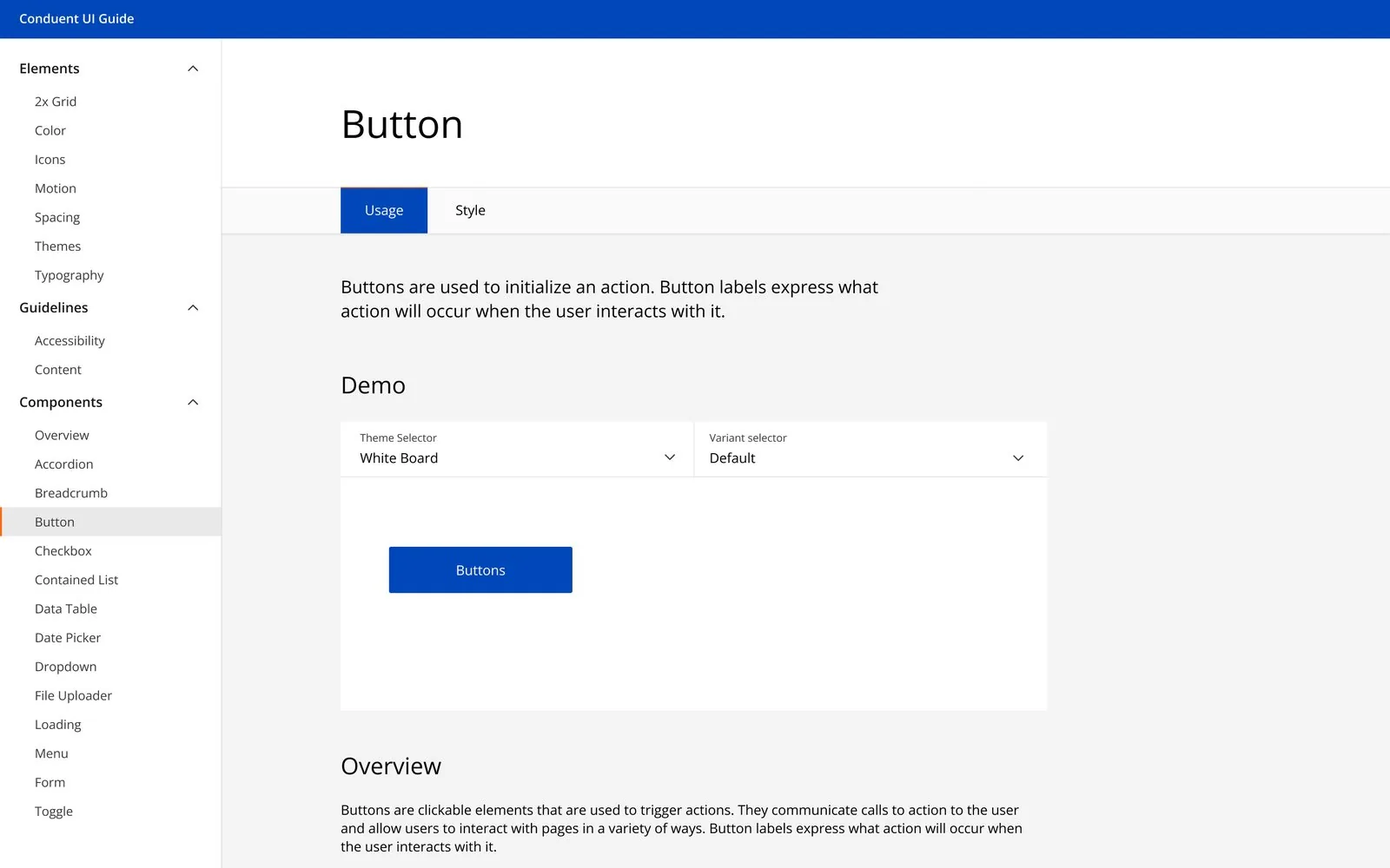
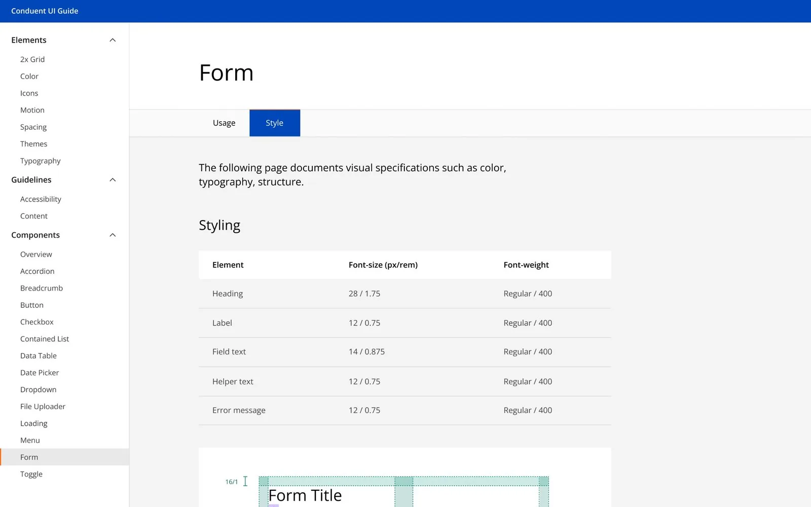
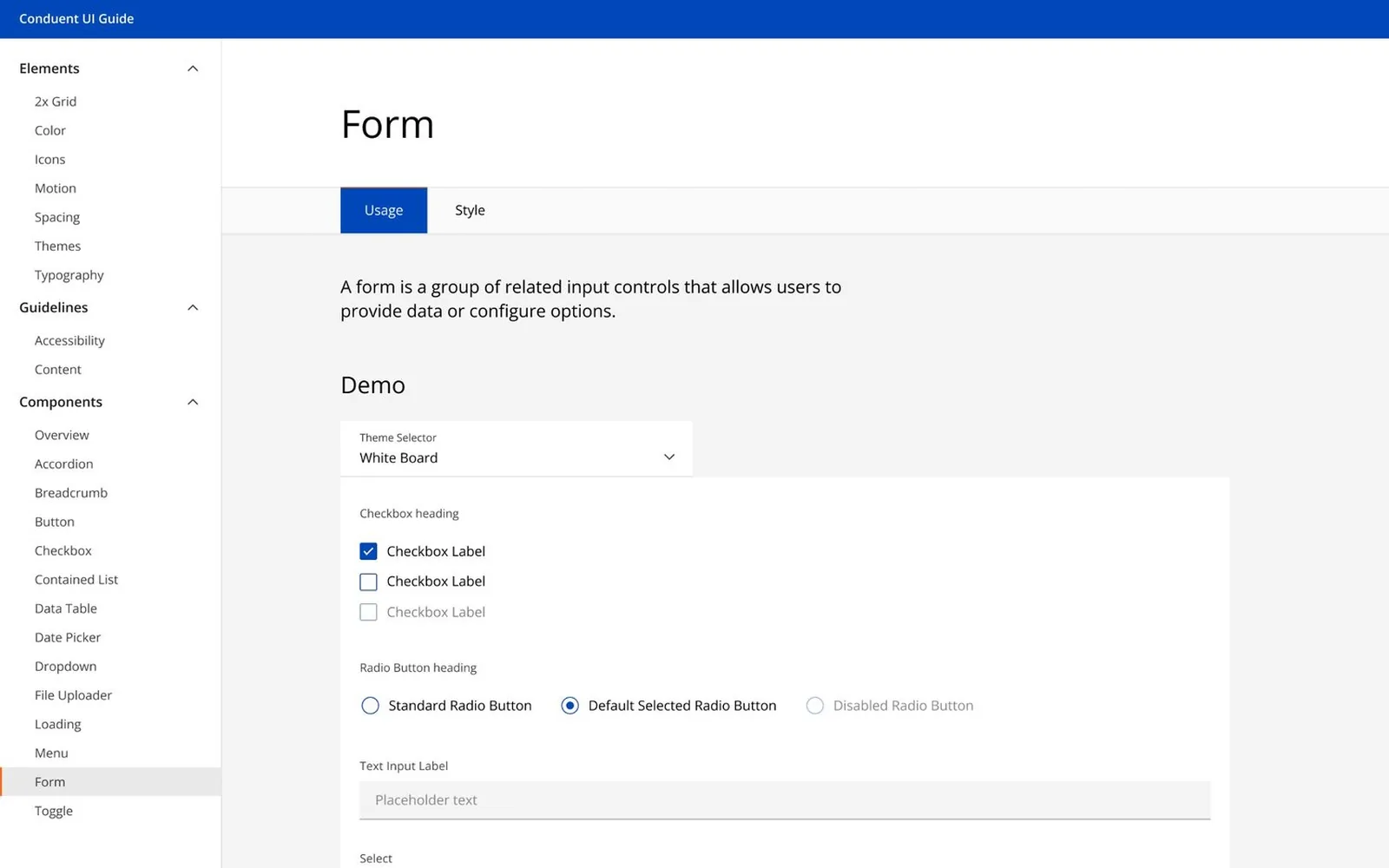
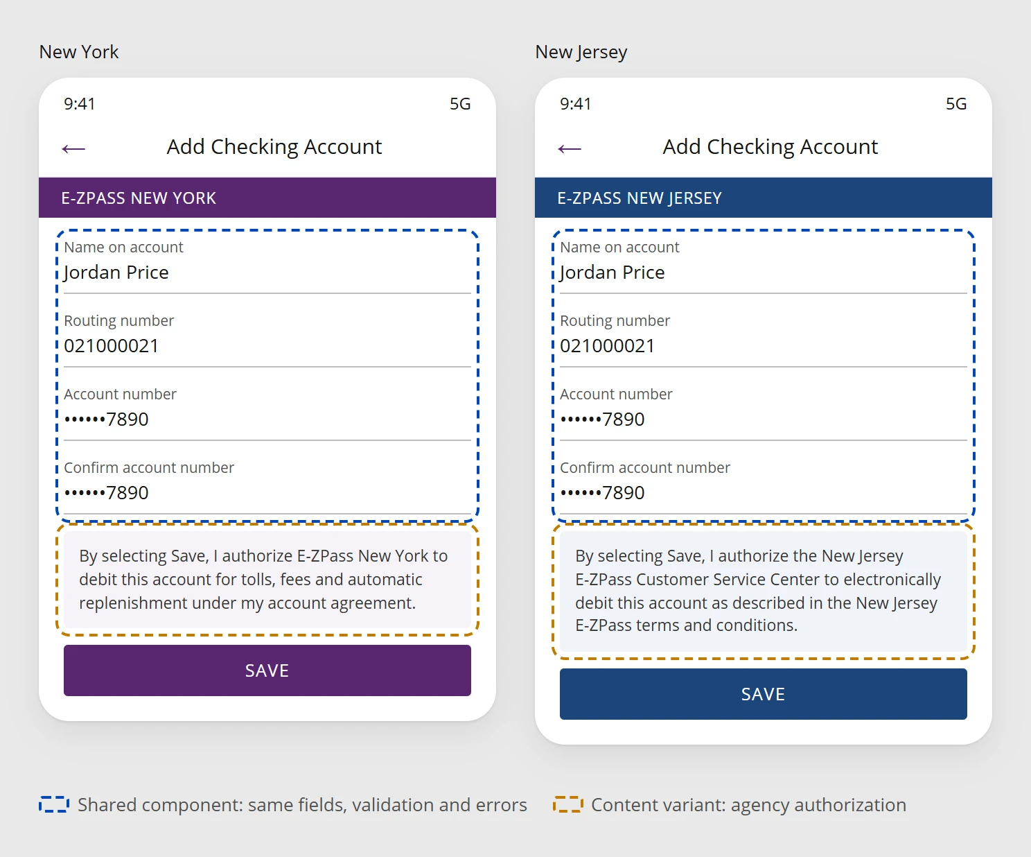
One component. Only the legal text changes between New York and New Jersey.
Fields, validation and errors work the same way. Only the authorization language differs, so we never kept two versions.
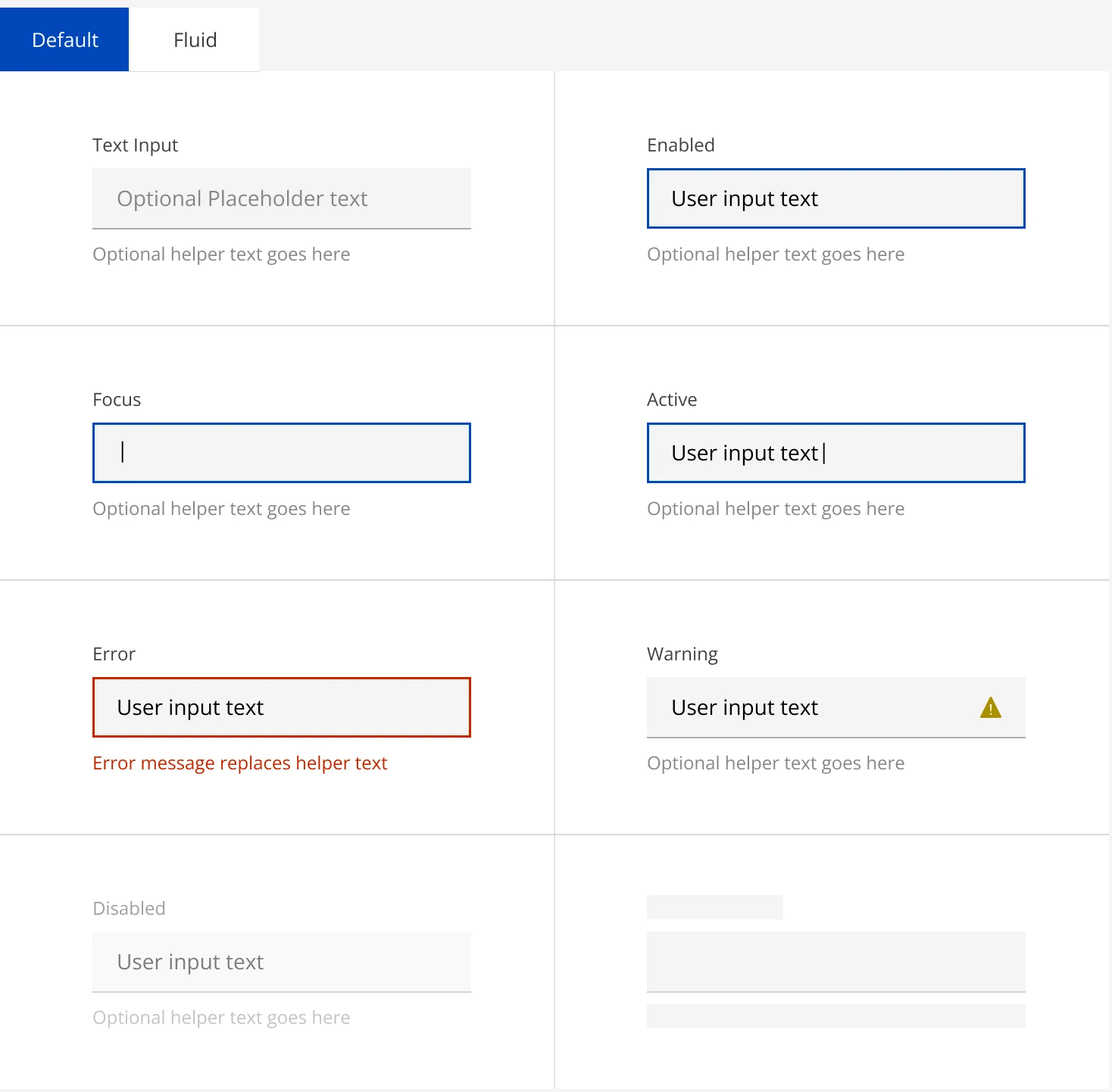
The frontend lead and I reviewed the working, coded components together, not just design specs.
We went through every state of an input together. Design and code pulled color, type and spacing from one shared list of values.
Input states from the Apollo form spec.
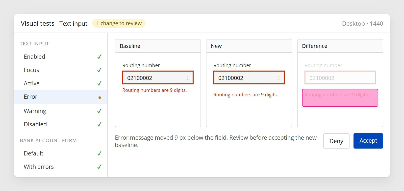
Automatic screenshot comparisons ran on every component change.
A difference wasn’t always a bug, so we reviewed it before accepting. Keyboard use, validation and the full payment flow we still checked by hand.
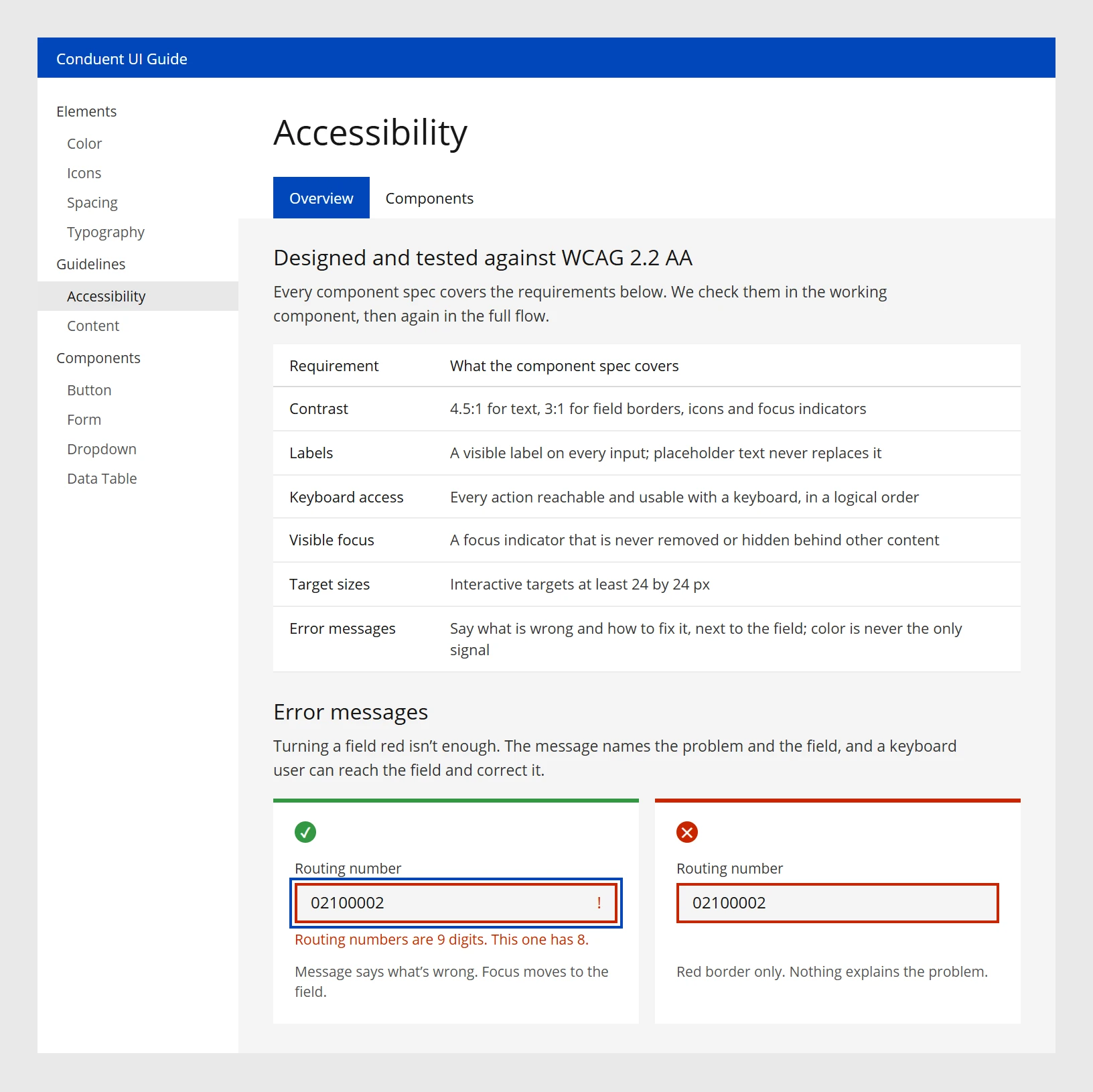
Accessibility requirements, from the WCAG 2.2 AA standard, were written into each component spec.
Contrast, labels, keyboard access, visible focus, target sizes and error messages. A red field wasn’t enough: the message had to say what was wrong and which field to fix. Designed and tested to that standard, not certified.
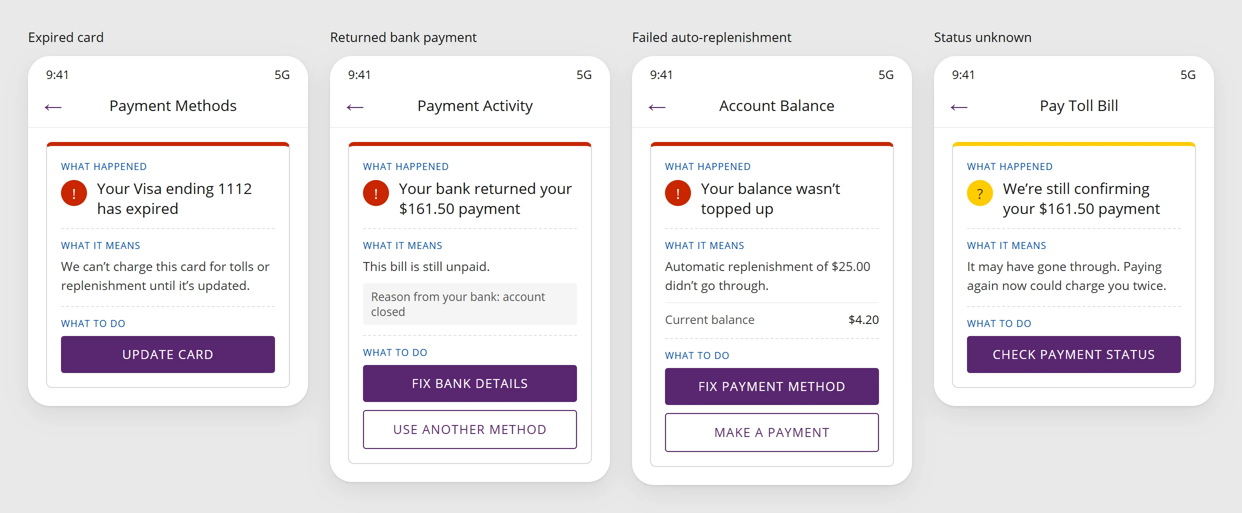
Every failure says what happened, what it means for the payment, and what to do next.
Declined cards, returned bank payments, expired methods and failed auto-replenishment share one structure. If the status is unknown, people check it before paying again.
Every request answered three questions: what’s the problem, where does it show up, and why doesn’t the existing component work?
The frontend lead and I made the call together.
Apollo, the design system I rebuilt for E-ZPass, covers most of any screen. I use the existing pieces for about 90% of the interface and save my design budget for the 10% that solves a problem nothing in the system solves yet.
Every value in the design maps to a token that already exists in code.
| Element | Token | Value |
|---|---|---|
| Primary button | color.action.primary | #5B2A86 |
| Amount due | color.text.money | #12858A |
| Error message | color.support.error | #A4262C |
| Section spacing | space.06 | 24px |
| Screen title | type.heading.03 | 28 / 36 |
The duplicate-payment check isn't a new component. It's an existing alert placed inside the standard modal.
Say the payment status timeline is something Apollo doesn't have. Every request answered three questions: what's the problem, where does it show up, and why doesn't an existing component work? The frontend lead and I made those calls together, and anything new was built to be reused, not as a one-off.
I treat the handoff as a blueprint of how the system behaves, not a stack of pretty screens. It has four parts, in this order.
1 · The intent
Help a driver pay a toll bill and know, without calling, whether it worked, so the agency handles fewer status calls and refunds.
2 · The happy path
3 · The condition matrix
| Loading | Slow response | Validation error | Unsure data | |
|---|---|---|---|---|
| Choose method | ||||
| Submit payment | ||||
| Payment status |
Scroll sideways to see every state →
4 · The tokens
Every element links to its Apollo component and token, like color.action.primary, space.06 and type.heading.03, so spacing, type and color match production code.
Nobody reads a 20-page decision doc. I document inside the Figma canvas with markers people can scan in seconds: status badges, short “why” notes, mapped branches and linked tokens.
Scroll sideways to see the whole file →
I review the staging build against real data and forced failures, not by eyeballing pixels. Every issue becomes a ticket an engineer can fix without a meeting.
Staging side by side with the design, checked against tokens: padding, type sizes, components.
Slow the network and force errors to see every fallback screen.
Data that isn't confirmed must never look like a fact.
Video, component reference and the exact fix. No vague feedback.
DesignFigma, frame 03
Staging buildSlow 3G, bank status forced to pending
space.07.The one Critical issue is an unconfirmed payment shown as “Paid.” Unconfirmed data that looks like a fact is the bug that matters most.
This sits on top of the regular checks: the frontend lead and I reviewed real components in Storybook, and visual regression tests caught spacing drift on every component change.
Unconfirmed bank payment shows as “Paid” on the status screen
- <StatusPill variant={payment.posted ? "posted" : "posted"} />
+ <StatusPill variant={payment.posted ? "posted" : "processing"} />
- padding: 12px;
+ padding: var(--space-07); /* 28px */
Launch isn’t the end. I check the goals I set up front, then look at what’s still left over.
Payment-status support contacts fell from 36 to 14 per 1,000 payments, from post-launch data shared by the E-ZPass program team.
The same three goals, written before the first wireframe. They are the three numbers at the top of this page.
| Goal | Target | Result |
|---|---|---|
| People knowCan say whether a payment went through, without help | 62% → 90%+ | 94% |
| People find it themselvesFind their balance and choose a payment method without help | 68% → 85%+ | 92% |
| Fewer people have to askPayment-status support contacts per 1,000 payments | 36 → under 20 | 14 |
| Result | 3 of 3 met |
I sort the support contacts that are still coming in by reason. The biggest group is the next problem.
Share of the payment-status contacts still coming in after launch.
Fewer people call to ask whether it went through. What’s left is “my bank sent it back, now what?” The screen says Action required, but people still call to find out what to do next.
Returned payments become the next problem, and the fix is bigger than one screen: payment status as a full system, where every state says what it means for the balance and whether it’s safe to try again.
Action requiredWhere the next round starts
| State | Balance | Safe to pay again? |
|---|---|---|
| Submitted | Not changed yet | No, wait for the bank |
| Processing | Not changed yet | No, wait for the bank |
| Posted | Paid | Nothing left to pay |
| Rejected | Still due | Yes, another way |
| Returned | Still due | Yes, another way |
| Reversed | Due again | Ask support first |
| Action required | Depends on the reason | Not until it’s fixed |
This is the same next step as in Looking back, and the loop starts over at step 1, Understand.
Moving the Pay button and making it more visible. Nothing really changed, because people could already find Pay. That pointed us to what happened after they pressed it.
Test rough end-to-end flows in week one. The problems were in the handoffs between steps, not the screens.
Payment status as a full system. Seven states, each saying what it means for the balance and whether it’s safe to try again.
How each group got to yes.
Asked for one page. On a phone it was too long, so it became one decision per screen.
What I cutI walked a small group, including two engineers, through the entry options. Task-based entry was kept.
Where people startThe bank wording couldn’t change. Approved with the legal wording unchanged.
DecisionsWe reviewed the coded components and made new-component calls together.
Design systemMost of the effort now is getting people to agree, not drawing screens. Two habits did the most: critique that ends in a decision, and showing a client their own goal failing instead of arguing about taste.
Weekly, 45 minutes: the designers, plus the PM or engineer whose area was on the table.
The agency asked for the payment screens on one page. Instead of arguing about layouts, I let their own goal decide.

“He approached problems thoughtfully, collaborated effectively with colleagues, and communicated design decisions with clarity. I valued his ownership of projects…”